Tranquil Dawn by Dulux is one of those colours that just works.
It’s soft, calming, and incredibly easy to live with – which is exactly why it’s become so popular in real homes. If you’re looking for a colour that feels fresh without being overpowering, this is one to consider.
I have created this post to be a one-stop-guide for you to get to know this colour better and to help you decide if it would be perfect in your home. After seeing how real homes use this paint colour, I also share colour combinations, mood boards, and styling ideas to help bring the look together.
This post may contain affiliate links. This means if you click and buy I may receive a small commission with no cost to yourself. Please see my full disclosure policy for more details.
A Quick Look Ahead
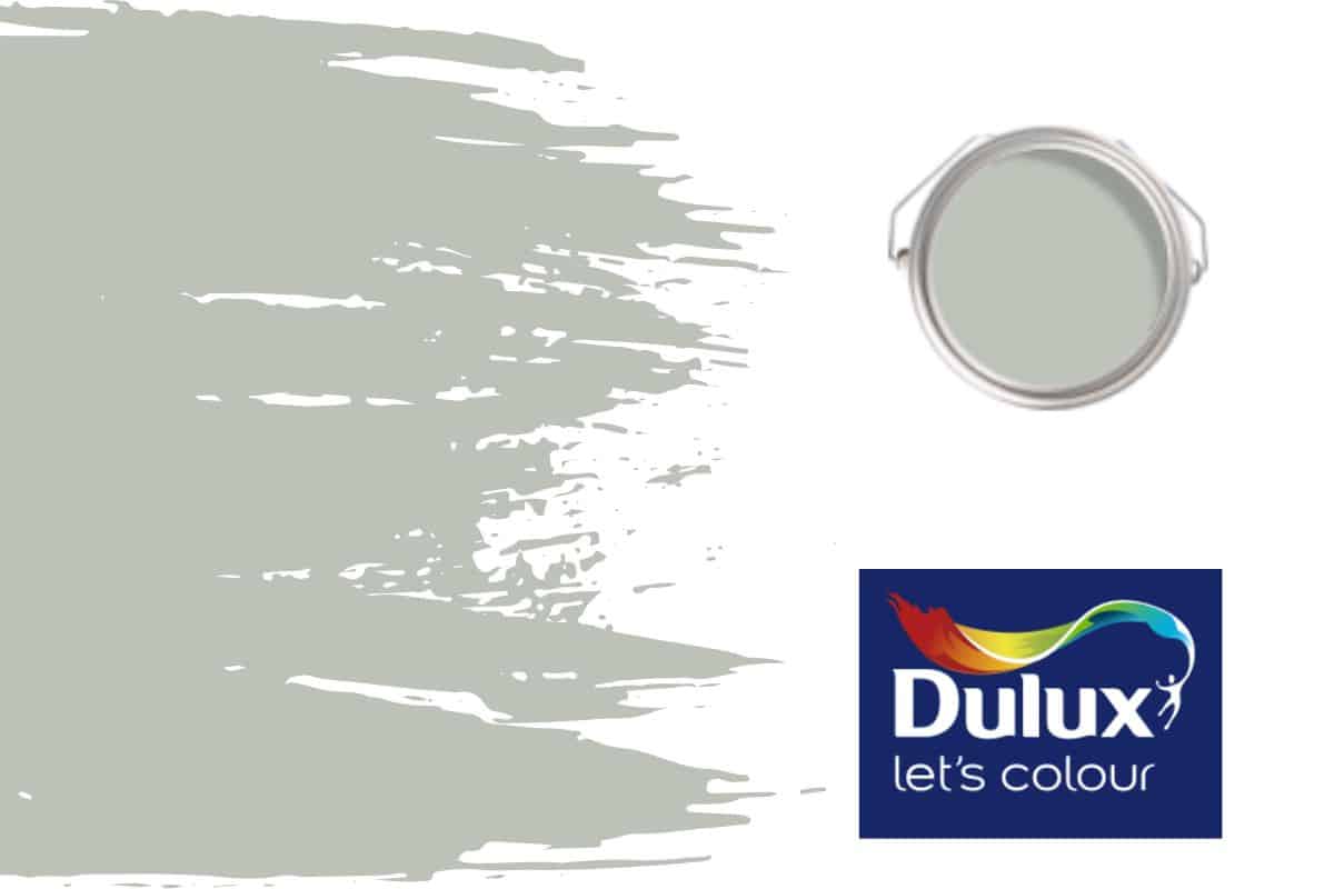
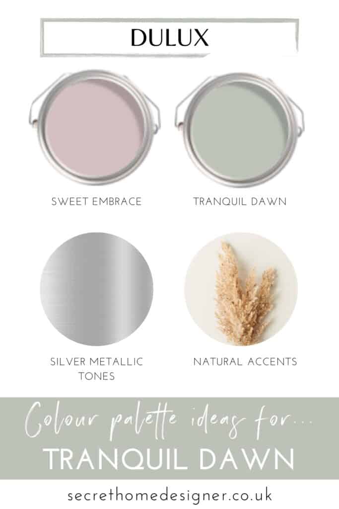
What Colour Is Tranquil Dawn?
Tranquil Dawn is a soft green tone with undertones of grey. Many people that have used this colour say the grey tone can get stronger depending on the time of day and the light quality. This is definitely a factor you should consider when choosing Tranquil Dawn for your home – in natural daylight it feels fresh and airy, while in lower light it softens into a more muted, cosy tone.
It’s a soft, earthy green that complements a wide range of colours and brings a light, calming feel to a space without feeling too cold or flat.
If you already love this colour, check it out on Dulux’s website.
Is Tranquil Dawn Warm or Cool?
Tranquil Dawn sits on the cooler side, but it’s very balanced. In north-facing rooms it softens the cooler light, while in brighter spaces it stops the room from feeling too stark or washed out.
Think of it as a neutral with personality rather than a bold colour.
How To Use Tranquil Dawn In Your Home
Tranquil Dawn is one of those colours that gives you flexibility. It can feel soft and airy or slightly deeper and more cocooning depending on how you style it, which makes it easy to adapt across different rooms and styles.
Best Rooms To Use Tranquil Dawn
Tranquil Dawn works beautifully in bedrooms, living rooms, kitchens and bathrooms.
In bedrooms, it creates a calm and relaxing atmosphere without feeling too cold. In living spaces, it acts as a soft backdrop that allows textures and furnishings to stand out. In kitchens and bathrooms, it brings a fresh, clean feel while still feeling warm and inviting.
Light vs Dark Spaces
In brighter rooms, Tranquil Dawn feels lighter, fresher and more obviously green.
In darker rooms or spaces with less natural light, the grey undertone becomes more noticeable, giving it a softer, more muted feel. This can work really well if you’re looking to create a cosy, more cocooned space.
North vs South Facing Rooms
In north-facing rooms, where the light is naturally cooler, Tranquil Dawn helps to soften the space and prevent it from feeling too stark.
In south-facing rooms, it balances out the warmth of the light, keeping the space feeling calm rather than overly bright or washed out.
When To Avoid Using Tranquil Dawn
Tranquil Dawn works in most spaces, but it can feel slightly flat if paired with overly warm or yellow-based tones.
If you’re working with very warm finishes or strong yellow undertones, you may find the colour doesn’t work as well. Keeping your palette soft and slightly muted will always give the best result.
Using Tranquil Dawn On The Fifth Wall
Have you thought about your ceiling? Painting the ceiling (often called the fifth wall) is becoming more popular.
Using it across walls and ceiling creates a more immersive, calming feel and helps to blur the edges of the room. It’s a great option if you want a more modern, styled look without going too bold.
If you thinking about using Tranquil Dawn in your home, you can view the colour, check the available finishes and explore tester options directly on Dulux’s website.
If you want to see how other people have used this colour in their homes then keep on reading. There are some beautiful examples of Tranquil Dawn used in different spaces. I hope these will give you some great inspiration for the best way to use this popular paint colour.
Tranquil Dawn Bedroom Ideas
Let’s see how Tranquil Dawn paint by Dulux has been used within bedroom spaces.
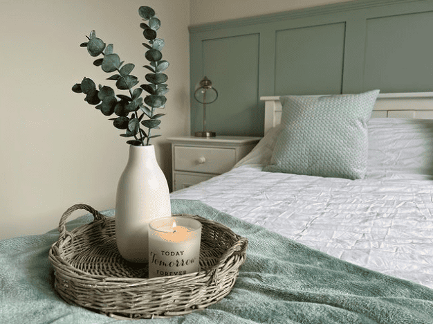
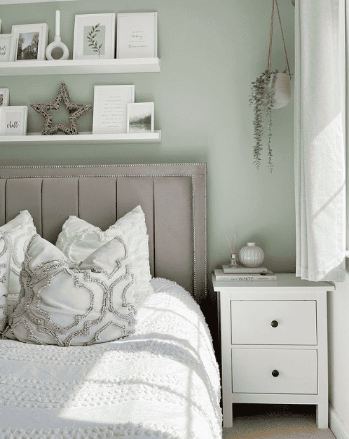
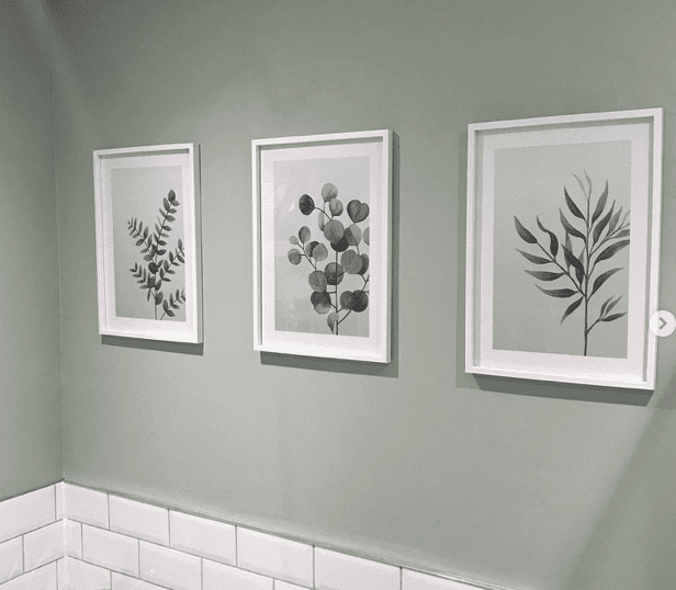
The two lovely bedroom images above by @renovating_at_35 show Tranquil Dawn paint colour used with a fresh, bright white and other tones of green. This creates a very calm space to relax in, which in todays world, we probably all need a little bit more of.
I feel that adding botanical pieces whether your preference is real or faux, is a must for adding that extra layer of calm to a space. And there’s something extra inviting to a room when the colour palette is green on green. I don’t know about you but when I see greenery against a green background, it’s almost like a piece of art framed perfectly. I see all the details of the leaves, the highlights, the shadows and also the various shapes of the leaves pop out – perfect for distracting your mind from daily thoughts, just as the paint colour was intended to do.
And let’s not forget textures. Using different textures in your soft furnishings and accessories will add interesting details to a space. You want your eye to move around your space absorbing everything.
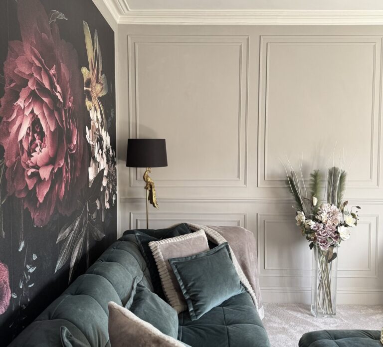
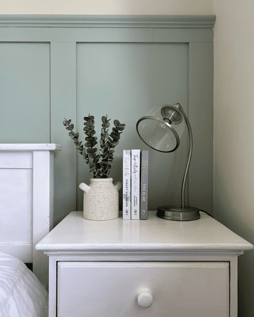
This lovely image above by @deeshousetohome shows another bedroom style where Tranquil Dawn is complemented beautifully, this time with patterns.
Natural wood tones have been used to compliment the soft green paint colour. And it works great! The wicker, the weave and even the colour of the book pages all work well together with the patterns on the cushions.
Do you display your favourite items in your bedroom to help create a relaxing space? I am working on this just now, lots of photo frames on the wall but nothing in them yet……another thing still on my to-do-list.
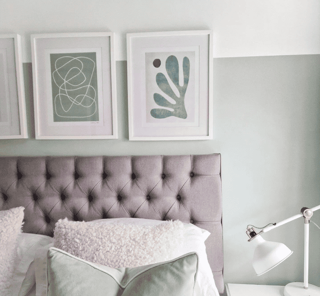
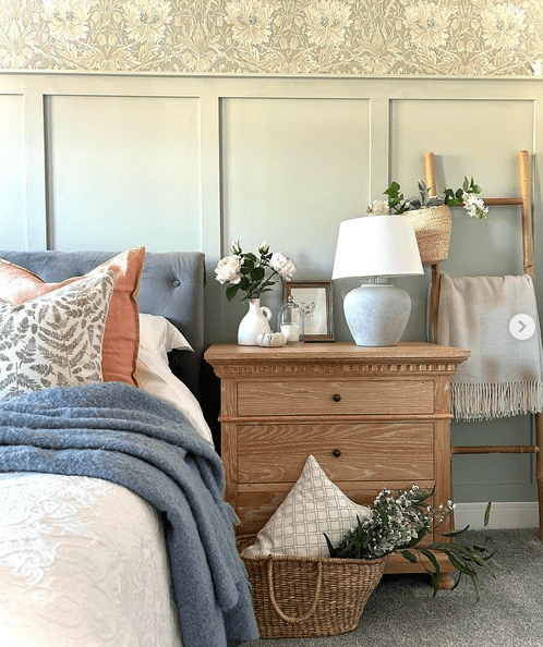
Tranquil Dawn works well with most colour palettes, and here is another great bedroom example by @newbuildnewhome2019. They have added grey into the mix, alongside the previously mentioned greenery, patterns and textures.
This soft green colour has a grey undertone which can come through depending on the light quality and time of day it is. Always remember to paint a swatch of your intended colour on all walls that you wish to use the paint colour so you can see the overall colour change throughout the day.
The grey velvet fabric works well in this bedroom because of the grey undertone in the paint. It also works well at pulling out the intricate detailing in the cushions.
Another great example above from @katebrowczuk of grey being used within the colour palette of Tranquil Dawn, light green tones and white.
The softness of the padded headboard along with the boucle fabric and velvet cushion fabric really adds to the relaxing feel of this paint colour. This colour really is great for creating a relaxing bedroom.
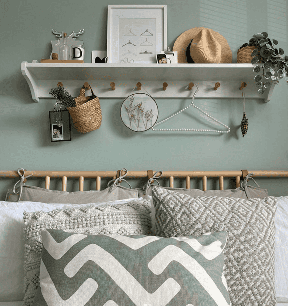
After deciding if Tranquil Dawn is the colour for you, you need to decide where and how you are using the colour. The above photo shows the paint colour used more as a colour block rather than all the way to the top of the wall. Have you thought about adding a styling twist to your bedroom?
Who loves a bold style in their bedroom?
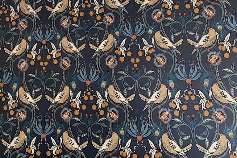
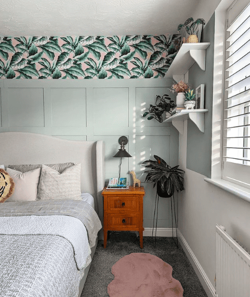
I’m loving the boldness of the botanical wallpaper used by @upgrading_upton. Pairing Tranquil Dawn’s soft green tone with a bold, colourful wallpaper is a great way to inject personality into your space. You can then pull colours from the wallpaper throughout the rest of the room creating a cohesive colour palette.
If you look closely you can also see how this colour has been used for another example of colour blocking behind the wall shelving.
You will need to have been living in a very dark cave to have not came across the trend for wood panelling over the last few years. There are lots of different styles out there but the above photo is a great example of how this soft green colour looks when paired with this particular style of panelling.
Here is another photo for inspiration from @upgrading_upton. How good does Tranquil Dawn look contrasted with these pink vases? Love it!
This photo is a great example of all the different colours, textures and accessories that all work well with this very versatile colour of paint.
This gorgeous bedroom above by @home_at_eden_gardens shows Tranquil Dawn used with other complimentary colours and wood tones. And another good example of the paint colour used with a different style of panelling as well as patterned wallpaper.
This bedroom shows you how you can use this soft green paint colour within a more country inspired room design allowing you to mix and match lots of textures, patterns and colours.
A styling tip to remember is to always think in layers when creating a space in your home. You can see layers in all elements of this room, from the bedding to the bedside table.
Tranquil Dawn Kitchen/Dining Room Ideas
Now, let’s have a look at how Tranquil Dawn has been used within Kitchen and Dining spaces.
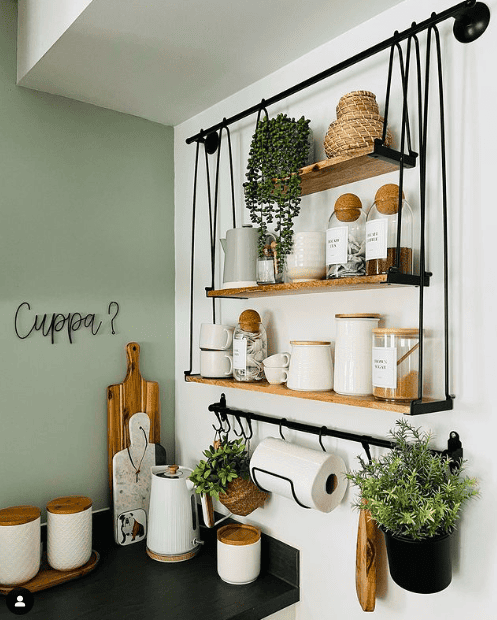
In the above photo @homebird_mrsmac has used Tranquil Dawn within their kitchen area, the softness of the green tone really works well contrasting with the warm wood tones and the black finishes. This paint colour gives such a fresh, calming feel to any space it is used in. This is such a great corner and I love the hanging shelving display. You’ve got to love a great #shelfie 😉
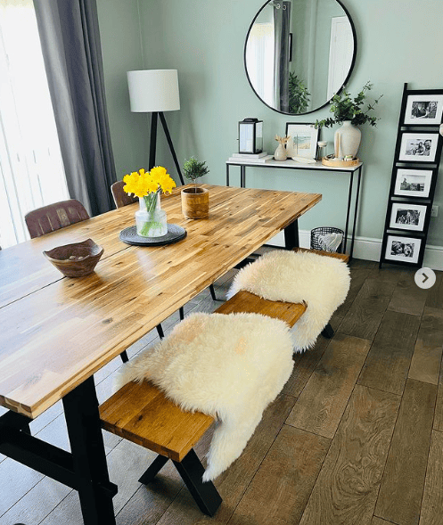
Here is another great example of Tranquil Dawn by @homebird_mrsmac, this time in their dining area. The space has been decorated with a modern rustic feel, whilst keeping it light and airy with lots of focal points to draw you around the room.
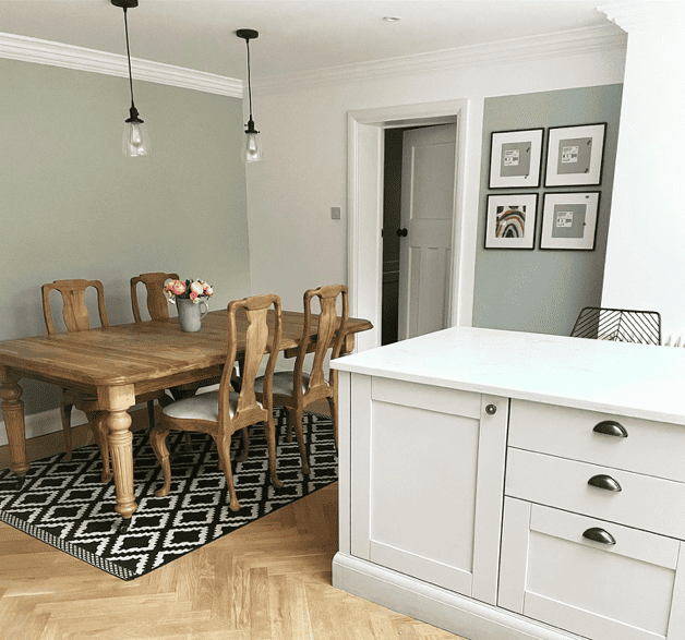
Tranquil Dawn is a great paint colour for creating relaxing spaces and this photo from @our_home_at_haresland shows that within their dining area.
Using the colour within a bright space alongside fresh, bright white and small accents of black, works great. You could try mixing style ideas like above with feature walls and colour blocking. Colour blocking allows you to highlight areas of interest and draw attention to them, perfect for showcasing artwork in the space.
More Tranquil Dawn Ideas
Now, let’s see how Tranquil Dawn has been used in other spaces of the home.
Bathrooms are another room in the house which Tranquil Dawn is absolutely prefect for. Bringing together everything the paint colour was created for – a fresh, calm and relaxing feel to the space.
Whether it’s a long relaxing bath your needing or just a quick visit 😉 this colour is truly versatile for any room you wish. The lovely bathroom created by @beesbeside_thegreen is giving off extra tranquil vibes with their complimentary artwork that works perfect with the soft green paint.
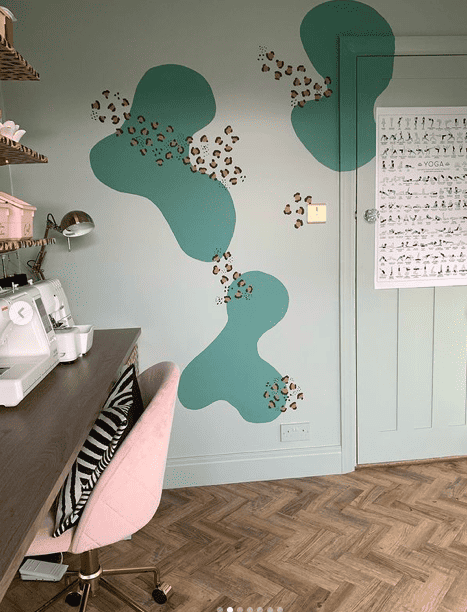
There are so many other rooms that Tranquil Dawn would be work well in, including nurseries, gyms and home offices. But the last photos I am sharing with you are from @caradiseinteriors yoga and craft room.
If you really want to add your personality to your space these two photos will get your creative juices flowing! They definitely make me want more rooms in my home so I can get super creative.
First let’s chat colour drenching…….have you heard of it?
This is where you paint everything in the same colour. It can include walls, skirting boards, doors, woodwork, ceilings and anything else that gets in the way! I personally love this look and have used it in many rooms of my home.
The above image shows @caradiseinteriors using this paint style on her walls, woodwork and door within her yoga/craft room. Tranquil Dawn is the perfect relaxing backdrop for this space. But as you can see, it doesn’t stop there……the paint colour looks great with the injection of a darker green and blush pink and amazing animal print!
The space is fun, creative and adventurous. It reminds you that you don’t need to stick to any rules when decorating, you can have a calming colour mixed with animal print.
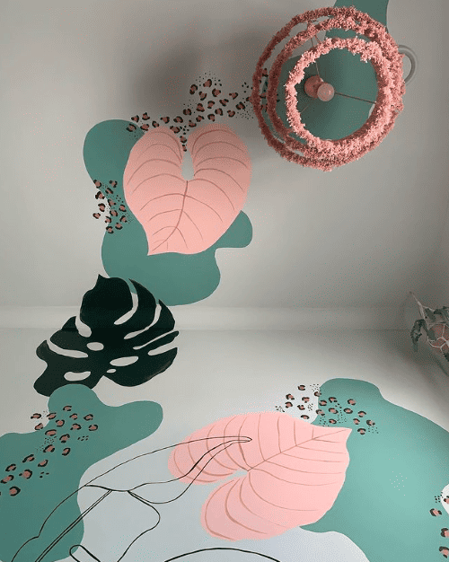
The above photo is a view of @caradiseinteriors ceiling in the yoga/craft room. I absolutely love it!
Even though the painted patterns are bold and colourful, it is still bringing a relaxing feel to the space with the leaf shapes and flow of the design.
I’d love to know in the comments below if you prefer a bold or simple style in your home.
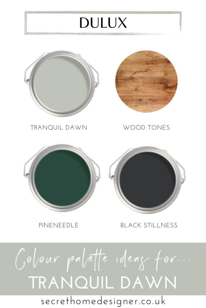
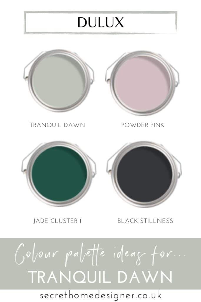
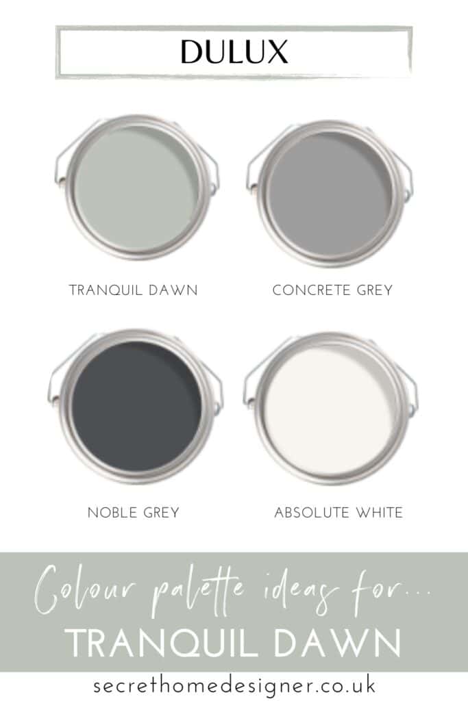
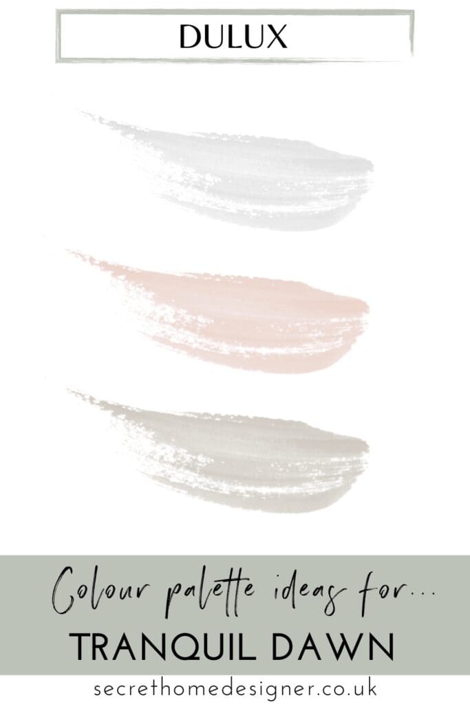
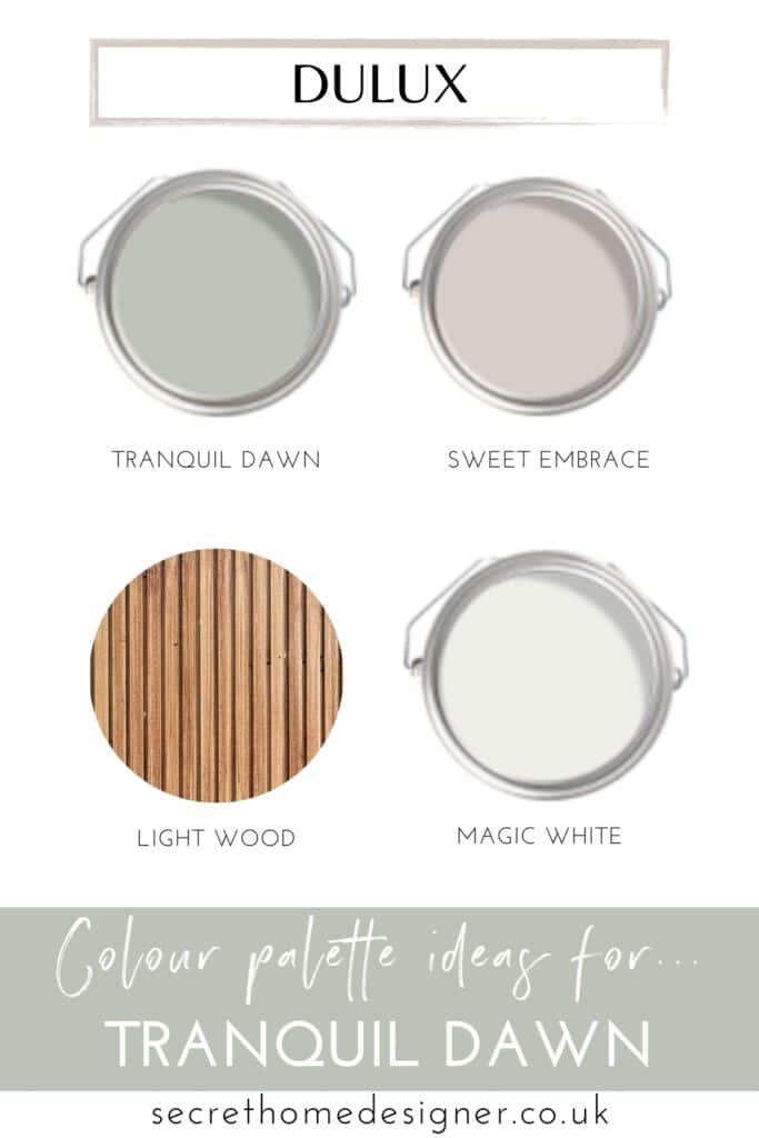
What Colours Go With Tranquil Dawn?
Tranquil Dawn is one of the easiest colours to pair with other tones, which makes decorating around it simple.
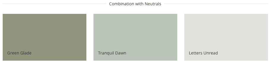
Some of the best combinations include:
- greige and soft greys that tie into the undertone
- muted taupes and earthy neutrals
- soft whites rather than bright, stark white
- natural textures like wood, linen and rattan
- darker accents like charcoal, deep green or black to add depth
Try to avoid overly warm or yellow-based tones, as these can clash with the subtle green-grey base and make the colour feel less balanced.

Here are some other suggestions from myself that you can save to your Pinterest board for inspiration!
If you are ready to decorate but need to work out how much paint you will need, let Dulux’s paint calculator work it out for you.
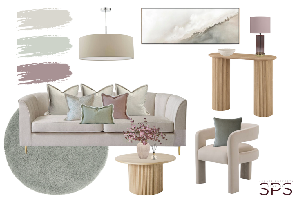
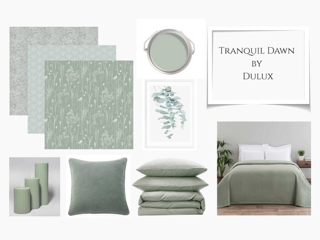
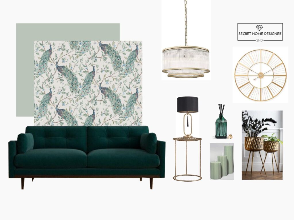
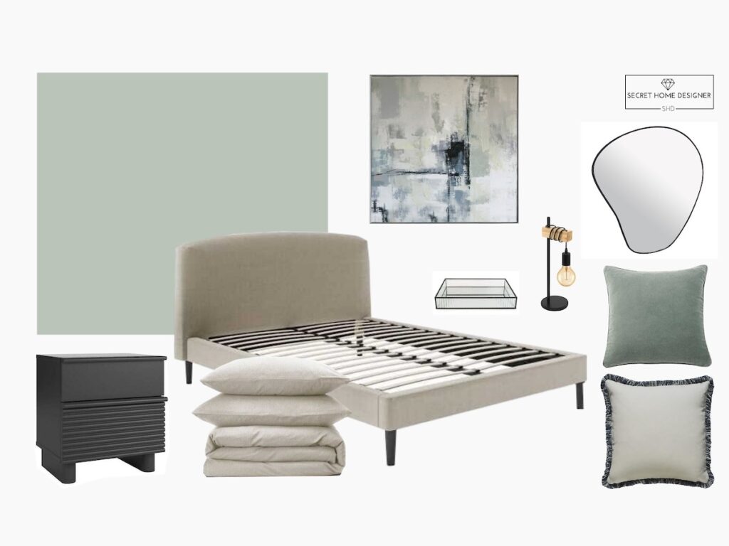
Tranquil Dawn Mood Board Ideas
The key to making Tranquil Dawn feel more elevated is layering. Instead of matching everything, mix tones and textures – soft fabrics, natural materials, and a few darker accents to add depth. This stops the colour from feeling flat and gives the space a more considered, styled look.
As well as real home inspiration and colour combinations, I also want to show you how to bring this colour into your own home. I’ve included a few mood boards below to help you visualise different styles and ways to pull everything together.
Here is our most recent Tranquil Dawn mood board for inspiration. Want to see more mood boards? Click here
The mood boards below are from a few years ago, but they’re still useful for seeing how the colour works across different looks.
If you’re still deciding whether Tranquil Dawn is the right choice, here are a few quick answers to some of the most common questions.
Tranquil Dawn FAQs
Is Tranquil Dawn warm or cool?
Tranquil Dawn sits slightly on the cooler side, but it’s very balanced. The grey undertone softens the colour, meaning it doesn’t feel cold or harsh like some cooler tones can.
Does Tranquil Dawn look grey?
It can do, depending on the light. In lower light or north-facing rooms, the grey undertone becomes more noticeable, while in brighter spaces the green feels fresher and more visible.
Is Tranquil Dawn blue or green?
It’s primarily a soft green with grey undertones, but it can take on a slight blue tone in cooler light. This subtle shift is part of what makes it so versatile.
What colours go best with Tranquil Dawn?
Tranquil Dawn pairs best with soft, muted tones. Greige, gentle greys and earthy taupes work beautifully, along with natural materials like wood and linen. It also works well with deeper shades like charcoal or forest green for added depth.
Is Tranquil Dawn too green?
Not usually — it’s a very soft, muted green rather than a bold one. The grey undertone keeps it balanced, which is why it’s often used as a neutral rather than a statement colour.
Is Tranquil Dawn similar to sage green?
It sits in a similar colour family, but it’s softer and more muted than most sage greens. The added grey undertone gives it a more neutral, understated finish.
Things To Consider With Tranquil Dawn
- The colour can shift depending on light, so always test samples on multiple walls
- In lower light, the grey undertone becomes more noticeable
- Works best when paired with soft, muted tones rather than overly warm colours
If you love learning about a brand that you are investing money into and their brand ethics, learn more about Dulux here.
Paint alternatives – depending on brand tastes and budgets, remember that you can always colour match paint. I have recently did this with great success but there are many others that it didn’t work out for. Always get a paint tester and use on white paper within the room your plan to decorate. I place sheets on all walls that I plan to paint so I can she how the light affects the colour throughout the day.
Is Tranquil Dawn Right For Your Home?
Overall, Tranquil Dawn is one of those rare colours that adapts to your home rather than dominating it. Whether you’re refreshing a bedroom, updating a living space, or starting from scratch, it gives you a calm and flexible base to build from.
If you’re thinking of using this colour in your home, I’d love to know how you style it.
Pin this post if you’ve enjoyed it!
Keep an eye out for the next blog post I will be sharing with you over on my social media.
To check out another paint colour in a soft tone – click to the post here.
Take care,
Michelle