
Looking for ideas to decorate with Sulking Room Pink? Here you’ll find 15+ real home ideas to help you style this beautiful Farrow & Ball shade.
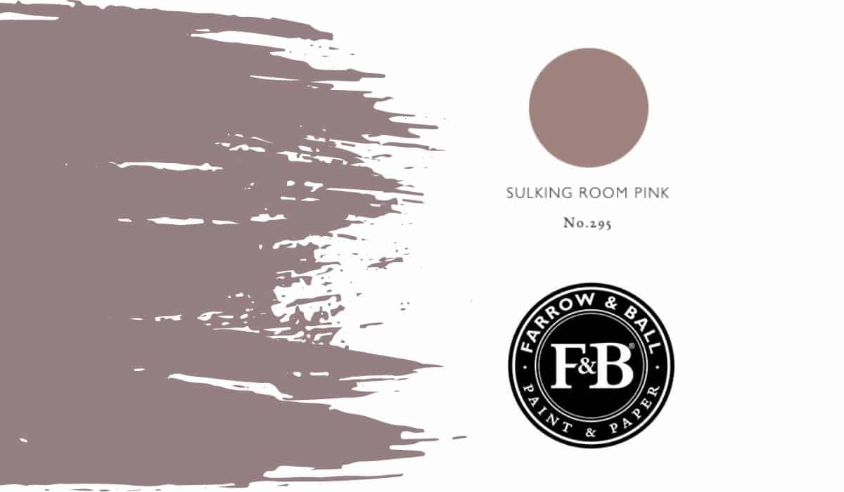
Pink isn’t always the first paint colour that comes to mind when choosing a shade for your home – but Farrow & Ball’s Sulking Room Pink (No.295) is one that shouldn’t be overlooked. This rich, muted pink shifts beautifully depending on the light, creating a warm, moody backdrop that works across a range of interiors.
In this post, you’ll find real home inspiration, styling ideas, and colour combinations to help you decide if Sulking Room Pink is right for your space. From bedrooms to living rooms and bathrooms, I’ll show you how to use this versatile shade and what colours pair best with it – plus curated mood boards with shoppable links so you can easily recreate the look in your own home.
This post may contain affiliate links. This means if you click and buy I may receive a small commission with no cost to yourself. Please see my full disclosure policy for more details.
A Quick Look Ahead
15+ SULKING ROOM PINK IDEAS FOR EVERY rooM
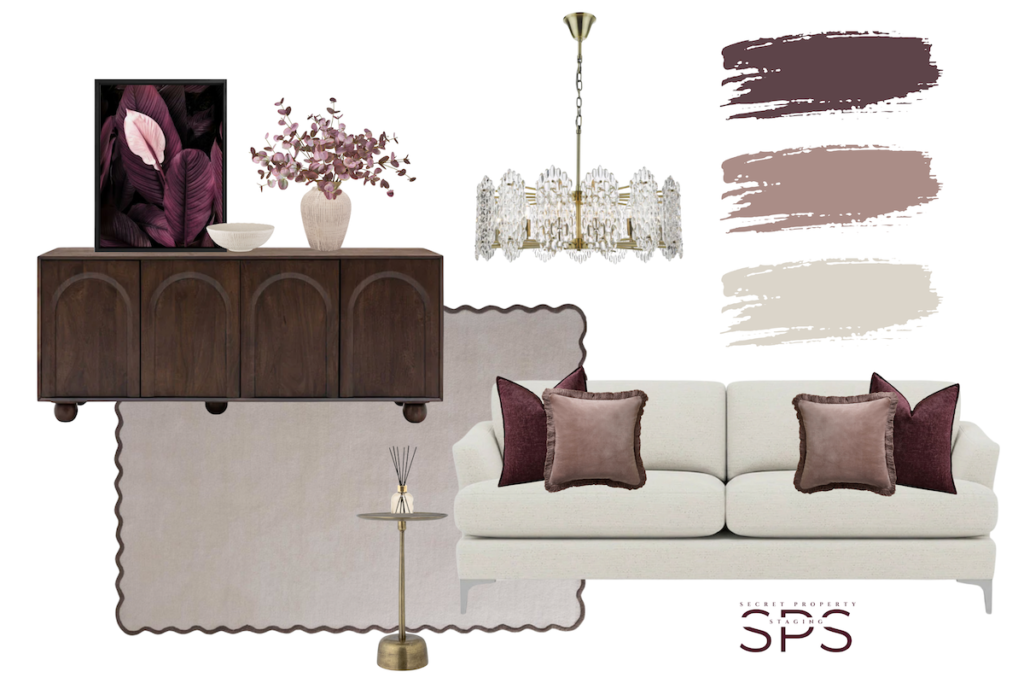
Want to see more mood boards and shop the look? Click here
What is Sulking Room Pink?
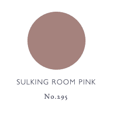
Sulking Room Pink is a warm, muted pink with soft grey undertones, giving it a rich, understated feel that works beautifully in both modern and traditional homes. Originally introduced by Farrow & Ball in 2018, it’s often described as a more “grown-up” take on pink — far removed from brighter or sugary tones.
The name itself is inspired by the soft, romantic shades traditionally used in boudoirs — spaces designed for retreat and quiet moments — which perfectly reflects the cocooning, comforting atmosphere this colour creates.
Often referred to as a more masculine pink, Sulking Room Pink has a depth and moodiness that makes it incredibly versatile. It can feel soft and elegant when paired with lighter tones, or deeper and more dramatic when styled with darker accents, making it a flexible choice for a wide range of interiors.
Visit Farrow & Ball’s website if you love it already!
If you want to see how other’s have used this colour in their homes keep on reading. There are some beautiful examples of Sulking Room Pink (or colour matched versions) used in different spaces. I hope these will give you some great inspiration for the best way to use this popular paint colour.
How To Use Sulking Room Pink In Your Home
Best rooms to use Sulking Room Pink
Sulking Room Pink works best in spaces where you want a warm, cocooning feel. Bedrooms, living rooms, dressing areas, and even bathrooms are ideal, as the colour adds softness without feeling overly feminine. It’s also a great choice for feature walls, panelling, or colour drenching if you want a more immersive look.
light vs dark spaces
This colour shifts depending on the light. In bright, natural light it reads as a soft, muted pink, while in darker rooms it deepens into a richer, more earthy tone. This makes it incredibly versatile, but also means you need to balance it with lighter elements like trims, furniture, or accessories to avoid the space feeling too heavy.
North vs south facing rooms
In north-facing rooms, Sulking Room Pink works particularly well because its warm undertones help balance cooler natural light and create a cosy feel. In south-facing spaces, it will appear lighter and softer, so you may want to introduce deeper accents (like dark woods or contrasting colours) to keep that signature moody look.
When to avoid using it
Sulking Room Pink can feel too heavy if used in very dark spaces without enough contrast or lighting. It’s also not ideal if you’re aiming for a bright, fresh look, as its muted, dusky tone leans more towards warm and moody rather than light and airy. Always test samples in your space, as lighting can dramatically change how the colour appears.
Fifth Wall
Have you though about your ceiling? Often referred to as the ‘fifth wall’. Using Sulking Room Pink here can create a cocooning, high-end finish, especially in bedrooms or dining spaces.
Sulking Room Pink Bedroom Ideas
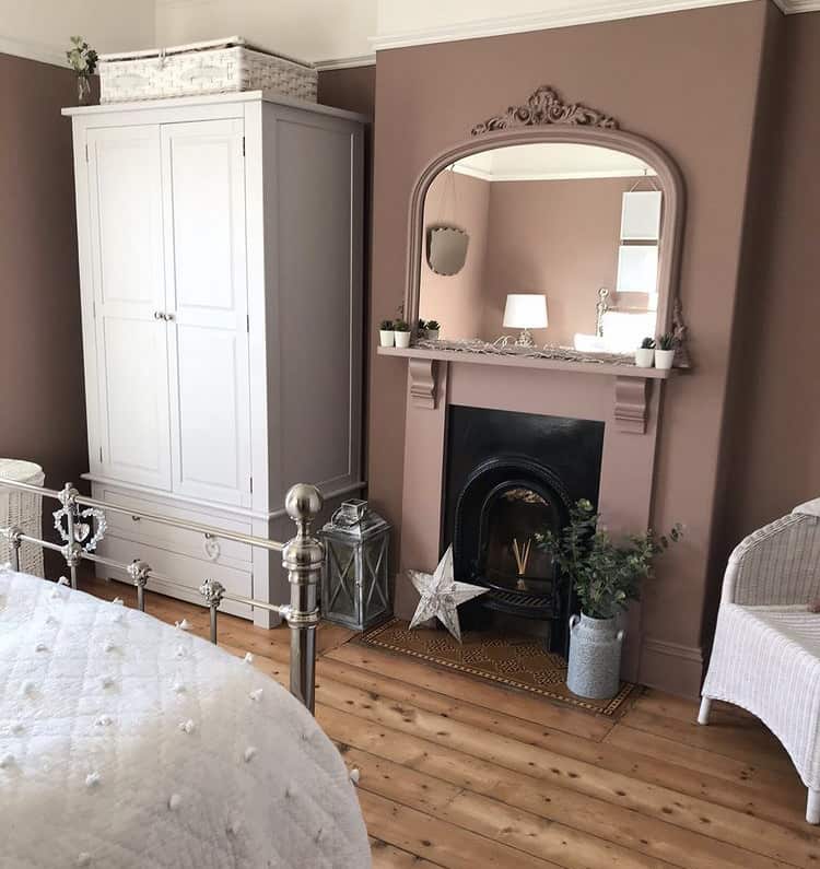
This beautiful bedroom by @renewing_hope1 shows Sulking Room Pink used within a traditional bedroom setting but in a modern way. Painting the mirror frame and the full fireplace surround creates a great focal point in the bedroom whilst keeping the flow of the colour in the space.
Pairing crisp white with Sulking Room Pink, as well as the warm tones of the wooden floor, this bedroom has used the paint colour perfectly and it would be a joy to wake up in every morning.
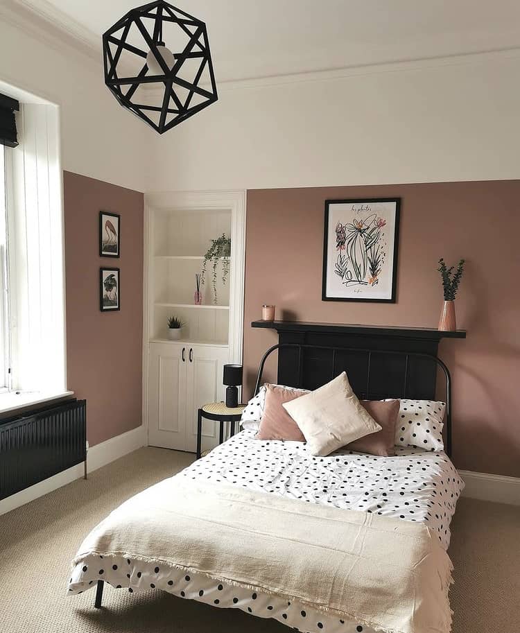
Another great picture of Sulking Room Pink used within a lovely spacious bedroom is from @the_house_of_page. Here, much less of this moody shade of paint has been used but it is complemented with bold accents of black that really works well.
Using black as an accent colour within your bedroom gives Sulking Room Pink a moodier edge compared to pairing it with lighter colours. All depending on your personal preference, you can keep it light and airy or add edgier touches. Whichever is your style, the depth of this Farrow & Ball paint will keep this pink grown-up and timeless.
Accessories have been used to tie the colour into the rest of the space. By taking inspiration from the first image, you could DIY your frames or even vases and artwork of existing pieces that you already have. This will ensure you get the finishing details for your bedroom just perfect.
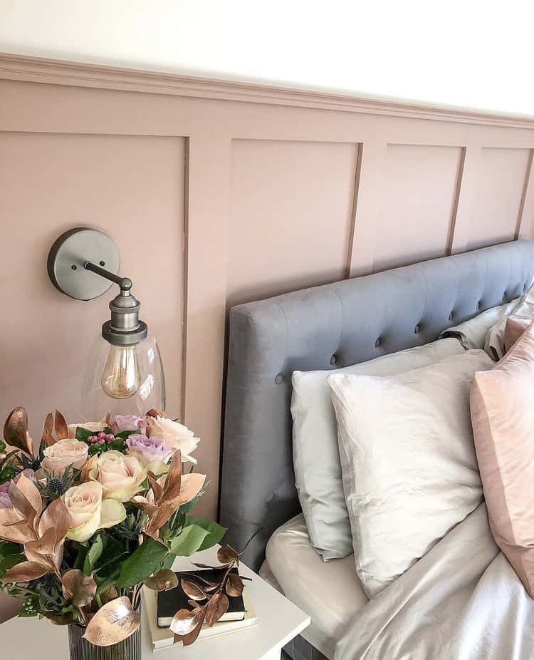
This great image from @athomewiththeraines is a beautiful mix of delicate details with a touch of industrial. Sulking Room Pink has been used to create a softer and more delicate feel for this bedroom design. Pairing the paint colour with softer tones of whites and greys shows just how versatile this colour choice is. It looks amazing used on the half-panelled wall, and as a backdrop for the soft and luxurious velvet headboard.
And nothing says soft and delicate more than a beautiful bunch of flowers in the most perfect colour combinations. The smallest of details is the trick to achieving balance throughout the whole room. So, if you ever feel like ‘something’ is missing, have another look around your space and make sure you have added all you need. Is there is anything else you can do to create the best space possible?
By introducing the hard finish of the industrial wall lights, it allows a contrast with the softness of the colour. This balances the details of the bedroom perfectly. A great mix of two Interior styles.
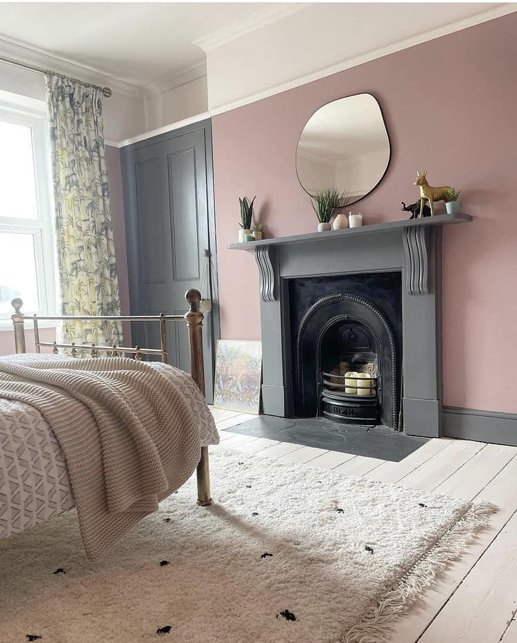
I’ve enjoyed sourcing these beautiful images and this one above of Sulking Room Pink showcases it with a dark grey. Perfect if black to just too bold of a choice for you.
Keeping a more traditional and cosy look to this bedroom space, @therobbosreno have mixed the moody vibe of Sulking Room Pink with an even moodier shade of grey. Decide on the vibe you want for your bedroom and collect paint swatches to make sure you are getting the look and feel you want.
There are other great design details in this room that I want to point out before we move on to living room inspiration.
If you’re feeling bold, why not trying painting your skirting boards, doors and frames? It is becoming increasingly popular as people want their home to have more of a personal stamp and it can be fun trying new ideas. Even if it is a shade or two different from your normal choice, go on try it!
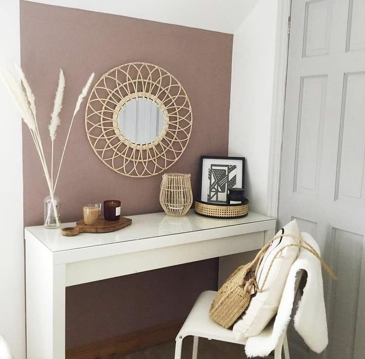
Why not freshen up your dressing space with Sulking Room Pink?
You could zone off a dedicated dressing area with a block of colour which can help to create an interesting corner in your room, @homeandpal has created this lovely space above.
The colour looks great here and works well with the detailing and organic shapes of the accessories along with the black accent colour. A little tip – use accessories of various heights to create a visually appealing space.
If you love these inspirational images for using Sulking Room Pink in your bedroom, head over to Farrow & Balls’s website for more information and to check out the price and details.
Sulking Room Pink Living Room Ideas
Now, let’s have a look at how Sulking Room Pink has been used within living room decor.
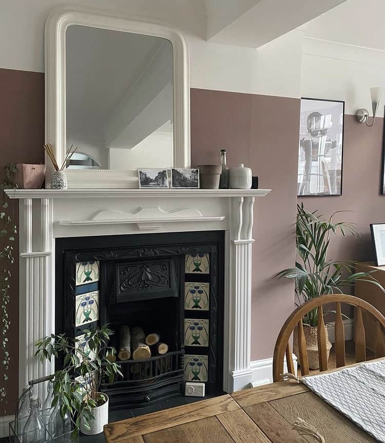
Here is another great colour combination of crisp white, natural wood and black accents from @the_house_of_plants_.
Creating a border at the top of the walls is a common theme for using this colour. It works great for making a statement whilst not allowing the colour to take over the space.
In the previous bedroom images we have seen, there were various colours used on the fireplaces which can be a great colour palette inspiration for you. Now we see a white, crisp fireplace that gives you another example of how this colour would look, whether you have a fireplace in your bedroom or living room.
Using a mix of plants alongside sulking room pink also looks fantastic and softens the overall vibe of the room. Are you a plant person? Faux plants are super popular for us that are not so great at keeping them alive!
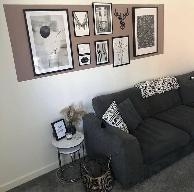
Above, @ournewbuild_grasmere have used this Farrow & Ball paint colour in more of a modern setting. I love the colour block style and how they have used a rectangle of Sulking Room Pink to frame their wall gallery.
The colour combination is modern and contrasting, which allows the black accents to pop.
I’d love to know how you would use this paint colour in your own home. Which colour combinations appeal to you most? Let me know in the comments section below.
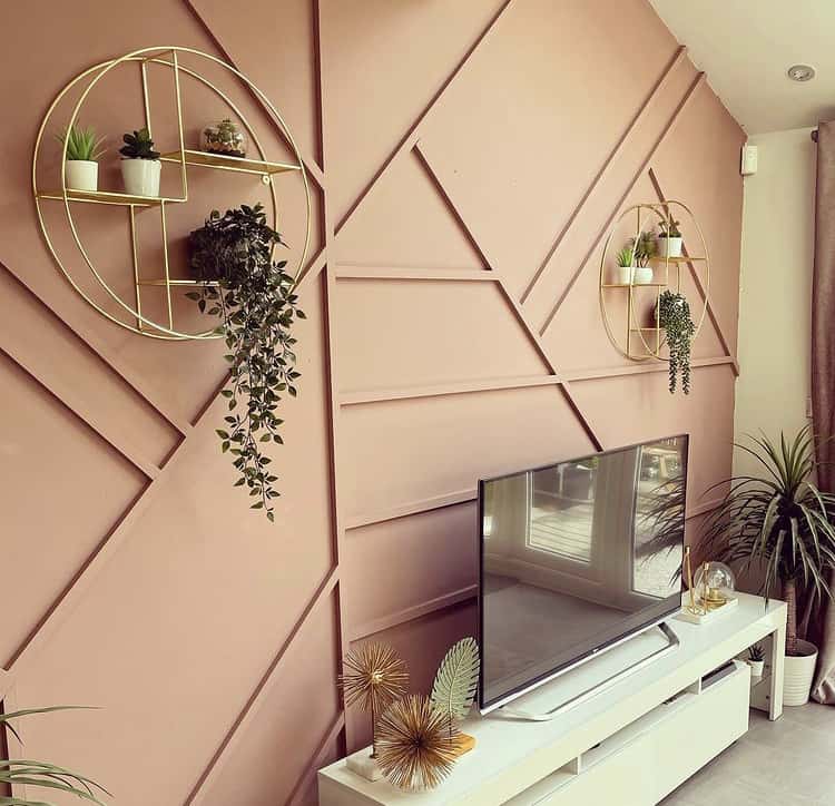
You would need to have been living under a rock to not have seen the latest interior trend for panelled walls. There are some amazing styles and colours that have been getting shared across social media. This wall finish has been increasing in popularity since we have been confined to our homes for the last year (2020-2021).
And this living room from @ournewbuildlife is fantastic inspiration for anyone wishing to see how Sulking Room Pink can be used with this style of wall finish.
This paint colour softens the sharp angles of the panelling. Allowing the living room area to have a unique geometric style without it overpowering the room.
There is a good combination of mixed metal tones which is another great colour combination that can be used with Sulking Room Pink. Sometimes people are scared to mix colours of metal for their accessories but it really is a great idea as long as you balance the finishes around the room. It will also give you more freedom and choice to get the perfect finishing accessories for your room.
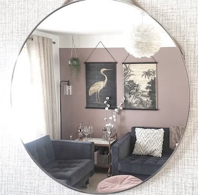
I love this unique viewpoint from @homehouseabode! I remember using a similar image way back on my Instagram and it is such a great perspective to see your room differently.
Sulking Room Pink has been used with a great mix of neutral colours and darker accents, but this time with a touch of luxe thrown in. Using velvets, texture, feathers and a drinks trolley opens up this paint colour to be used perfectly with the classic luxe colour of blush pink.
We’ve seen this paint colour used before with the white section at the top of the wall but here we see that done with a twist. The black accent colour has been used to overlap the white section, adding extra detail to the wall art panels and creating a unique style.
If you love these inspirational images for using Sulking Room Pink in your living room, head over to Farrow & Balls’s website for more information. You can also check out their review section where 83% of the reviewers recommend this paint colour.
If you’re still undecided, it’s worth ordering a sample to see how the colour looks in your own space.
Sulking Room Pink Bathroom Ideas
Many people using this paint colour have ended up using it in multiple spaces in their homes because it looks so fantastic anywhere! So let’s see how it looks in some bathrooms.
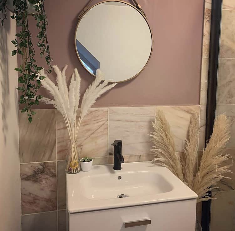
This lovely bathroom space from @our_journey_69 image has paired sulking room pink with lovely warm tones of creams, beiges and golds.
In smaller spaces, this paint colour changes tones depending on the natural light of the room. It really is a shade of many moods.
Using a mirror to interrupt the wall colour and prevent it from absorbing too much of the light in the room is a perfect solution. Always test how the colour will work in a space by placing colour swatches on each wall you plan to use the colour. This will allow you to see how the colour can change depending on wall angle and the time of the day.
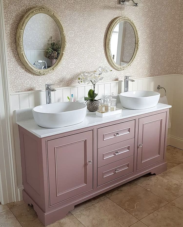
Who said Sulking Room Pink needs to go on your walls?!
I love this combination of wallpaper and painted vanity unit from @countrylifemystyle. It is so fresh and really allows the vanity unit to be the statement in the space.
The colour combination is a great mix of white, beige and Sulking Room Pink – what do you think?
Also, note the mix of styles in this bathroom that works well together. The silver modern taps, traditional style panelling and the crystal knobs on the unit – why not combine different styles for your own unique taste. It’ll make for a much more interesting design.
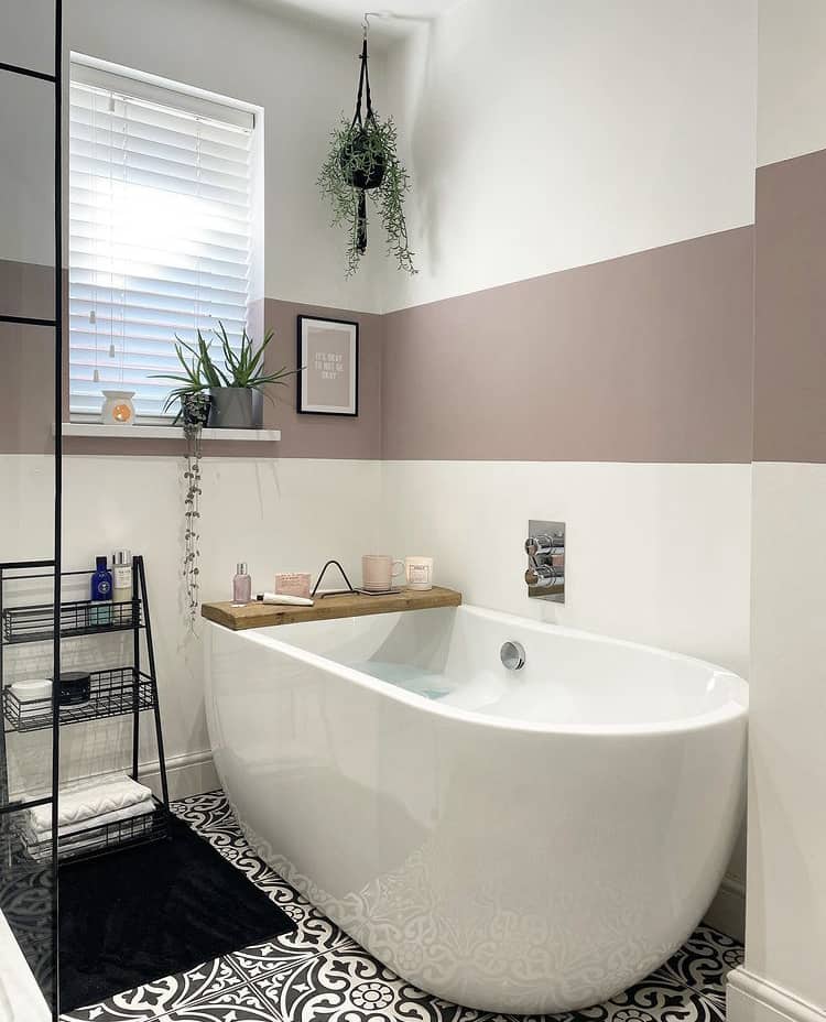
We are back to visit the idea of colour blocking within a modern space. This beautiful bathroom from @mamofboys has a bold band of colour that adds a unique feature to this bathroom design.
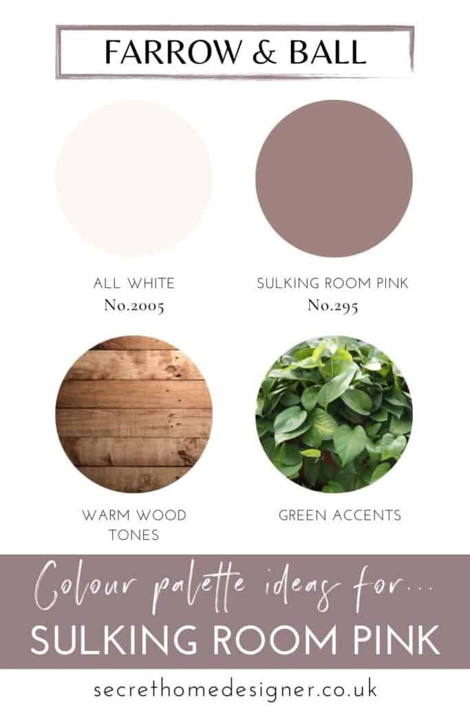
Using the popular combination of crisp white, black accents, natural wood and greenery, this space looks inviting and stylish. The patterned flooring and bold colour block each have space to breathe and work in harmony together.
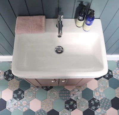
How would you use Sulking Room Pink with more colour and pattern?
I couldn’t have found a better inspirational image for you than this one above from @at_the_stables image.
I think Sulking Room Pink mixed with this beautiful shade of blue, alongside crisp white is my new colour crush. Oohhh maybe I should start a colour crush feature over on Instagram??
Those tiles are beautiful for combining all the colour together and giving the bathroom some great personality. Also, by adding the right colour tones in your bathroom it can help to make your space feel cosy and warm.
Whichever look you are going for, I hope these great bathroom images featuring Farrow & Ball’s Sulking Room Pink paint colour will help to show that it is a versatile colour for many different bathroom styles and colour combinations.
To grab either a free colour chart or a sample pot of Sulking Room Pink, head over to Farrow & Balls’s website here.
More Sulking Room Pink Ideas
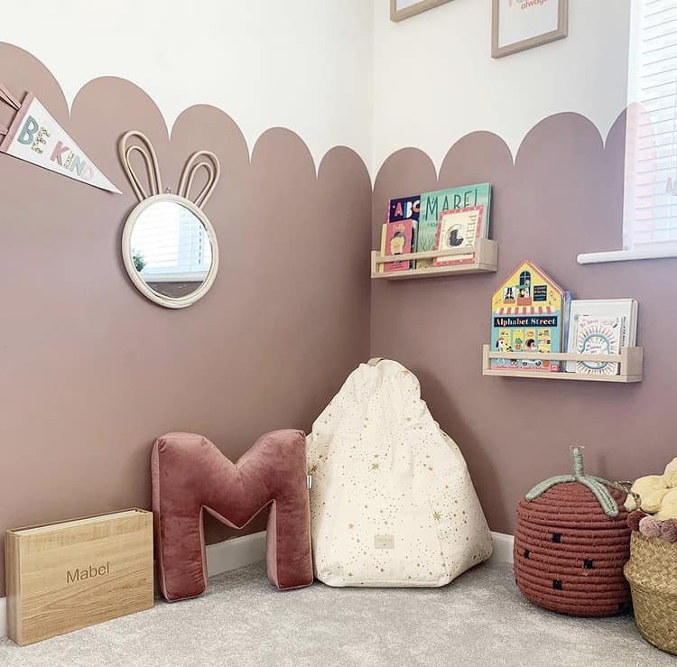
Children’s bedrooms can also look great in this paint colour. Especially if you want to add a sophisticated vibe by avoiding the typically used brighter or delicate blush pink paint shades.
This lovely scalloped wall design from @arnoldsatno31 using Sulking Room Pink looks great and allows for a muted colour palette to be used throughout the rest of the space. The shaped detail keeps the bedroom fun and playful, showing that this colour can absolutely be used anywhere in your home.
If your looking for unique furniture for your child’s bedroom, painting the furniture is also another option to tie the bedroom together.
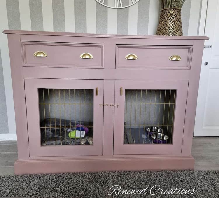
Why not have your pet matching your decor!
I loved this image as soon as I saw it! These custom-made wooden pet crates from @ec_renewedcreations are unique and crafted from unloved furniture. And it’s been beautifully painted with Sulking Room Pink.
This paint colour looks fantastic with the gold handles and detailing. Visit their Etsy shop here if you want to see more of their beautiful creations.
Let this idea inspire you to get creative with your home and colour ideas.
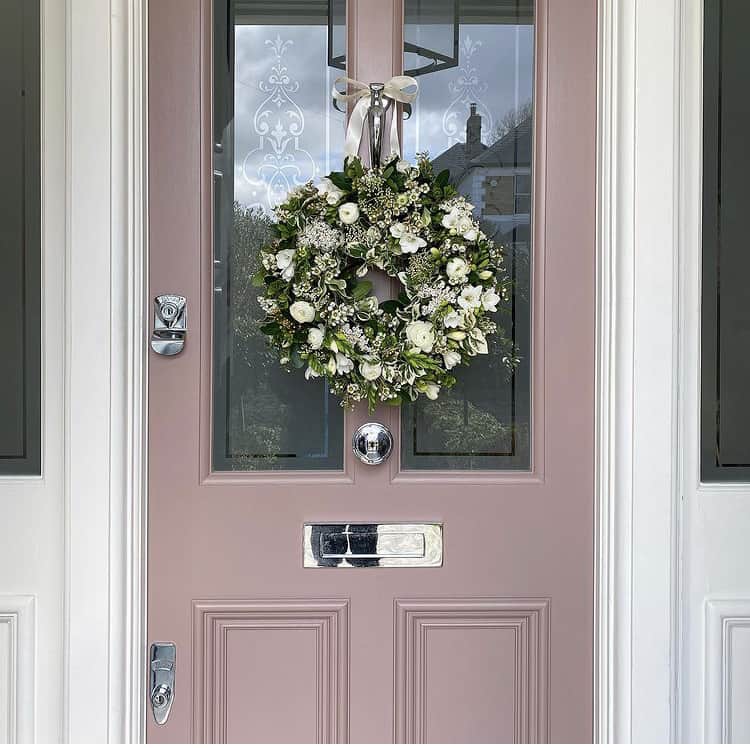
I found a gorgeous new Instagram account to follow when I stumbled across this next image from @styletheclutter.
We’ve looked at many amazing ways to use Farrow & Ball’s Sulking Room Pink inside your home but what about using it outside?
I love everything about this front door (are door crushes a thing?!?)
We’ve seen this paint colour with gold and also with mixed metals, but just look at it mixed with a chrome finish! (wish I knew how to insert a heart-eyed emoji right now).
How do you feel about your front door right now? Is it time to give it a makeover?
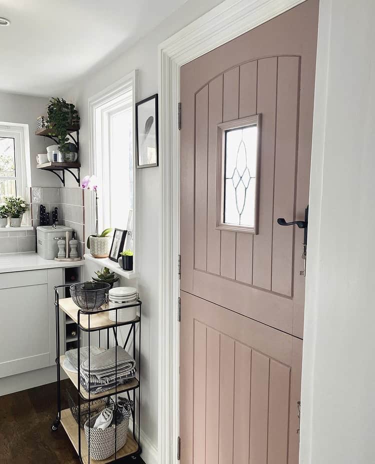
While I’m on a door crush roll, let’s look at another door paint in this super adaptable paint colour but this time from inside the home.
This beautiful door from @cushion_faffer1901 gives you inspiration of how great black hardware would look for the door handle. We have seen accents of black in previous images but here we see how perfect Sulking Room Pink, crisp white and black go together without it being solely used on your internal walls.
What Colours Go With Sulking Room Pink?
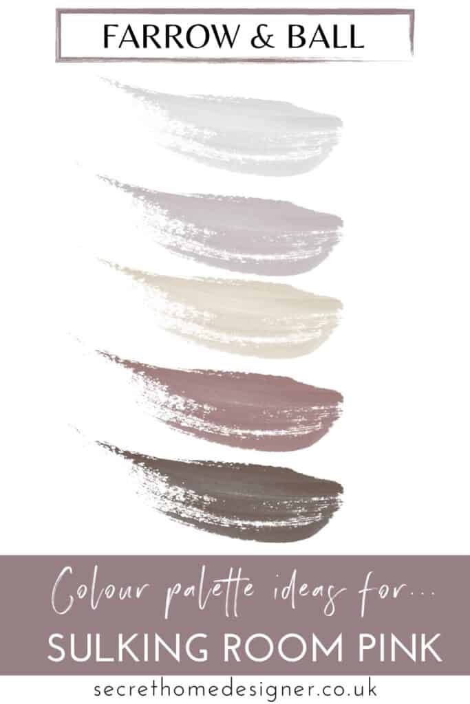
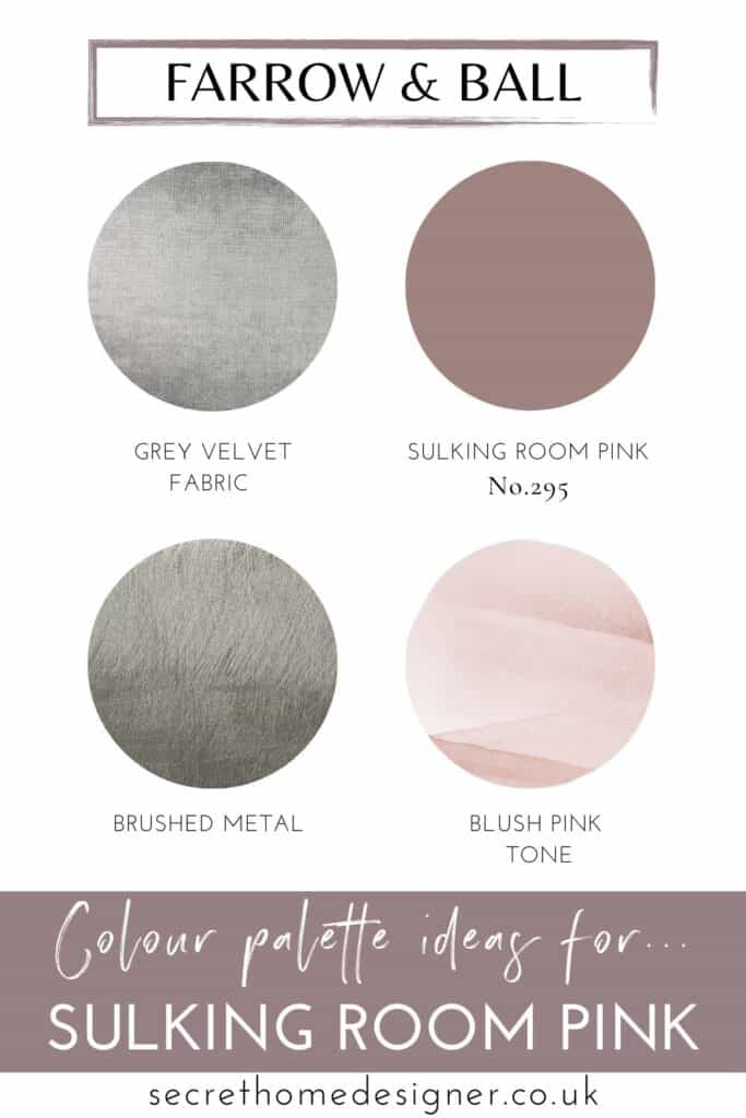
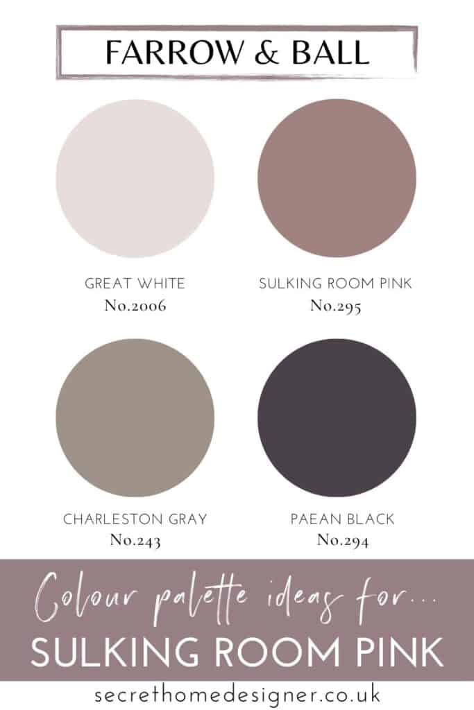
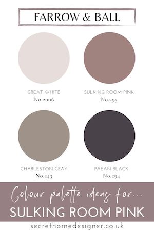
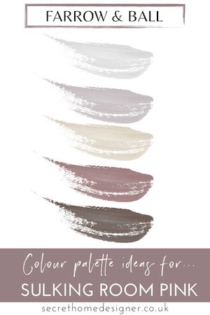
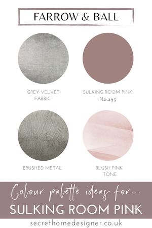
I hope the above inspirational images have given you great ideas on how to decorate your home with this lovely tone of pink paint. Here are some great combinations advised from Farrow & Ball themselves, check them out below.
Best colour combinations with Sulking Room Pink
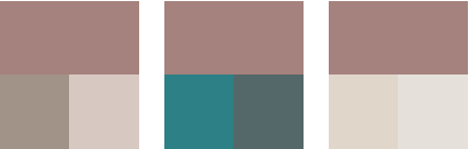
How to Use These COlour Combinations
Sulking Room Pink + Charleston Gray — warm, earthy pairing that creates a calm, grounded feel
Sulking Room Pink + Peignoir — soft, tonal combination for a lighter, more delicate look
Sulking Room Pink + Skimming Stone — soft, warm neutral that keeps the space light and balanced
Sulking Room Pink + Strong White — crisp contrast that highlights architectural details
Sulking Room Pink + Inchyra Blue — deeper, moody pairing for a more dramatic look
Sulking Room Pink + Vardo — bold contrast that adds energy and personality
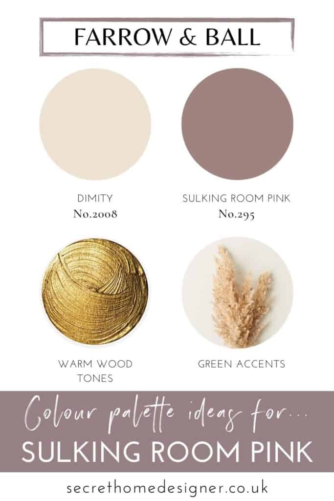
Sulking Room Pink + brass or gold finishes — adds warmth and a more elevated, luxe feel
If you are ready to decorate but need to work out how much paint you will need, let Farrow & Ball’s paint calculator work it out for you here.
Here are some other suggestions from myself that you can save to your Pinterest board for inspiration!
Mood Board Inspiration
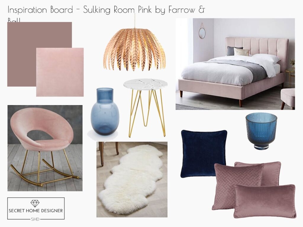
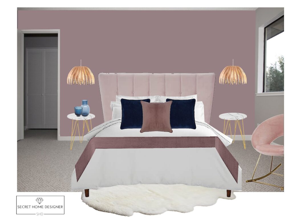
Here is our most recent Sulking Room Pink mood board, with links below.
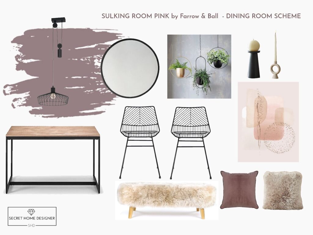
The following mood boards are from a few years ago but they still can help you with colour and style combinations.
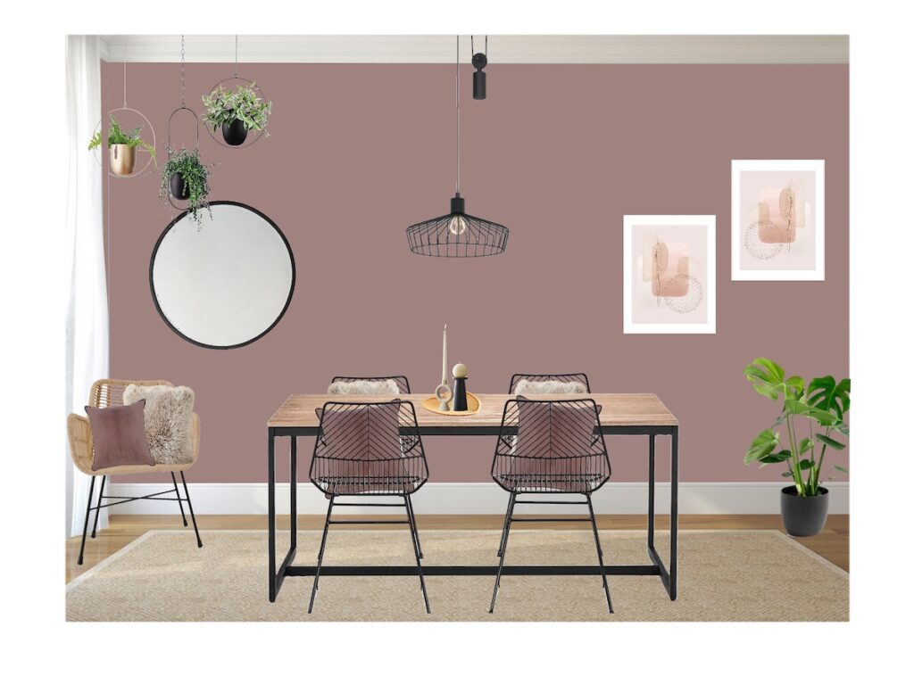
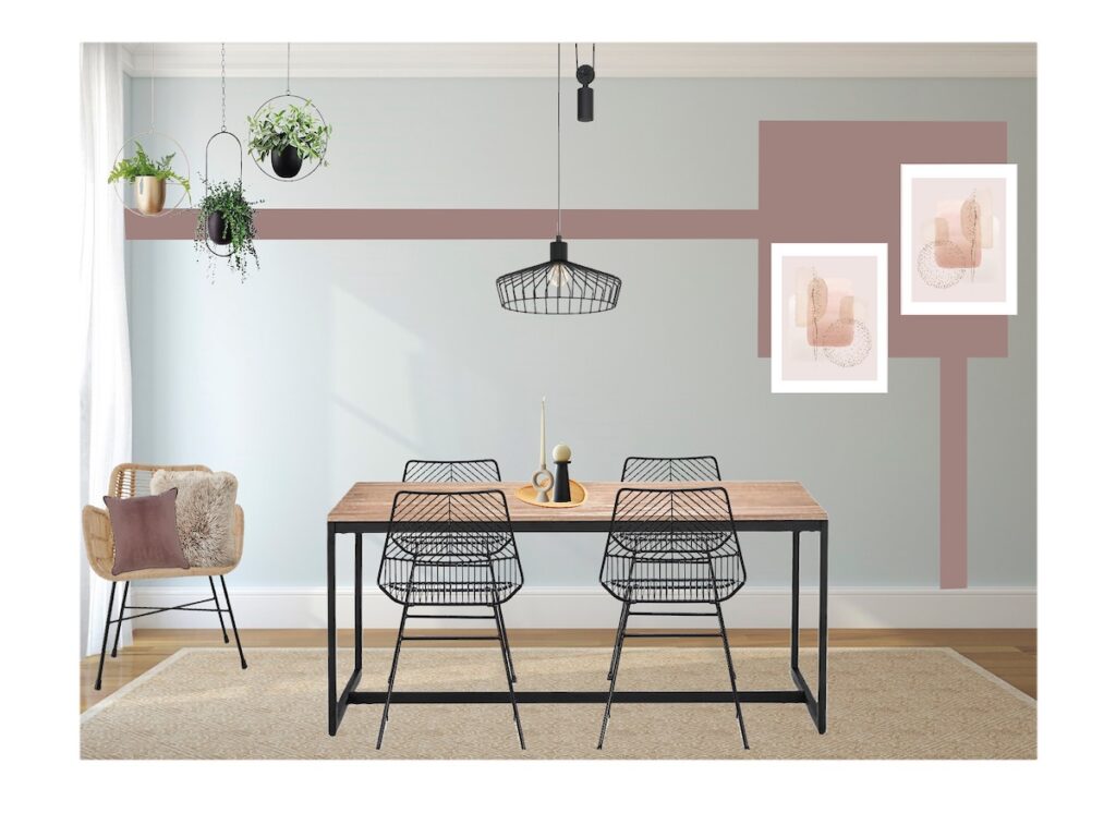
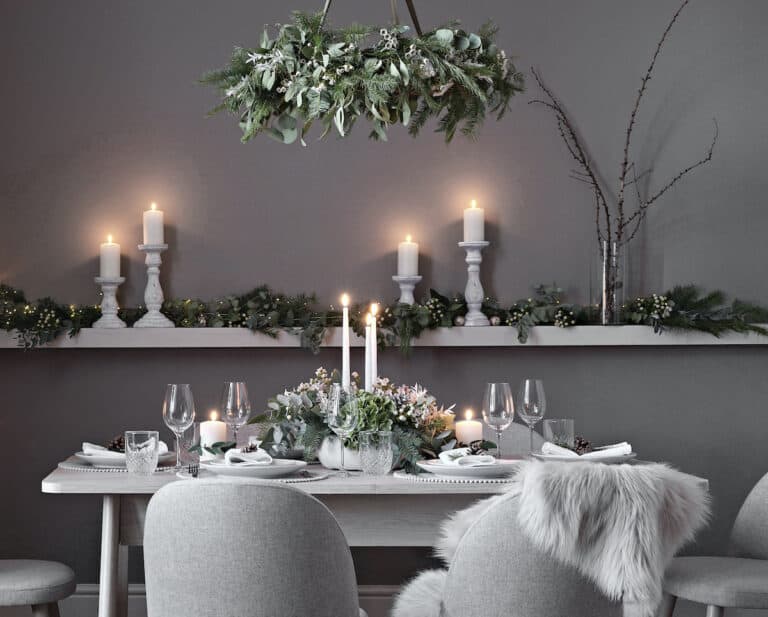
Dining Room Ideas – Scandi/Minimal
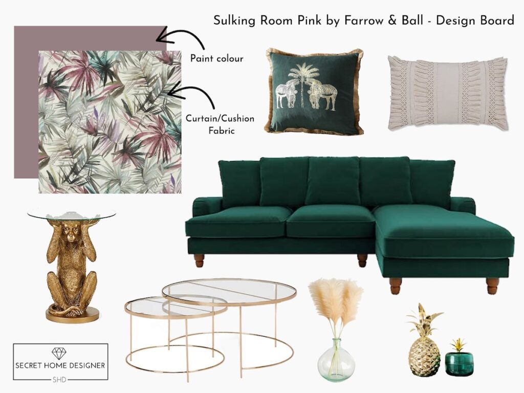
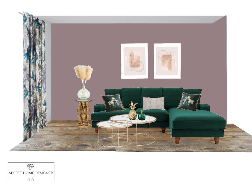
Living Room Idea – Luxe/Quirky
Bedroom Idea – Luxe
Sulking Room Pink FAQs
Is Sulking Room Pink warm or cool?
It’s a warm, muted pink with subtle grey undertones, which gives it that soft, moody feel rather than a bright or sugary finish.
Does Sulking Room Pink work in small rooms?
Yes, but it works best when balanced with lighter elements like white, soft neutrals, or mirrors to prevent the space from feeling too enclosed.
What colours go best with Sulking Room Pink?
It pairs beautifully with warm neutrals like Skimming Stone, deeper tones like Inchyra Blue, and metallics such as brass or gold for a more elevated finish.
Is Sulking Room Pink too dark?
It can appear darker in low light spaces, which is why it’s always worth testing samples on different walls before committing.
What finish should I use for Sulking Room Pink?
For walls, Estate Emulsion or Modern Emulsion both work well depending on durability needs, while woodwork and furniture can be finished in Estate Eggshell or Modern Eggshell for a subtle contrast.
Mistakes To Avoid With Sulking Room Pink
- Using it in low light without contrast – this can feel too heavy if not balanced with lighter tones or good lighting
- Pairing it with the wrong pink tones – avoid mixing with overly cool or sugary pinks as it loses its depth
- Not testing samples first – the colour shifts depending on light, so always check it in your space before committing
Still undecided? If you prefer something softer, consider pairing Sulking Room Pink with lighter pink tones or using it as an accent rather than the main wall colour.
If you’re wanting to learn some more about the brand Farrow & Ball, then keep reading. I’ve included some useful information that will let you understand more about the brand.
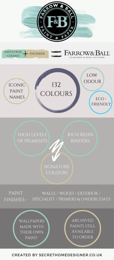
Farrow & Ball: A Quick Guide
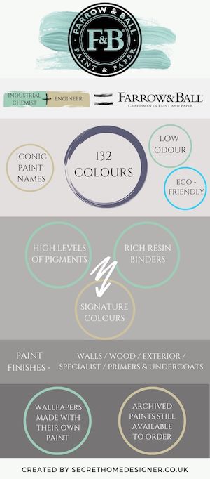
Farrow & Ball is an iconic brand within the British Interior’s scene that has stood the test of time. I have their fabulous resource book called How To Decorate, which is jam-packed with great advice and images on everything you would need to know to help create the perfect space in your home. You should be able to find the book on Amazon…..it would also make a great coffee table book!
Paint alternatives – depending on brand tastes and budgets, remember that you can always colour match paint. I personally haven’t done this before but lots of people have had success doing so. Some of the images above have been colour matched and they look great!
Overall, Sulking Room Pink looks amazing while being used in lots of different areas throughout the home, and in various styles. If you are thinking about using this colour I’d love to hear it in the comments below!
To check out another paint colour by Farrow & Ball – click here. I also have a post on how to decorate with Dulux’s Tranquil Dawn if your looking for a softer tone of paint, check it out here.
And lastly, if you like a before and after browse from home renovations – I’m sharing my latest Victorian home renovation here where I’ve used a few Farrow & Ball colours.
If you love it, pin this post!
Keep an eye out for the next paint colour that I will be sharing with you!
Take care, Michelle.

AMAZING, please fo with vert de terre
Ohhh Vert De Terre is a lovely colour, thanks for the suggestion Lorraine. I’ll note that one down to write next 🙂
Thanks Michelle this it is really helpful. I have just done a feature wall in our bedroom that is sulking room pink . Me and my partner are currently arguing about curtains. I’ve chosen a few that are gold and he is really not liking them. What would you suggest? I have bought crisp white textured bedding and going for a scandi vibe with geometric shape prints and bits of macrame and rattan.