Interior inspiration – Visit this amazing Show Home
Are you looking for a great source of Interior inspiration for your home?
Are you free right now? Come and visit this Show Home with me, where I will be sharing interior inspiration tips and ideas.
Today I will be sharing with you –
- Interior Design advice and suggestions to help you style your home
- Show Home knowledge you may not have discovered before
- Interior Inspiration tips – Watch out for these throughout the post as an extra bonus
- Ideas on how to add your personality to bedrooms
- My photos from the visit to inspire you
- Links to my Pinterest boards for further interior inspiration on particular furnishings
(if you are familiar with my Show Home posts you can skip down to the start of the visit)
How will visiting a Show Home help you with your home?
Show Homes only have one purpose – to look so utterly amazing that you want to buy it …….now! Therefore, it is logical to believe that the house builders will put a fair bit of effort into all their Show Homes and create each one with hot new interior trends and styling techniques which will make them attractive to buyers (= sales).
The interior styling also has to withstand the test of time. For instance, it may be a large development and they may be building (and selling) on-site for many years to come. It can be time consuming and not always geographically logical to visit a Show Home. So, why not let me do the hard part and share fresh interior ideas that I have found for you and your home.
TOP TIP :If an item or piece of furniture stands out, the Sales Advisor should be able to provide the Designer’s details for further information.
Before we get started with our Show Home visit today…
One thing to bear in mind with any Show Home – the price brackets of the properties being sold will determine the budget that is spent on the Show Homes. Normally the pricier the property the more exclusive the finishes are. There are so many great styling tips and interior ideas that can be taken and recreated, no matter what the Show Home budget was or what your budget is.
This is what I love about the advice I share on Secret Home Designer – you may have a studio apartment or a six bedroom mansion – every space has the potential to look amazing by finding interior ideas that appeal and fitting them into your home.
TOP TIP: Use Show Homes as a point of interior inspiration. If you see an item that you love, but it’s £££ (or you just know that it’s expensive) try and find something similar on the high street or online. However, you may have to compromise on some details but you may like that piece even better!
Time to come and join me on my tour around this Show Home and hopefully go away with some great Interior inspiration.
I am excited to show you this lovely Bellway Show Home today. It is furnished beautifully and has some great features that I will share with you below.
ENTRANCE
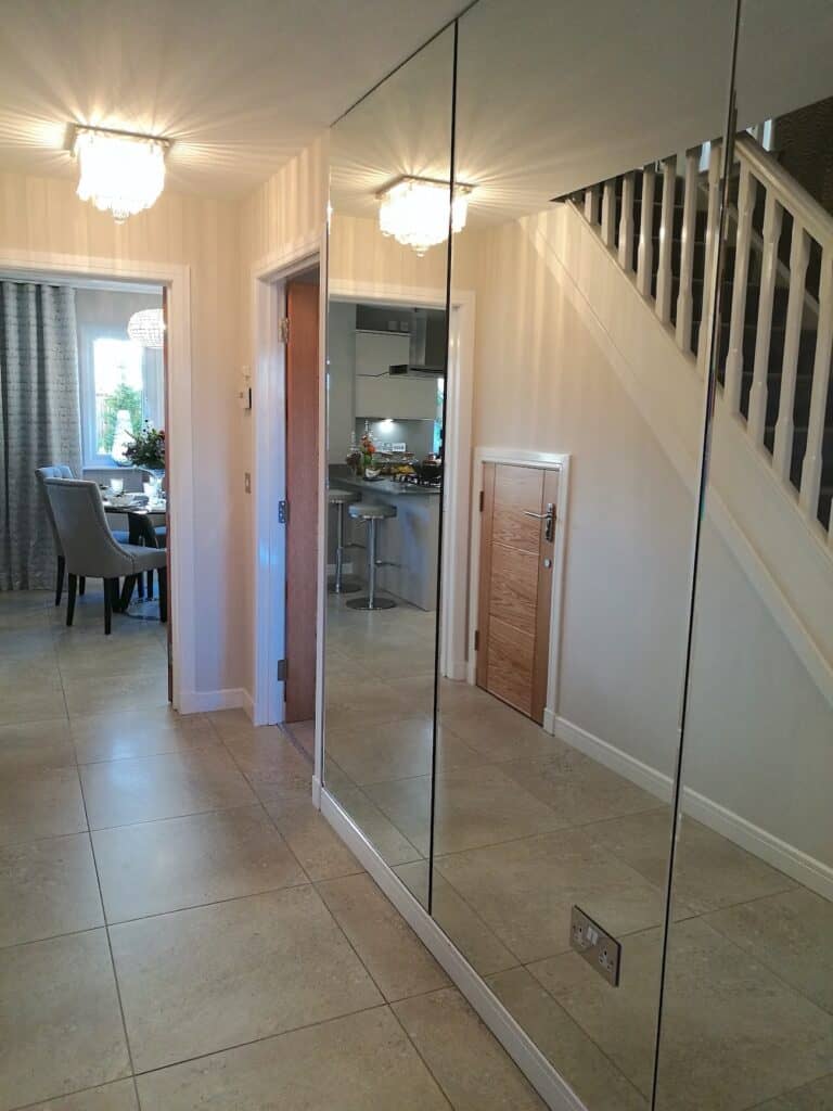
This entrance definitely has a ‘wow’ factor to it. The full-mirrored wall is bold and unique in its design and it is an unexpected surprise as you enter this Show Home.
Now, depending on your lifestyle and taste this may not suit your home, especially if you have young children with sticky fingerprints and pets with wet noses 😉 but it really is quite impressive as an entrance to a home.
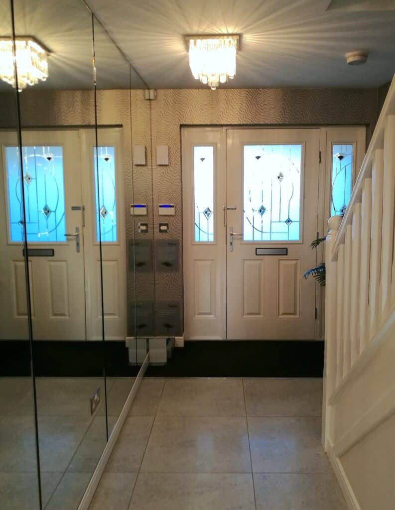
Even though this area has restricted natural daylight, which a lot of hallways have unfortunately, the mirrored wall allows any light entering this space to bounce around all the reflective surfaces therefore giving a bright and airy feel to the area.
Since visiting this Show Home quite a while ago I have seen this idea used in lots of different ways. Pop over to my Pinterest board if this is a design element that you think would look great in your own home. I have created this board especially for this post to give you more interior inspiration ideas. There is so many unique and beautiful ways people have styled a full-mirror wall in their homes. Check it out!
INTERIOR INSPIRATION – If you have a hallway which natural light is limited, use reflective furnishings where you can. Mirrors, mirrored frames and mirrored furniture are a great source to bounce light around and stop the space feeling dark. The goal with an entrance hall is to give a welcoming and spacious feel to anyone visiting your home.
Floor Tiles
Large neutral-coloured tiles have been used in this entrance and carried through to the kitchen. This helps to open up the space and allows the two separate zones to flow seamlessly together. Tiled flooring may not suit everyone’s lifestyle requirements but it does add a clean, fresh look to an entrance space.
You may not have noticed in the previous picture the integrated entrance mat. I had this useful detail added in a home as there was a vestibule before entering into my living room. Now, it isn’t cheap in comparison to a nice welcome mat but it looked much better as it was fitted flush into the flooring. This streamlined the area and stopped the door getting jammed if the separate welcome mat I chose was too thick.
Lighting
This Show Home light does not disappoint.
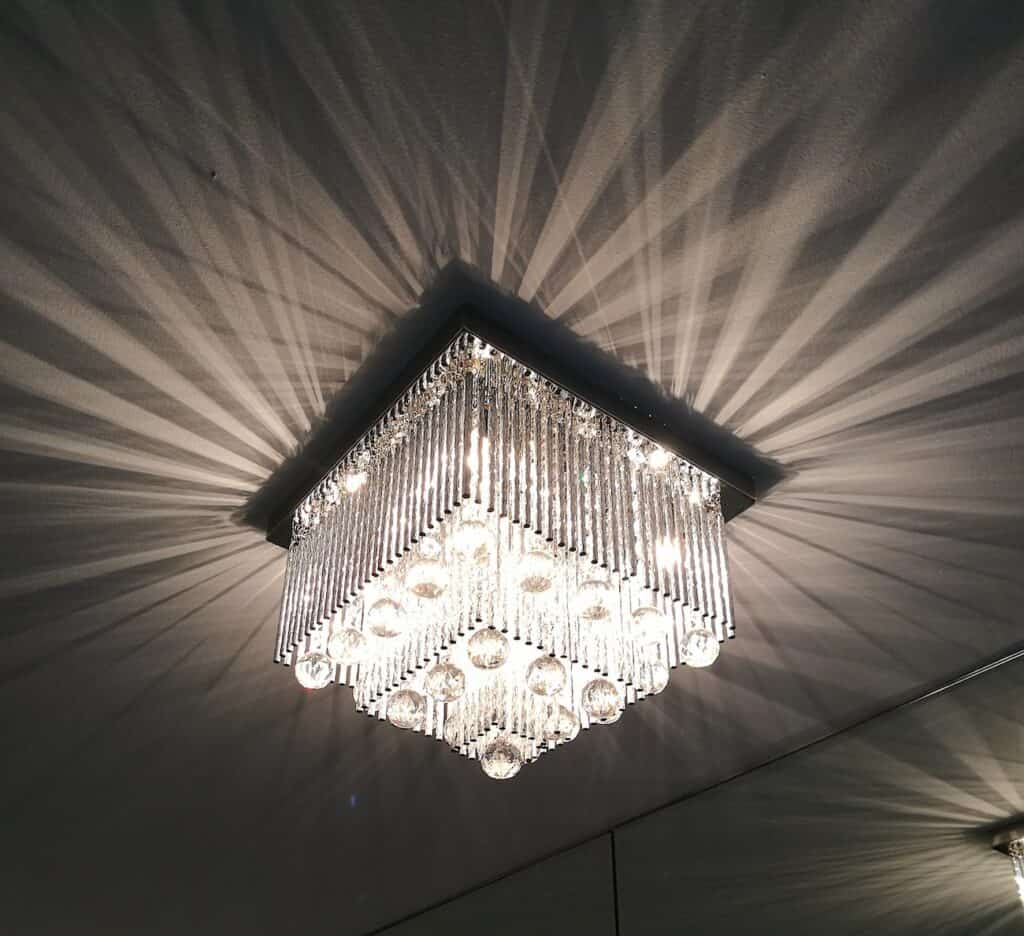
This light fitting is lovely and it suits the room height perfectly whilst still being aesthetically pleasing on the eye. The light shadows are bounced around the ceiling, reflecting in the mirrored-wall and providing adequate brightness to the hall. Win-win.
If you have read any of my previous Show Home blogs you will know I am slightly obsessed with lighting. I just love a statement light…guilty!
And Show Homes never fail to impress me. Many times I have been found standing in John Lewis’s lighting department staring up at their lighting display in awe. One day I will get told to leave I’m sure….but til then…
Function
There is so much more to light fittings than just their function. Yes its main priority is to give you enough light to function in the space. A single light bulb can do that, but how boring would that be? The aesthetics for me personally, probably rank higher than how much light it gives off. Correct answer or not, the shadows given off by the light design, the atmosphere the light creates are also all important factors when styling your home. Keep an eye out for lighting posts coming soon.
TOP TIP – Make sure your chosen light fitting is appropriate for the space and height of the room and will not affect how you function in the space. Measure the ideal drop space before shopping for any lighting so you know straight away what would suit the room best.
Wallpaper
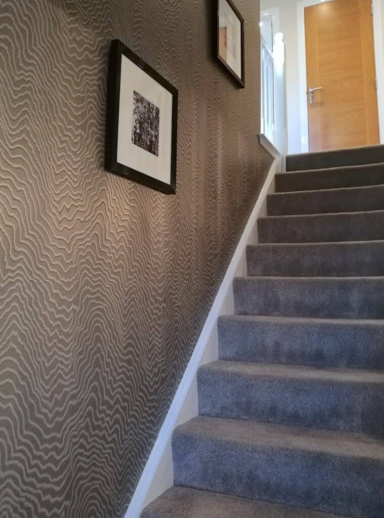
Due to the full mirrored-wall on the main wall as you enter, patterned wallpaper has been used on the stair wall as a feature. This style of patterned wallpaper is similar to textured wallpaper, as in, it can add interest but doesn’t need to be overpowering and won’t ‘date’ quickly.
I like the monochrome style to the picture frames as it pulls the white out from the woodwork. It makes it look fresh and bright, the black also ties in with the overall colour palette of this Show Home which you will see more of further into this post.
LIVING ROOM
Furniture
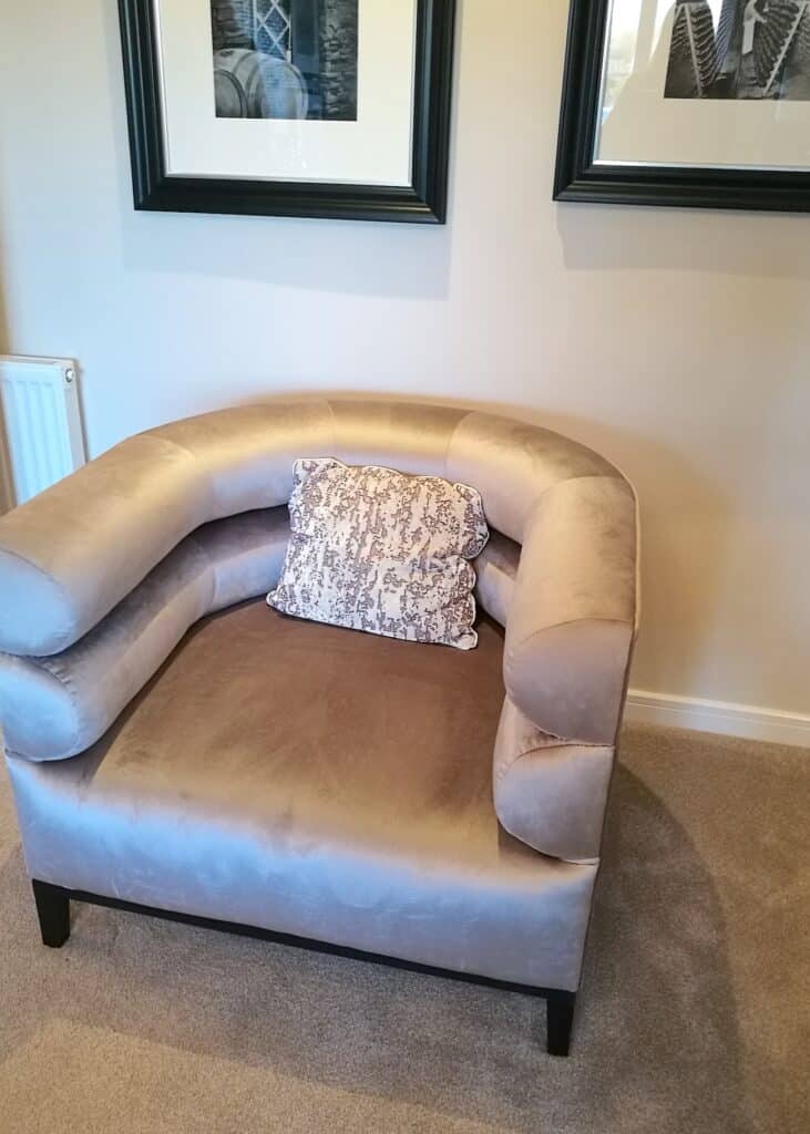
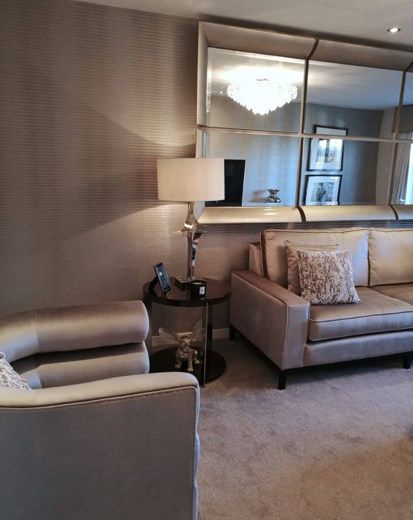
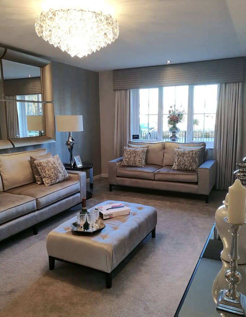
This living room is very luxurious with its finishes. It is full of reflective pieces and plush fabrics which creates a sophisticated feel to the room. The furniture and the soft furnishings details of straight lines and boxed shapes have created a formal style. However, the fabric choice of velvet and satin for the sofa and footstool softens the sharp shapes allowing an element of comfort into the design.
Along with the reflective nature of satins and sheens, this room uses mirrored furniture to add even more luxury. As I mentioned before, this room is more of a formal styled design so mirrored furniture is ideal. What I would suggest as someone who had to polish and dust this style of furniture everyday when I worked in an Interiors store…you have to enjoy cleaning! They are beautiful pieces but a big dust and fingerprint collector. So, if you have young children you may want to keep this in mind (or keep the door closed on this room)
INTERIOR INSPIRATION – Footstools are a great piece of furniture to have within your living space. It can have many uses depending on what is happening within your room at the time. Firstly, it is obviously a footstool, I absolutely love mine and its ideal when your relaxing watching a movie. Secondly, used it for extra seating without the need for larger, bulky pieces of furniture that would be rarely used. And thirdly, like the photo above, display your accessories with trays, candles and ‘coffee table’ books.
Colour palette
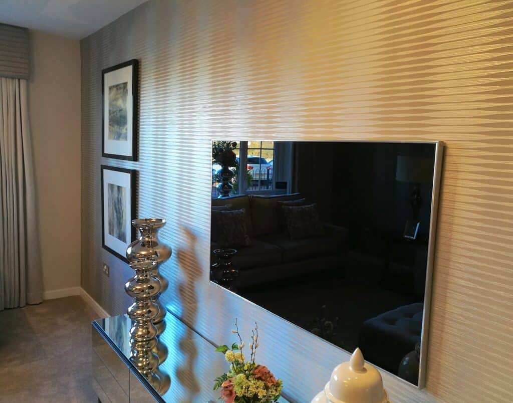
The colour palette is decorated with neutral tones and a small accent of black. The patterned wallpaper theme that we saw in the stairway has been carried through to the living room wallpaper and cushion fabric. The pattern makes enough of a statement whilst tying together the neutral tones in the room. And by adding metallic touches into your design, it not only creates a luxurious look, it also reflects light.
The two black frames fill this space nicely without getting too fussy with the wall. Sometimes overfilling a space or wall can end up making the room feel unbalanced or cramped. I would always suggest starting with just a few pieces at a time. You can always add more later once you have added the main furniture to the room, if there is still spaces to be filled.
INTERIOR INSPIRATION – If you like this style you could introduce a patterned or textured wallpaper. Ensure that the design is subtle enough to not overtake a room but bold enough to be a feature in the space. This is a great way to ensure your interior style does not date sooner than you want it to.
How do you like this style? Does it give you interior inspiration for your home? I would love to hear your feedback in the comments at the bottom of the page.
Mirror
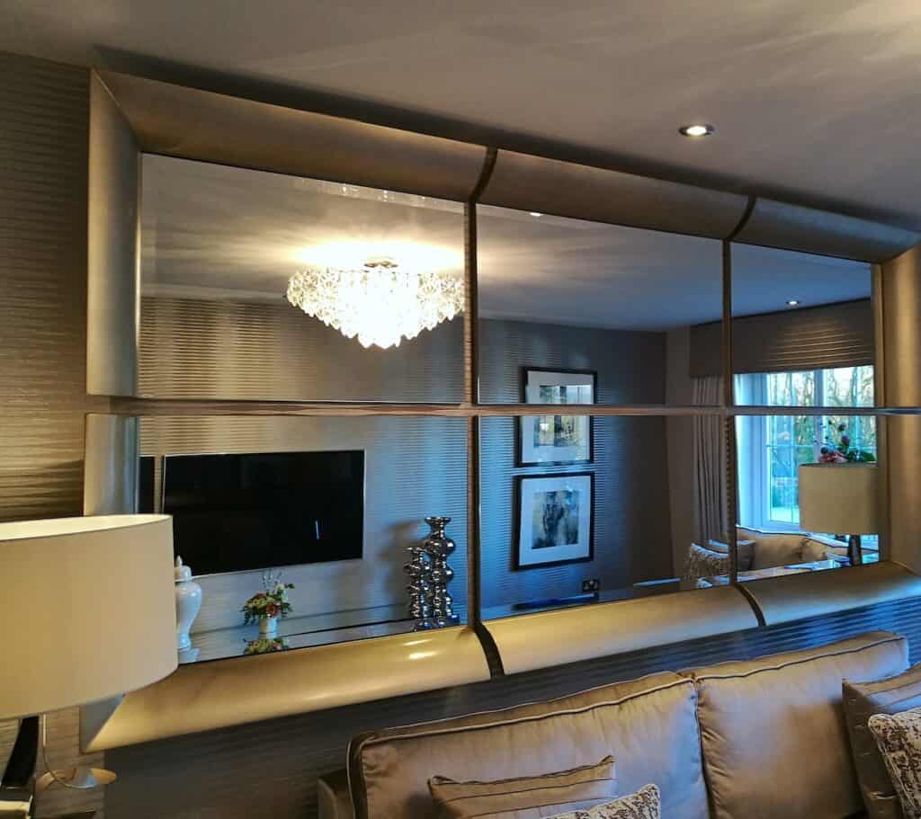
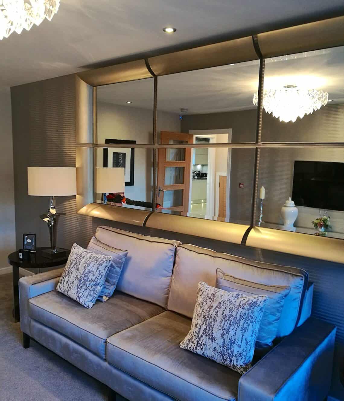
Large statement mirrors are very popular and a great focal feature of any room. Just make sure the space and wall can take it.
This mirror is super sized and a great feature about this particular one is that it is made up of six pieces. If memory serves me right, I am sure each panel is bought separately. So, if your wall can only take a smaller size but you love this style, then you can have four sections and it will still look great!
If you like this idea, search for mirrors that offer an option to purchase the sections separately. This one is by a trade supplier but I am sure there will be something similar on the high street.
TOP TIP – I have noticed over the years that products that are sold exclusively to trade customers only i.e. designers, boutique shops, are sometimes found years later to be offered by high street stores or at least a very similar style. The best store for picking up individual one-off pieces is TK Maxx (U.K name). They definitely have some ‘trade-supplier’ products pop into their stores and are fantastically priced if you find any. They may possibly be ‘end of lines’ which makes them an even better exclusive buy!
Window Dressing
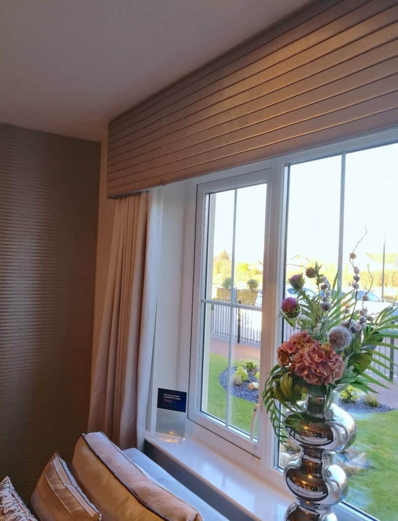
I love the fabric and the deeper, solid pelmet in this room. By taking the pelmet up to the ceiling it is another way to bring a designer feel to your home. With bespoke soft furnishings, it is fitted to your exact room in the style and design that works best for the space. More on bespoke soft furnishings in another post soon.
INTERIOR INSPIRATION – If the side wall space is too small to use then it is worth your while to create a visual statement with your windows. Take your pelmet and curtains out over the empty space at the sides of the window. Yes, this will take more fabric but the bespoke look it will add to your room is worth it, I promise!
Details
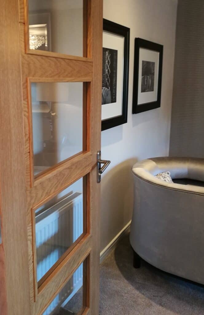
Now, I wouldn’t normally include random door photos but there is a reason for this one. How many of us actually think about our internal doors? Let me know in the comments as I’d love to know.
My last flat had glazed doors and I loved the spacious feel it added to the layout. So much, I now think it is a must for any property I buy in the future. It would be a good investment regardless of the cost as it shows the space better and is more appealing.
Glazed doors allow light to flow through into areas that may have restricted natural light. It also allows easier communication from one room to another and also allows privacy but visibility between spaces.
TOP TIP – Some new property builders may offer upgrades on internal doors but it will probably come at a cost. If you want it done for you before moving in then it would be worth it. But I would also suggest getting a quote from a supplier/tradesman so you can make an informed choice.

INTERIOR INSPIRATION – To create interest on your sofas, use various sizes and fabric finishes on your cushions. Mixing pattern and plains, textures and piping detail adds more layers to your room design. Also, if you have a pattern within your curtain fabric why not ask your curtain maker to include extra fabric in your quote to insert a panel into cushions. This will tie your soft furnishings together nicely by carrying the fabric design throughout the room. Matching soft furnishings is something that may not always be available on the high street in the design you like. Although, some stores are getting better so keep an eye out for them when you are looking to decorate a room.
Here are some other photos of this Show Home living room to give you some interior inspiration.
KITCHEN
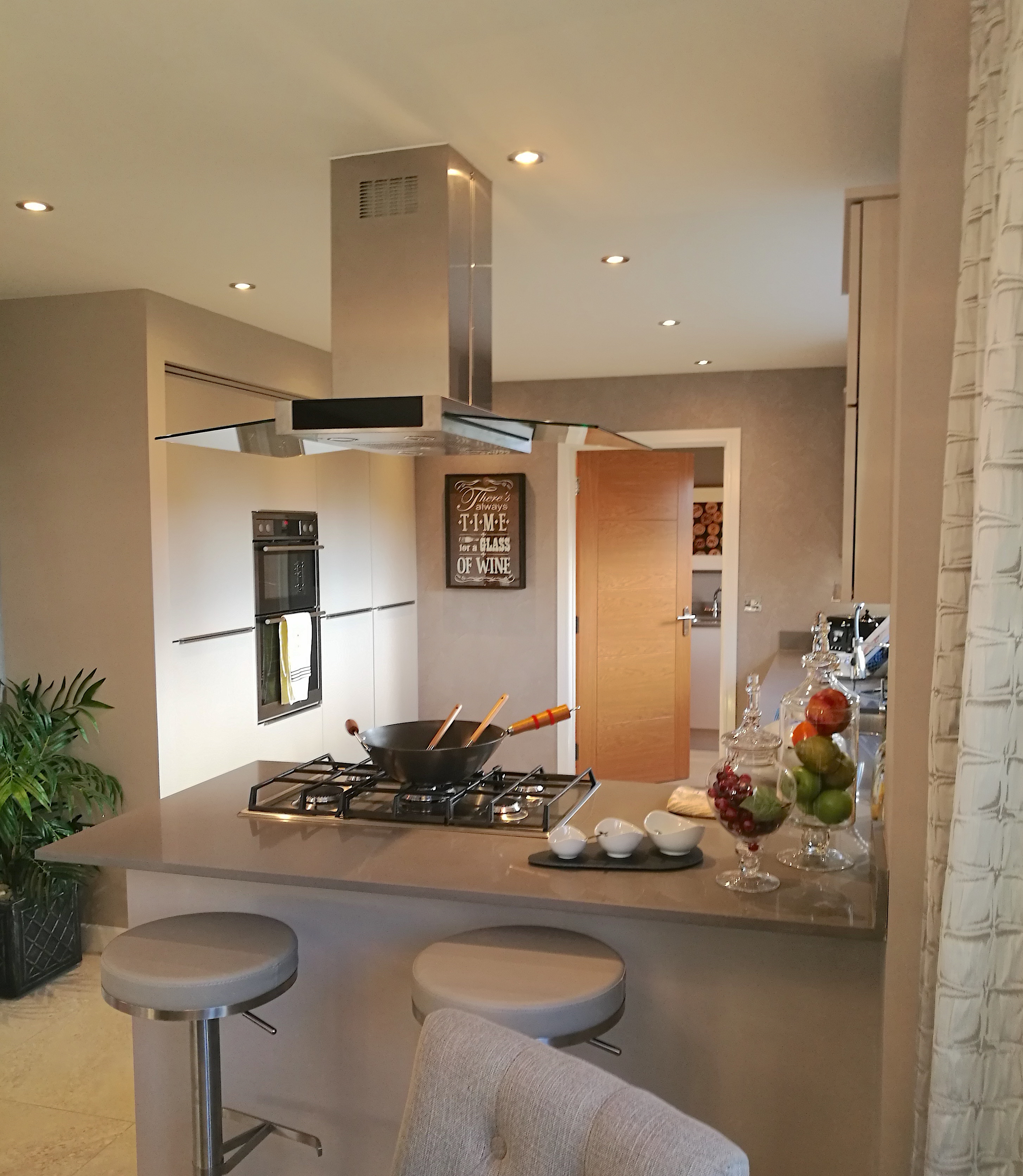
As mentioned above, the same tiles have been carried through from the entrance area into this kitchen/dining/lounge area. By doing so, all the spaces have a visually pleasing flow into each other. The neutral colour palette has been carried through from the living room and used within the hard surface finishes and leather seating.
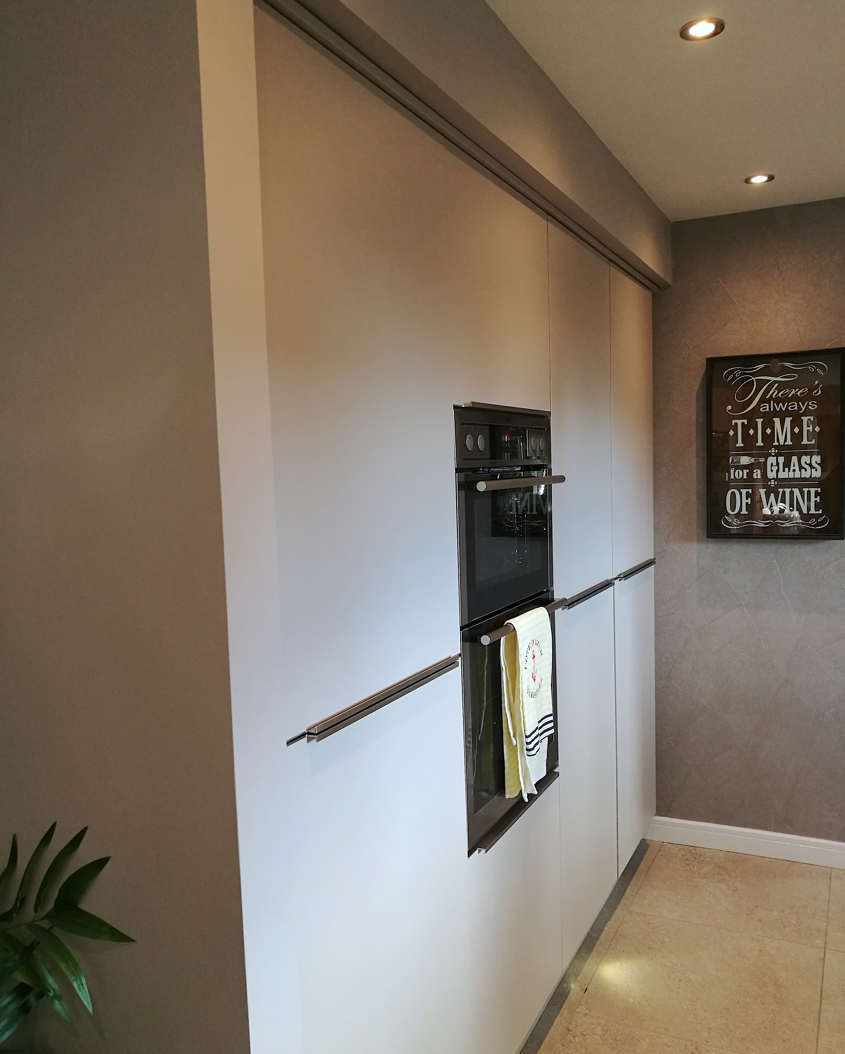
Popular within kitchen design just now is streamlining your units, as you can see in the above photo. All the units have been integrated into the one flush wall area, creating a feature of the units themselves. It also eliminates any unused or wasted space above the units, keeping everything functional and uncluttered.
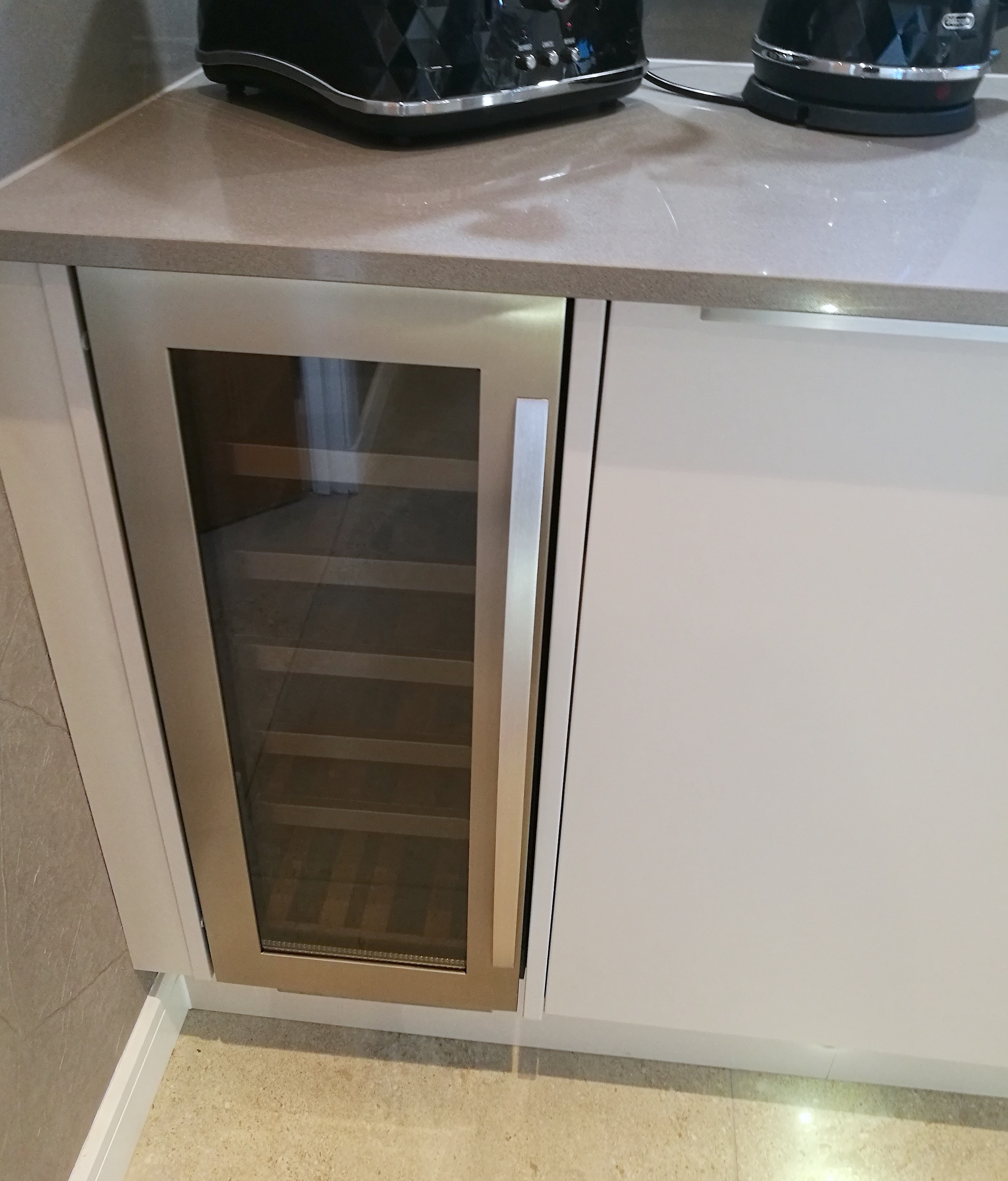
Now, I definitely am getting myself one of these in my next kitchen! This cute integrated wine fridge is the perfect size for storing drinks that you want to keep at the ready.
Slimline fridges are great for freeing up space in either your cupboards or general fridge. So, having this dedicated fridge for bottles is a great solution.
I have collected images of some spectacular wine fridges that were integrated into stair spaces and hallways. But that may only encourage me to drink more…kidding….
If you love this idea and want to see some beautifully designed fridges, I have created a Pinterest board especially for this post to give you lots of interior inspiration.
Wallpaper
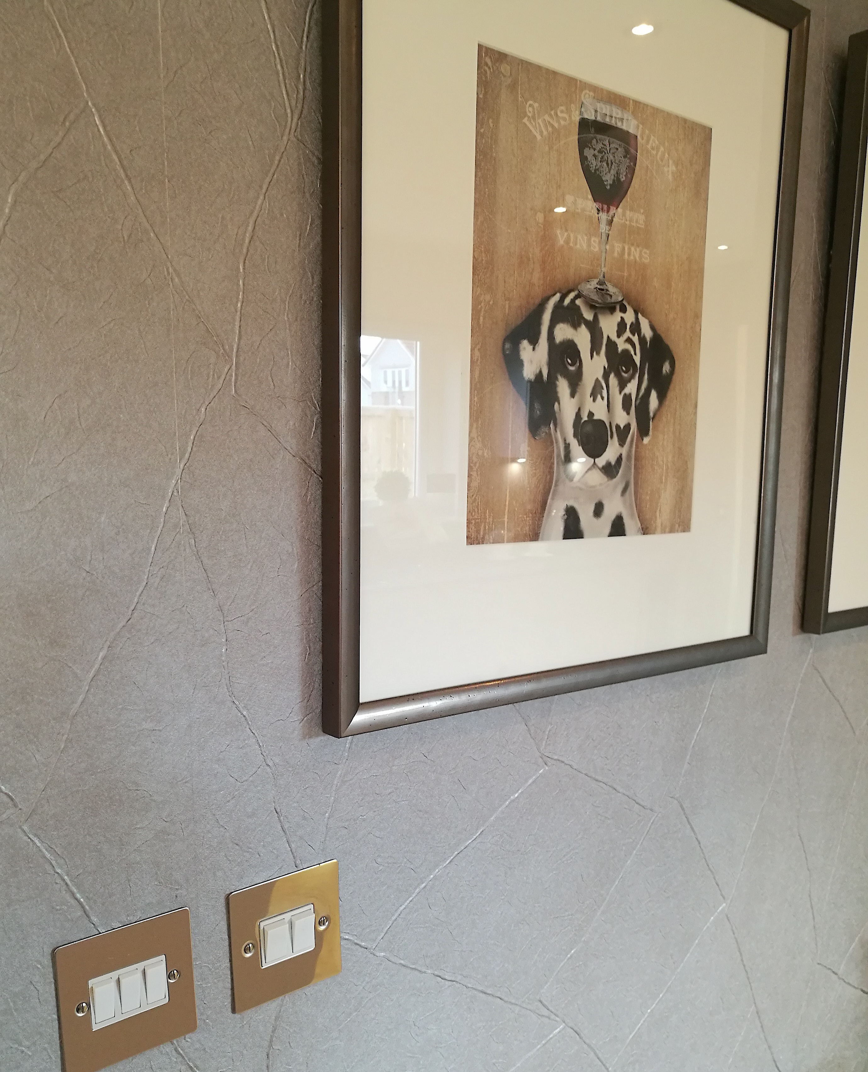
This wallpaper has a beautiful metallic texture to it and is a perfect style for large spaces that has multi-uses. Using the same wallpaper throughout the full space ties all the areas together. By keeping it neutral it allows other main features such as furniture and kitchen details to be a feature.
You can also see in the above photo that the black and white accent colours have been carried through into the kitchen area from the previous spaces we’ve looked at.
TOP TIP – When buying a new build property you can upgrade your light switches and plug sockets to a nicer finish. But you will pay a premium for this. If you are happy to have this done for you moving in then it may be worth it to you. Otherwise, see if you can find a bulk deal online or at a hardware supply store and hire an electrician to replace them all in the rooms you wish once you have moved in, you may end up still having some change left in your pocket from what the house builder quoted you.
Dining Area
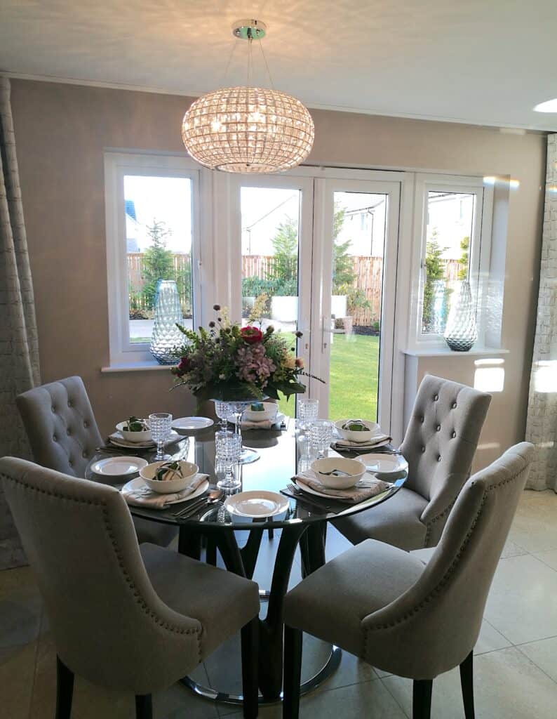
Placing a round table within a multi-use space is neat and compact whilst still offering a functional area to use. Sometimes a space isn’t big enough for a square or rectangle table or you may want to soften the style of the furniture with rounded corners and shapes.
This beautiful lighting fixture suits this space perfectly. Also, by mimicking shapes throughout a room it is aesthetically pleasing to the eye. Here, you can see how height, shapes and symmetry in the chosen finishes are used to create harmony.
I really love this space especially the vases. They don’t even need any flowers or extras added to them, as they have textured detail to their design already.
INTERIOR INSPIRATION – Larger sized vases are great ‘go-to’ item that can be used throughout your home, in any space or room. Do you have a corner needing livened up? Use a large scale vase and add greenery or faux flowers if added height is required to fill the space. Got a window ledge that is lacking something? Pop a single vase or even a trio of vases to help finish off the room.
Details
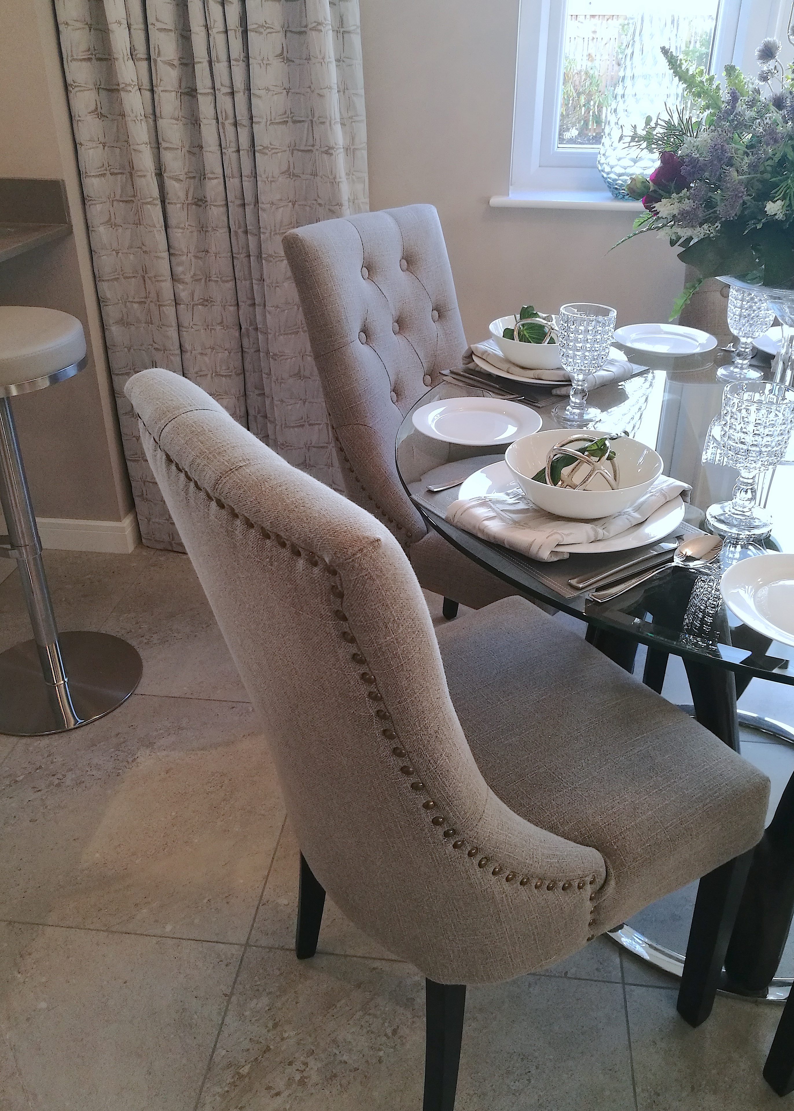
Studded chairs are another of my personal crushes. These chairs in the photo above are very versatile and great for using in many interiors styles. They have been made with a hard wearing fabric in a neutral colour. This style of chair could be used in rooms that are traditionally styled but also within rooms that are glamorous.
Also notice how all the colours and finishes work well together in this photo. The flooring tiles, curtain fabric, chair fabric and the bar stool fabric all complement each other as well as the reflective surfaces of the table and bar stool base.
At the end of this room there is a living space, this layout is very popular with both new build and older properties. A lot of home owners that may not have the space are either extending their kitchen areas or knocking down walls to accommodate this style of living. Having an open plan living and kitchen space allows a sociable and flexible environment for the whole family to enjoy.
KITCHEN LIVING AREA
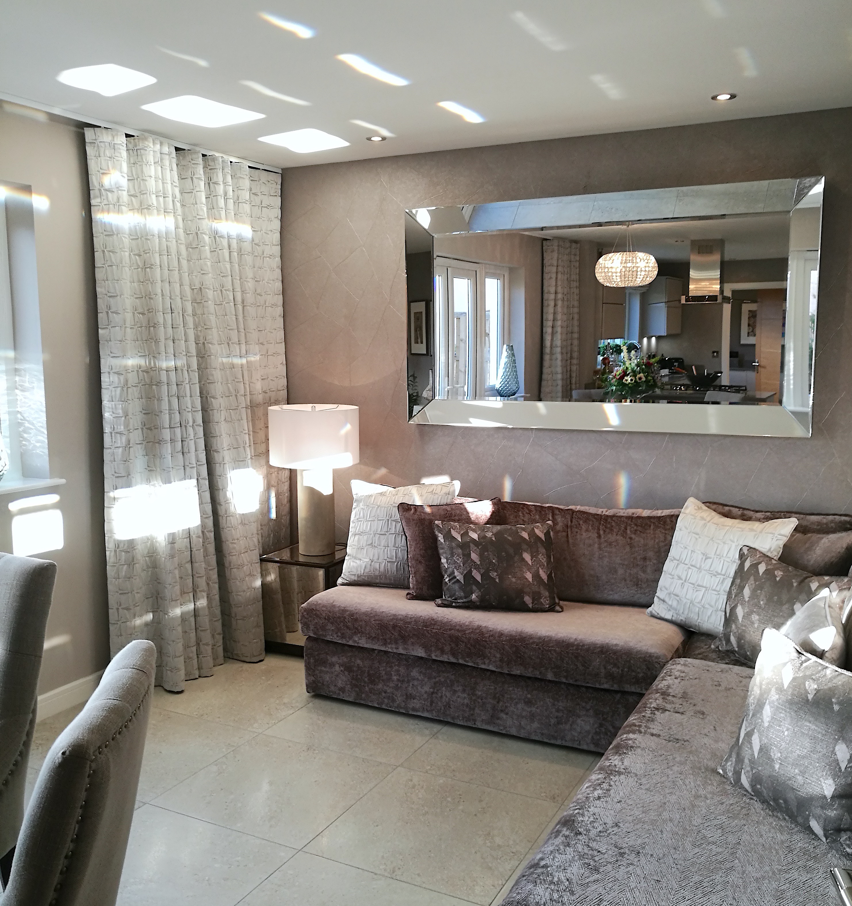
This is a cosy space is perfectly proportioned to the room and provides enough seating for anyone using the space. The colour and style has been carried through from the living room, bring with it soft luxurious fabrics. This helps to soften the hard finishes of a functioning kitchen. And, the large mirror is a nice detail to open up the space and reflect light around the space. It is a great focal point and statement mirror.
Now, there are always visitors in a Show Home touching and moving things about. Fact. So, it may be that the curtains have been pulled back too far because your curtains should cover the side edges of the window frame. The curtain track has been taken to the end of the window wall, covering empty wall space. If you have something similar in your home, I would say this space is large enough that it doesn’t necessarily need to be covered.
INTERIOR INSPIRATION – You could make use of the space with a lovely row of small prints or framed family photographs.
I love the look of taking curtains over empty spaces. But, if the space is a large area I would try and show off artwork or photographs. The reason for this advice is there are extra fabric costs to think about when taking your curtains further over your wall than required. And, it is very noticeable if you try and scrimp on the volume of the fabric. Volume is what will give you the luxurious look. So, it is either a style detail that you embrace, costs and all, or you keep the curtains to the standard functional use.
Fabric
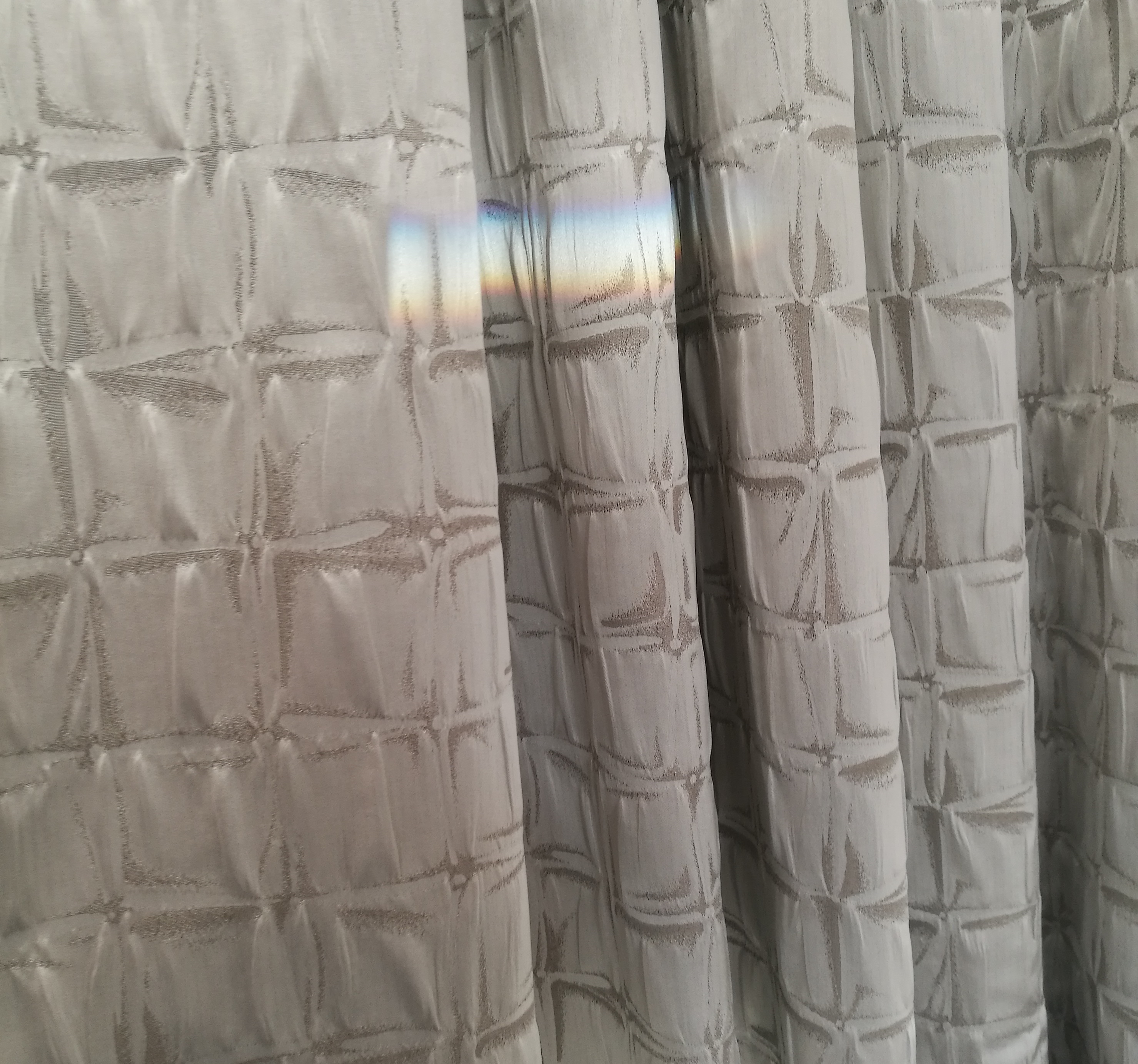
Before we leave the kitchen area, I just wanted to show you the lovely fabric used for the curtains. Now, I can’t recall if the fabric was textured or if this was a print effect. But either way it is perfect if you want to add some detail but still keep a neutral look to your room.
BEDROOM
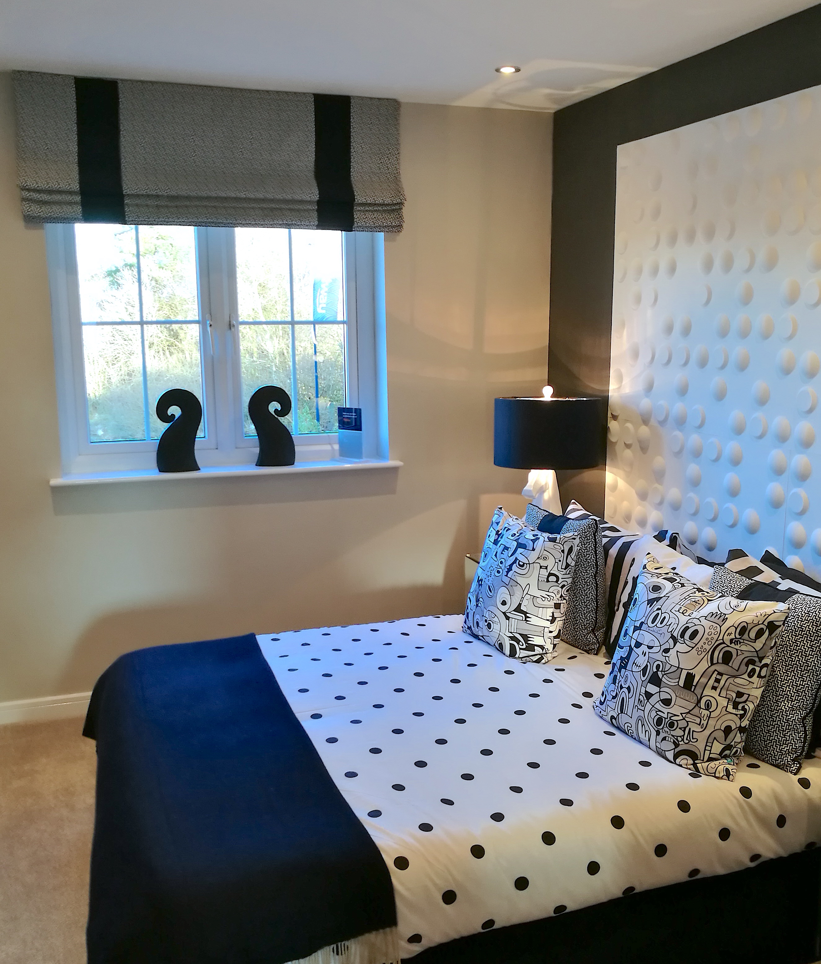
This room decor is crisp and fresh, whilst pulling in contrasting colours which work really well. The headboard is unique and definitely the feature of the room. Why not try a unique style of headboard/bed framing for a spare room, it will give the room character with added fun!
Also, adding patterned cushions to a room really gives it a fun vibe that may not always suit a main bedroom, depending on the atmosphere you want to create.
I really like the roman blind in this room, the style, fabric choice and colours work really well together. It suits the room perfectly.
You may have seen me mention before about bespoke soft furnishings for your home. Curtains, blinds and cushions look great when they have been created especially for your room and style. Being able to tie a room together and be a statement in itself can be a mix that is really hard to find on the high street.
There will also be a post very soon in which I discuss different solutions and styles for your windows. Keep an eye out for that!
Accessories
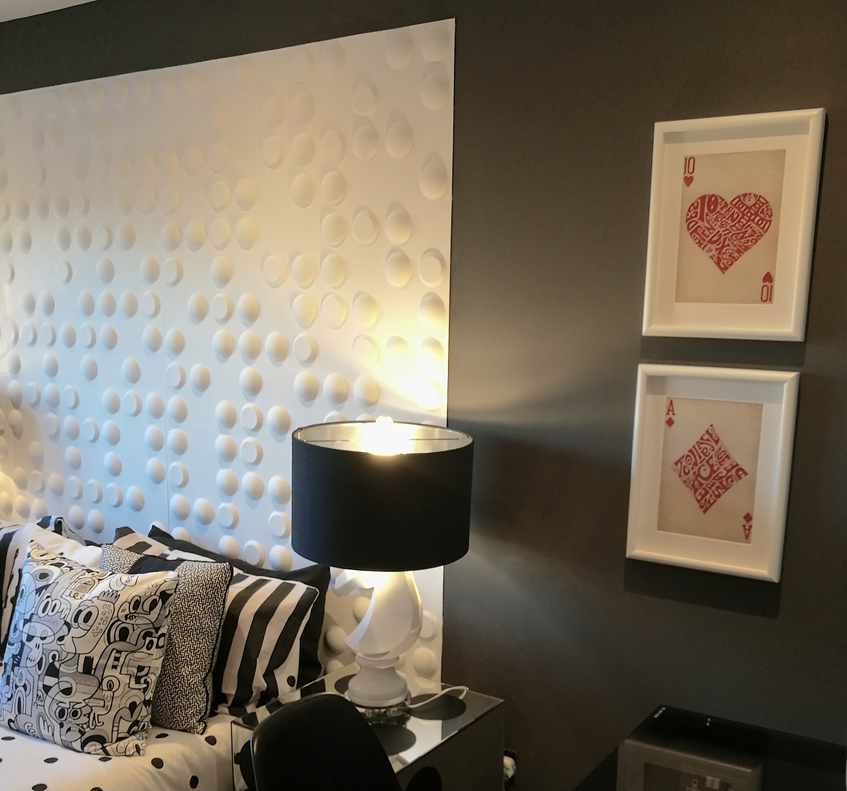
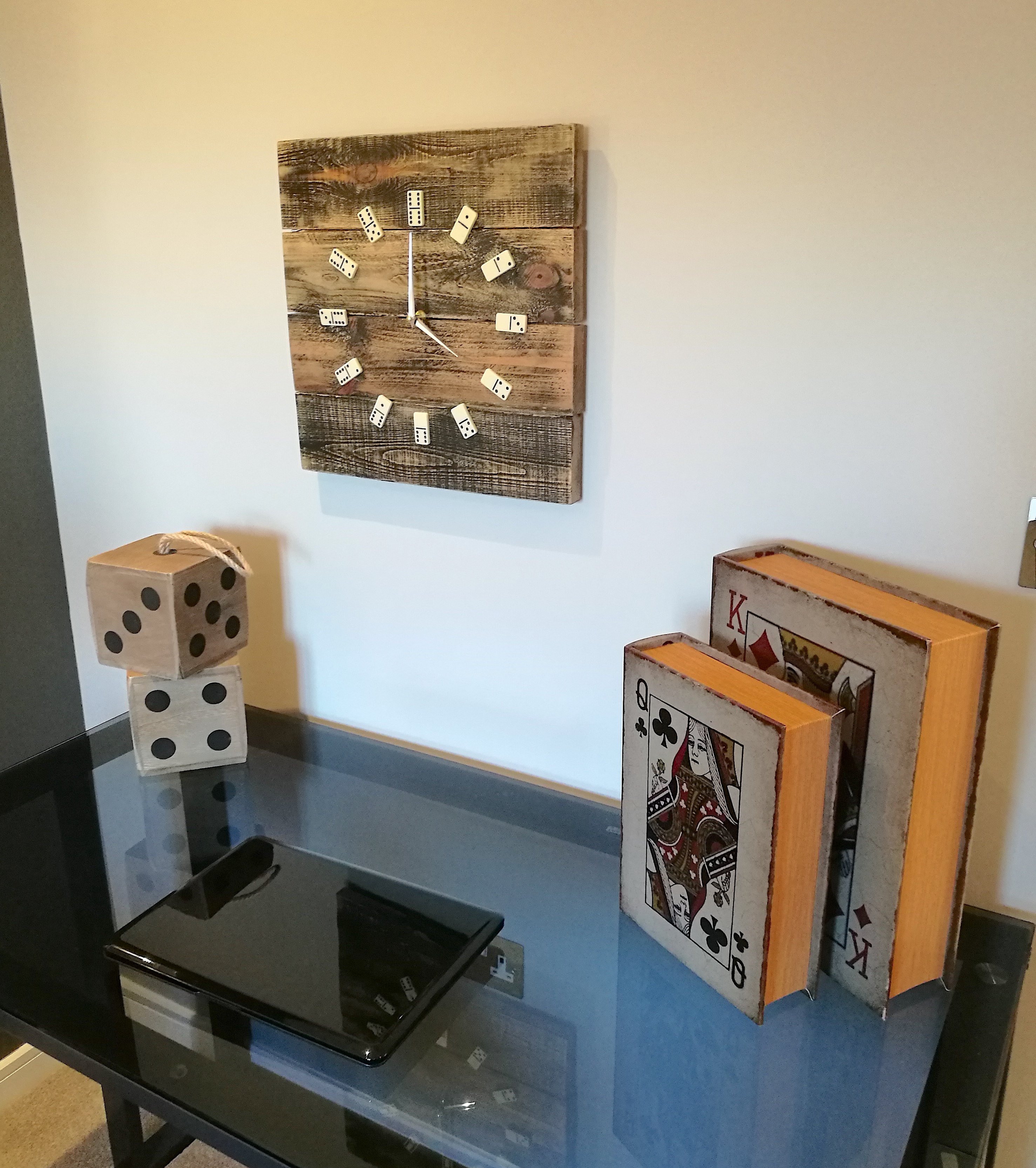
Spare rooms are great for adding unique accessories and quirky styling details. I love these playing card prints, this theme is also carried into more accessories in the below photo. The domino’s used for the clock numbers are also a fun and unique idea. What is a spare room for if you can’t add some personality?
BEDROOM
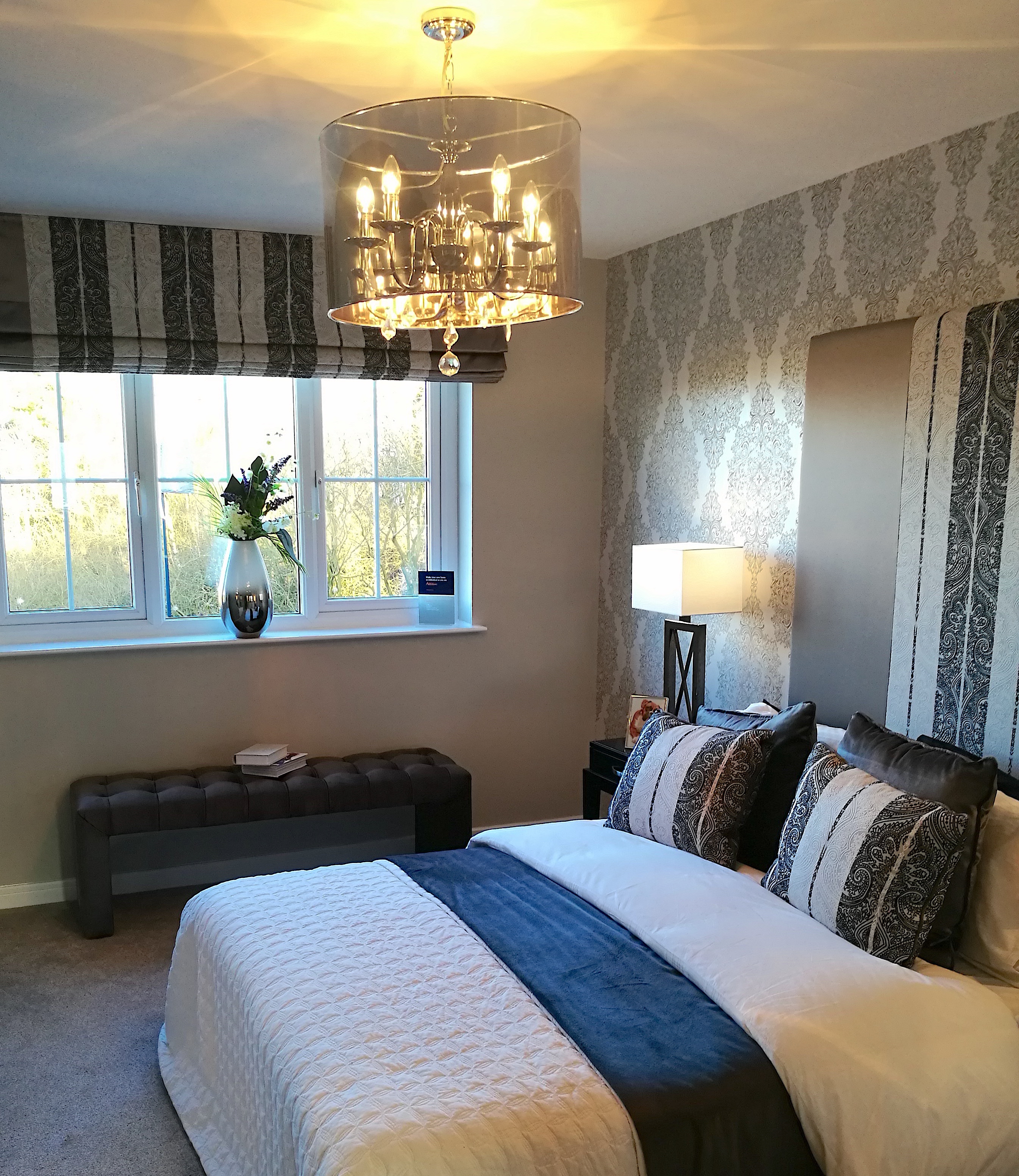
This bedroom is a great example of how to carry fabric throughout your room and do it well. The patterned feature fabric is a mix of light and dark colours which is a theme that is carried through this whole Show Home. It really works well in this room and creates a welcoming and cosy space to relax in.
In my opinion a bedrooms main goal is comfort. We work hard in life and when we finally get to retreat to the quiet sanctuary that is our bedroom, we want to look at our bed and feel completely comfortable and relaxed.
Therefore, bedding is always something you should consider if you want your room to feel luxurious, stylish and comfortable. I recommend using the best bedding you can afford. It will honestly make such a difference. Also, a great way to really add that extra comfort to a bedroom is by adding and layering your cushions, duvet and throws.
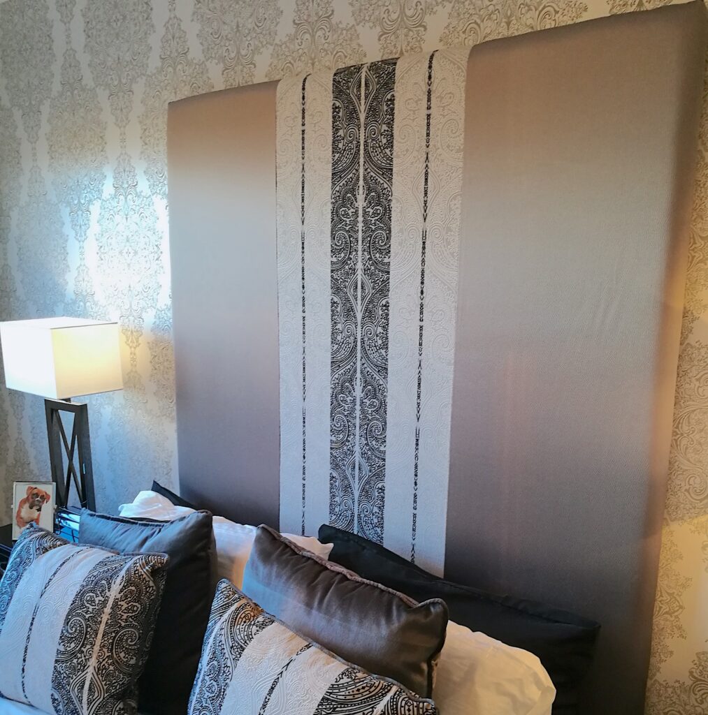
INTERIOR INSPIRATION – Fabrics can be mixed. If you like a pattern but feel it may be too much for a room, why not use only part of the fabric and have it stitches together with a plain fabric? For example, the headboard has incorporated the pattern but it has been teamed it up with a neutral-coloured fabric to help keep proportions balanced and not overload the room. You can also use patterns down the middle of cushions and bed runners as a way of tying a look together but keeping it interesting.
Details
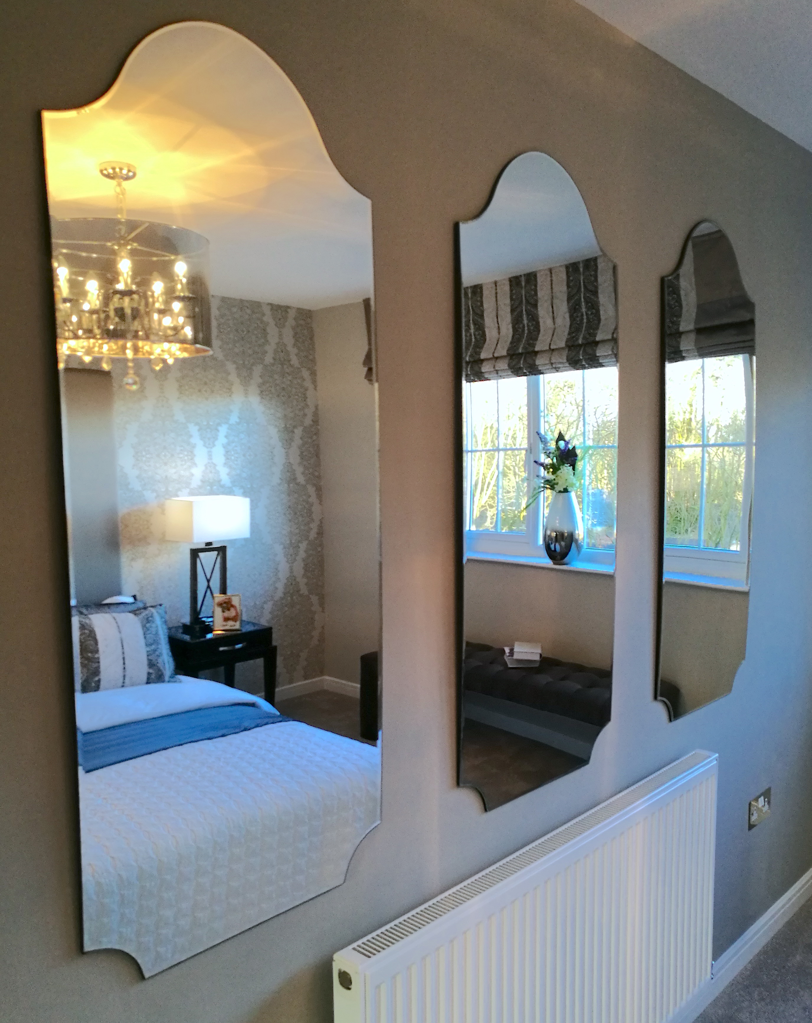
This trio of mirrors really suits this room style nicely. The curved detail of the mirrors compliment the shape within the wallpaper pattern perfectly. Using shapes as interior inspiration is a great way to tie details together.
If you are trying to tie a room together, but are unsure about getting it wrong or picking something that won’t suit, then just take your time. This is your home and don’t put yourself under stress as that will really make this decorating experience very unpleasant. Start by deciding on the bigger style details first, like the wallpaper, fabrics and furniture. Putting these at top of the list will make choosing the finer details or accessories much easier as you will have colours, patterns and textured to be your guide.
BEDROOM
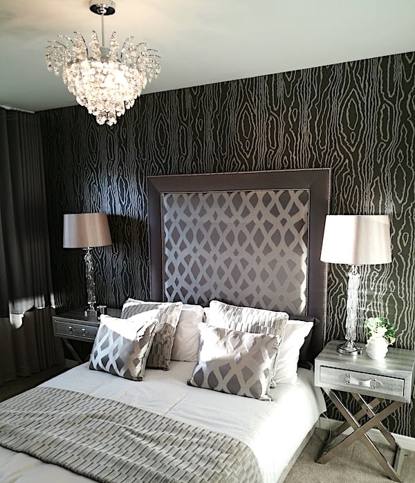
We are seeing each room get more luxurious and glamorous as we go up room sizes in this Show Home. It also shows how to use different styles within your home while still ensuring everything has a common theme tying it together i.e the light and dark colour palette and also the pattern features.
Symmetry
Symmetry is a designer’s best friend as it balances a space and creates harmony.
Visually, many people feel much more comfortable with balanced rooms. But, if you have lived in a space for a while and now it is time to decorate, it can be hard to see what will work best. That is why looking for interior inspiration online is a perfect way to detach from what your room looks like just now.
I would recommend researching photos that you are drawn to, that will help you visualise how your room could look. It’s a great first step to finding your style if you are needing a helping hand.
Patterns
Here’s a question for you – if I said I was going to put a grey/black wallpaper on your bedroom wall, how comfortable would you feel about that? Some people will be like ‘Hell yes!” others may be like ‘Nooo way!’ I want you to look at the photo above and tell me if you see what I see…….that this room does not look dark and scary??
The combination of reflective surfaces in the furniture and fabric choices keeps this room light and bright even with the darker wallpaper.
Let me know your thoughts in the comment section below (opinions may vary on this so please word your opinion pleasantly :))
A lovely bold pattern has been carried through the headboard and cushions. And the headboard is finished with a border in a complementing plain fabric. By keeping the bedding and furniture light and bright in this room it has allowed darker tones to be used on the walls and window dressings without it overpowering the room.
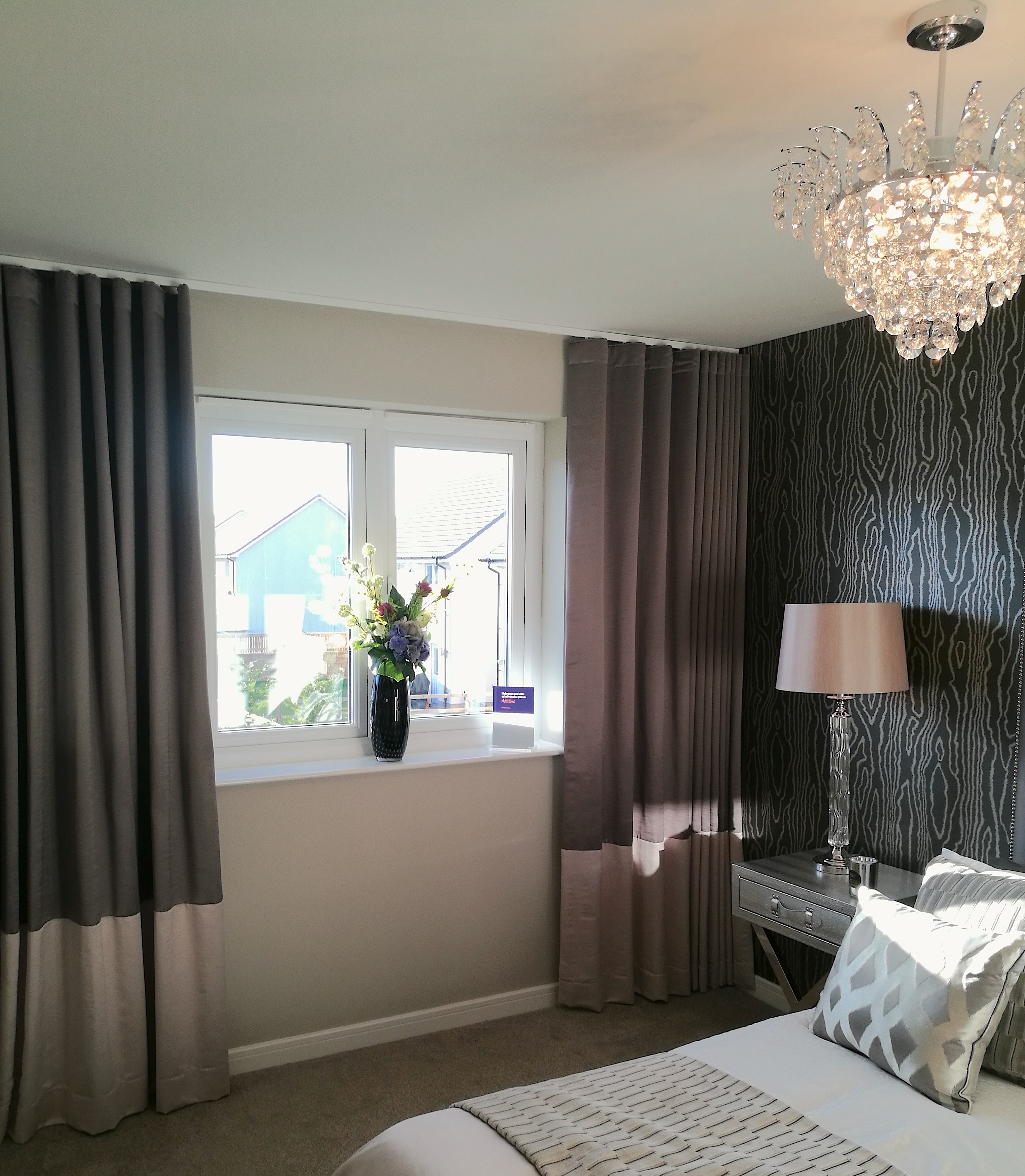
The curtains have been taken to the end of the wall and also up to the ceiling in this room. This will help create a dark and cosy space, perfect for people who love their room as dark as they can get it. There has also been two colour ways of the same fabric used to create this curtain design.
INTERIOR INSPIRATION – If you like this idea then you could choice two fabrics in the same finish, like above or you could mix it up and use a pattern and a plain fabric together.
MASTER BEDROOM
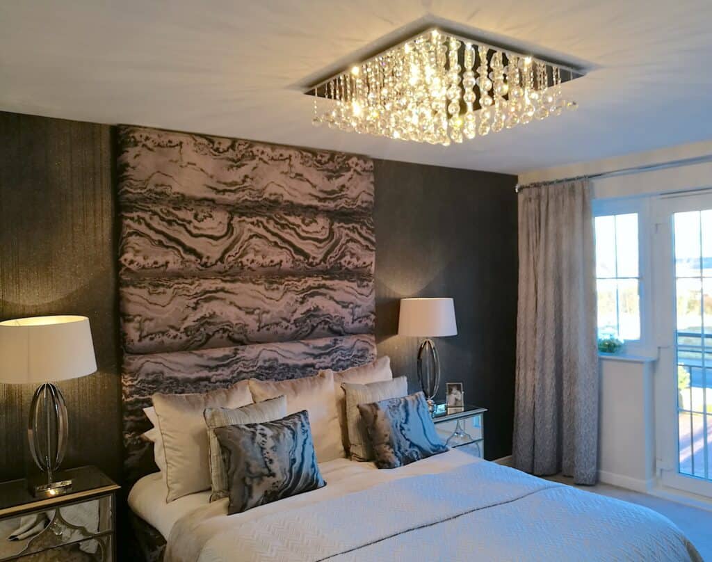
And the final room on our visit today is of course the master bedroom. All the design details that have been used throughout this Show Home are also used within this space. The use of pattern, light/dark accents, mirrored furniture and stunning lighting fixtures. All the rooms have each had these design elements but all have been designed completely differently.
Pattern
This pattern is quite bold but with the size of the room and again, keeping bedding and other features of the room light and bright, the room can carry it well. We can also see the fabric is taken from the headboard into the cushions again. This design detail has been consistent in the last few rooms we have looked at and has worked very well. Has it inspired you for your interior and is maybe a detail you fancy trying?
Symmetry has been used again with the bedside tables and lamps, creating a very consistent look and calming style to the room. Also, notice how the curtains in this room haven’t been taken up to the ceiling. This will allow you to compare these two curtain styles from the previous bedroom photos and see if you have a preference for one or the other.
I’d love to know if you have a preference after reading this post.
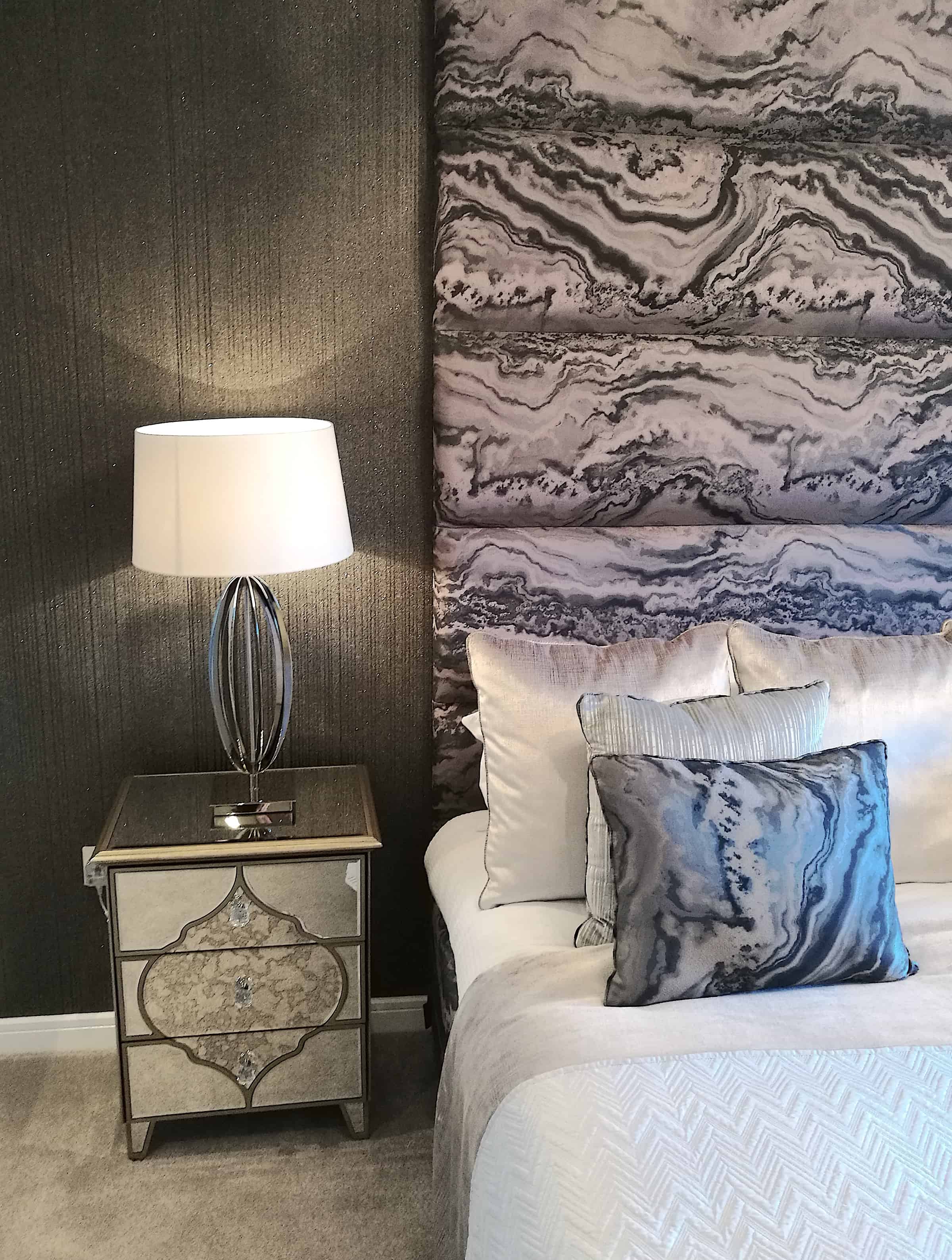
Here is a closer photo of the bedroom finishes. Again, a darker wallpaper has been used and like the previous room it carries it very well.
TOP TIP – If you want to use darker wallpapers in your home I highly recommend finding a metallic or a shimmer style. If this fits with your decor taste. These finishes reflect light and don’t make your room as dark as you would expect them to be. Are you feeling brave enough to give it a try?
I love the crisp white bedding and its zigzag pattern. I had white, navy blue and grey in my last bedroom and I absolutely loved the contrast between the colours. A mix of fabrics and colour tones have also been used to dress the bed, adding layers of comfort that I have previously mentioned.
Furniture
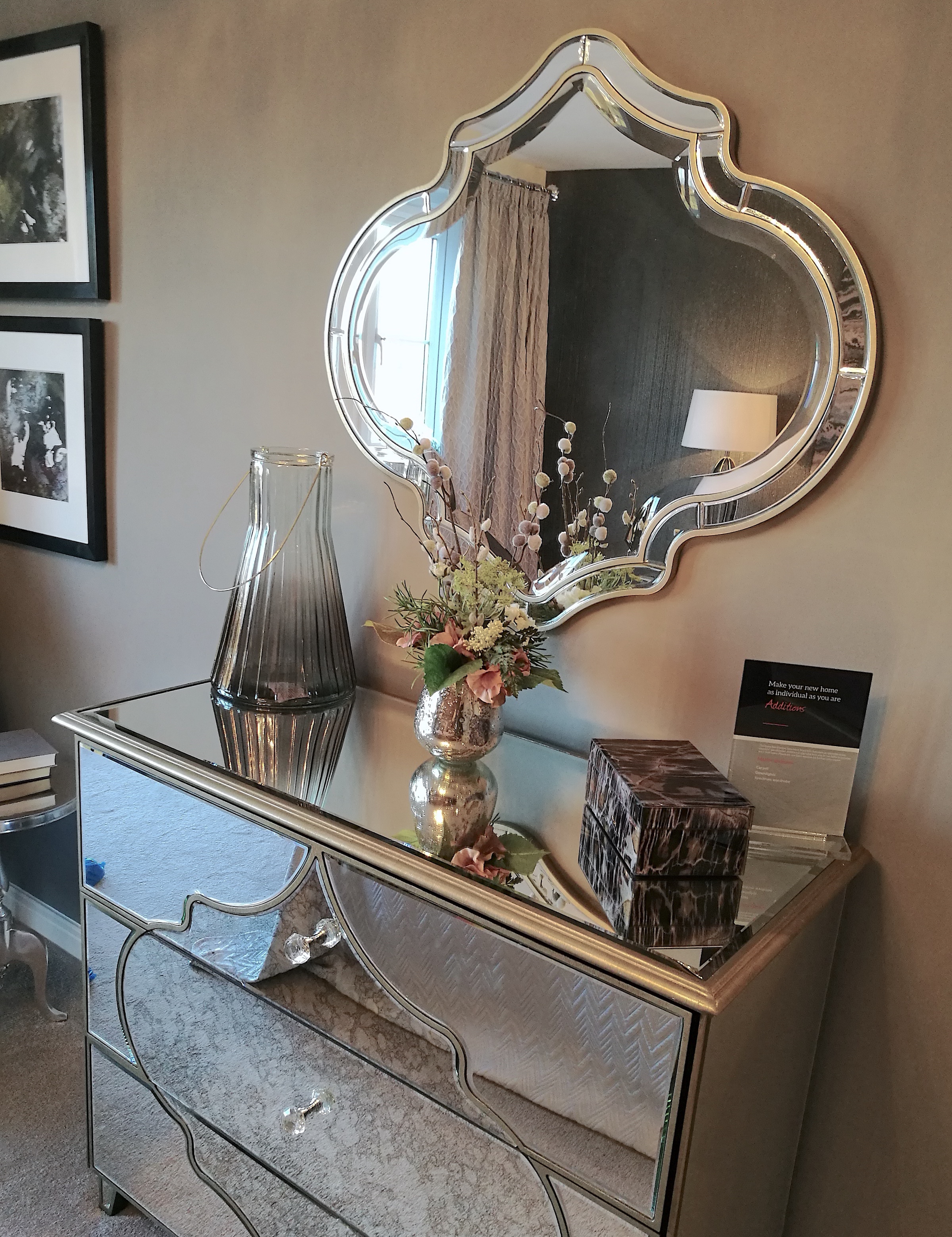
This chest of drawers and mirror are perfect together, with the pattern being mimicked between both pieces.
INTERIOR INSPIRATION – Finding similar shapes to tie furniture and accessories together is an easy way to make a room work well.
Even the accessories used here on top of the chest of drawers are tying in the light/dark colour theme perfectly along with the picture frames on the wall.
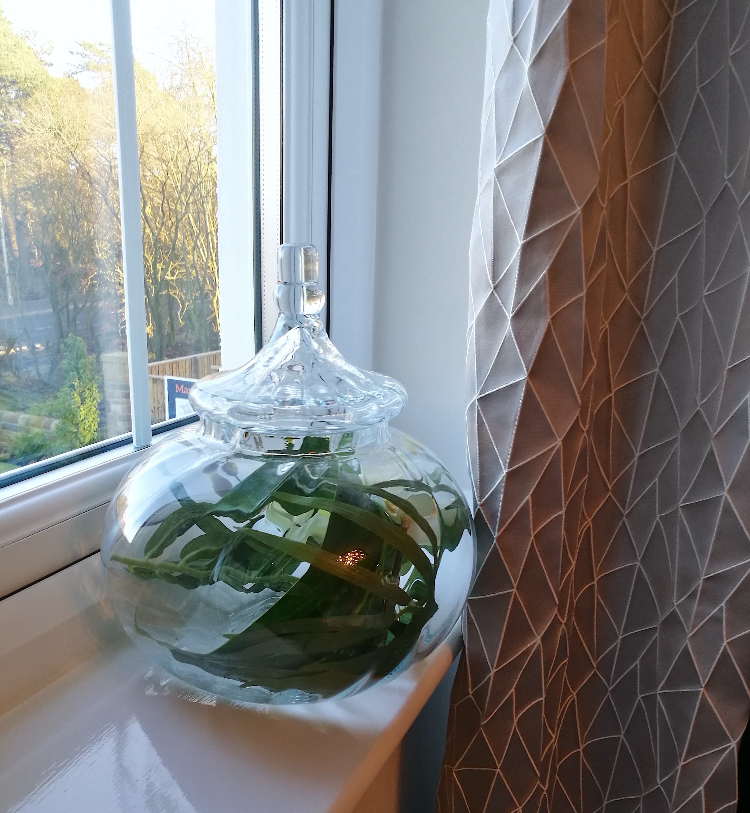
I just wanted to throw this little vase in before I go. Now, this is a bad photo. I was trying to capture the curtain fabric also, total photo fail, apologises. And I haven’t caught it at the best angle but……if created correctly, these styles of vases are perfect for placing faux flowers inside, wrapping the stems around the inside and creating a beautiful and unique display for your room….and no one else will have the exact same thing 😉
That’s our Show Home visit done for today. Did you pick up any Interior inspiration for your home?
I really hope you got some good inspiration on how you can use similar choices of colour and add your own personality to your home interiors and you picked up some helpful tips and ideas.
I will be sharing my Show Home visits with you regularly. Therefore, please remember and pop back as you never know, the next visit could be exactly what you are looking for.
If you found this post helpful or you want to share any interior inspiration tips with me and other readers, please let me know in the comments. If there’s something you would like me to write about please let me know here.
Need more inspiration? Visit another Show Home here.
Take Care


