Visit a Show Home with me today – Bellway Homes
Are you looking for a great source of inspiration for your home?
Are you free right now? Come and visit this Show Home with me, where I will be sharing interior tips and ideas.
Today I will be sharing with you –
- Top Tips – Watch out for these throughout the post as an extra bonus
- Interior Design advice and suggestions to help you style your home
- Show Home knowledge you may not have discovered before
- My photos from the visit with interior ideas for your home
- Links to my Pinterest boards for further ideas on particular furnishings
How will visiting a Show Home help you with your home?
Show Homes only have one purpose – to look so utterly amazing that you want to buy it …….now! Therefore, it is logical to believe that the house builders will put a fair bit of effort into all their Show Homes and create each one with hot new interior trends and styling techniques which will make them attractive to buyers (= sales).
The interior styling also has to withstand the test of time. For instance, it may be a large development and they may be building (and selling) on-site for many years to come. It can be time consuming and not always geographically logical to visit a Show Home. So, why not let me do the hard part and share fresh interior ideas that I have found for you and your home.
TOP TIP :If an item or piece of furniture stands out, the Sales Advisor should be able to provide the Designer’s details for further information.
Before we get started with our Show Home visit today…
One thing to bear in mind with any Show Home – the price brackets of the properties being sold will determine the budget that is spent on the Show Homes. Normally the pricier the property the more exclusive the finishes are. There are so many great styling tips and ideas that can be taken and recreated, no matter what the Show Home budget was or what your budget is.
This is what I love about the advice I share on Secret Home Designer – you may have a studio apartment or a six bedroom mansion – every space has the potential to look amazing by finding the ideas that appeal and fitting them into your home.
TOP TIP: Use Show Homes as a point of inspiration. If you see an item that you love, but it’s £££ (or you just know that it’s expensive) try and find something similar on the high street or online. However, you may have to compromise on some details but you may like that piece even better!
Time to come and join me on my tour around this Show Home.
I am excited to show you this lovely Bellway Show Home today. It is furnished beautifully and has some great features that I will share with you below.
ENTRANCE
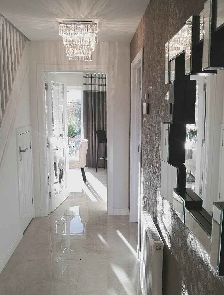
I really love the entrance hall of this Show Home. It is bright, fresh and with just the right amount of glam to impress any visitor to your home.
Floor Tiles
High gloss floor tiles have been gaining in popularity over the last few years and is an instant statement of modern interiors. Although, these tiles may not suit everyone’s lifestyle or taste, they do give this entrance a stunning wow factor upon entering.
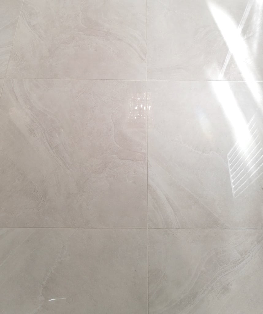
TOP TIP – Using reflective furnishings in your home will bounce light around the space and brighten up areas that may otherwise be dark if there is no natural light available.
The styling for this entrance is quite glamorous while the shadows that the main light is casting on the ceiling still manages to create a warm and inviting atmosphere. I love the textured wallpaper and even though it is a deeper colour tone, it isn’t overpowering the space. (There is an older post about lighting shadows that I am tweaking, it should be live very soon.)
Statement Lighting
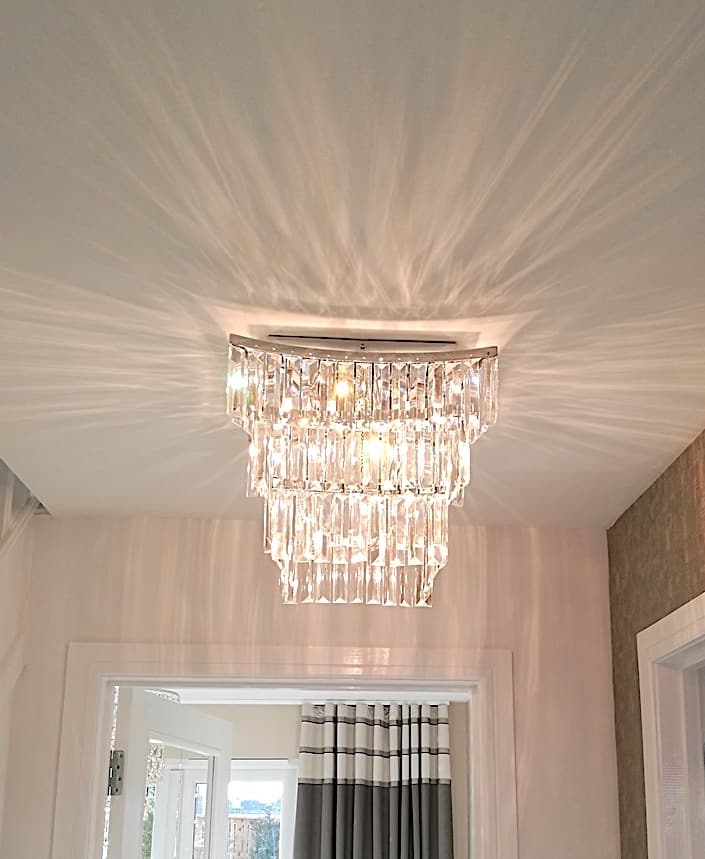
Statement lighting in your hallway is another beautiful way to create a welcoming feature for any visitors to your home. If your ceiling can take it, why not make your ceiling light the main feature of the space?
There can be many features of an entrance area. Sometimes it’s the staircase, a large statement mirror, artwork or even a seating space. As a result, I would advise to choose the feature that will compliment your space the best. The main thing is not to do too much, as the space could get a little confusing. Therefore, pick a main feature and allow everything else to compliment it.
Textured Wallpaper
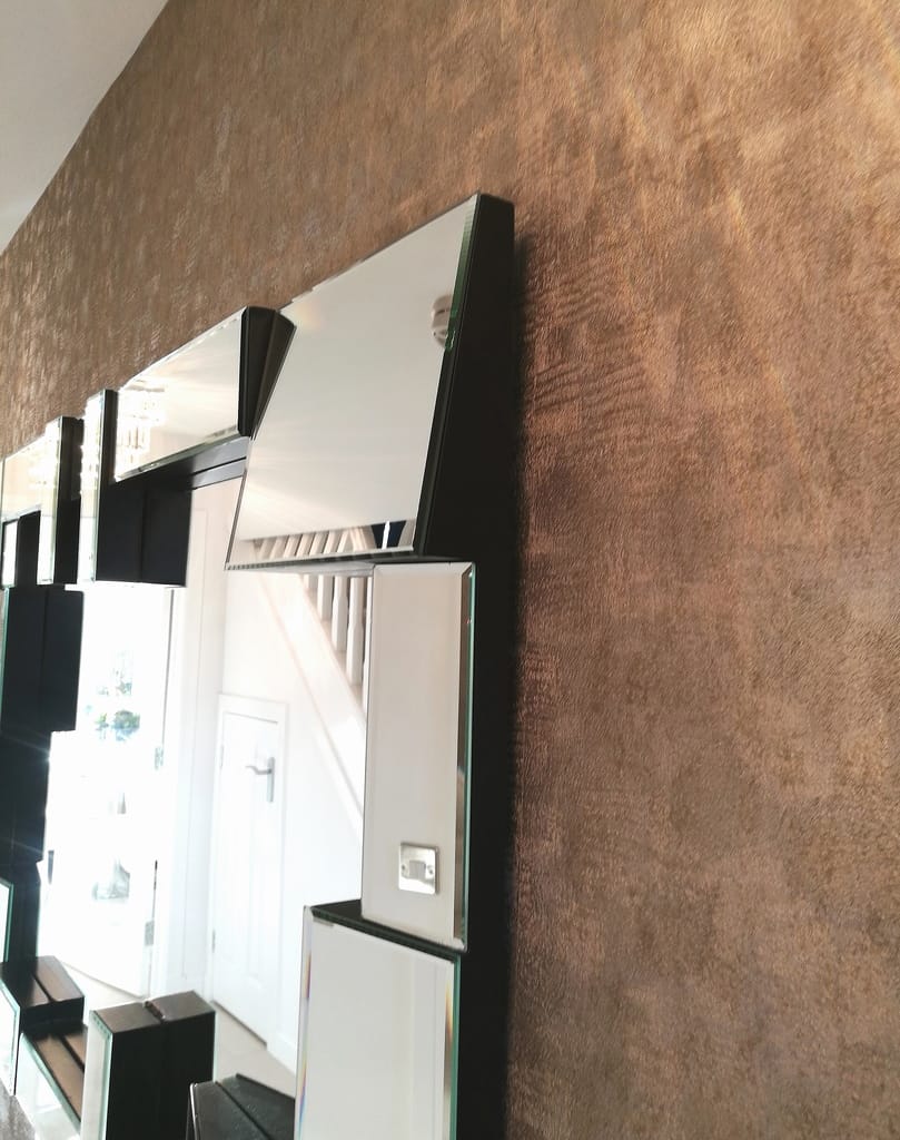
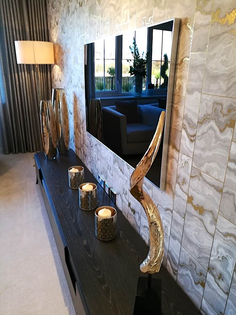
Here is a close up detail of the textured wallpaper and the mirror design. Textured wallpaper suits everywhere (in my opinion…can you tell I like it 😉 but especially areas that you don’t want to ‘date’ too quickly. Use this style in any room of your home to add interest whilst not overwhelming the space.
You really can’t go wrong with textured wallpaper and depending on your taste, you can choose to go subtle or bold. Normally, there are various tones running throughout the design which allows you to pick out accent colours and tie them into your furnishings.
Accessories
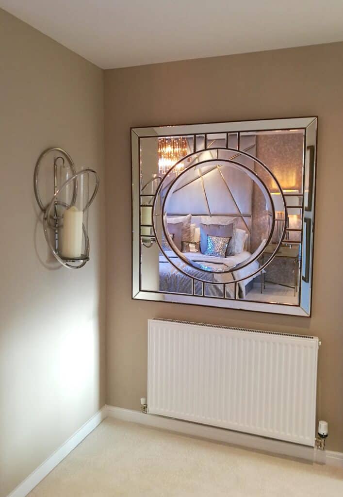
The entrance to this Show Home has a stunning mirror which suits the space perfectly. This area is spacious enough to take the large sized mirror easily and the angled edging detail allows light to bounce to any other reflective surface.
Are you thinking of putting a statement mirror into your entrance space but worried about getting it wrong? See my top tip below which may help you.
TOP TIP – To help find the right mirror for your entrance, I would advise measuring the full wall area. Decide on the ideal size that you would like your mirror to be and also take a photo of the space and its surroundings before starting to look in-store or online. It can sometimes be overwhelming with the amount of choice available when browsing for something new. So having a photograph of the space, the measurements of the wall and the ideal size of the mirror, will help you make the right choice without getting side tracked by (pretty but) unsuitable items.
LIVING ROOM
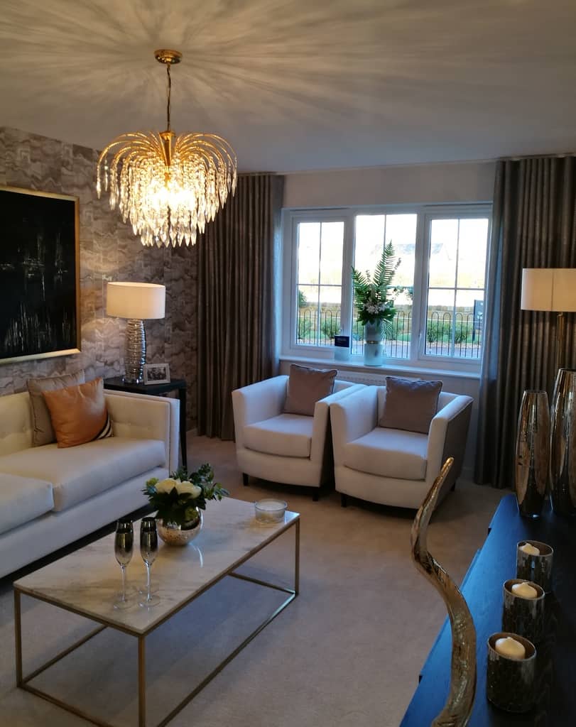
The styling details of Show Homes are created specifically to entice you to buy the home and the lifestyle. Where as, a ‘lived-in’ home may need to function a little differently there are still many ways to incorporate elements that will work no matter who or how many people are living in your home.
This Show Home’s living room is laid out to perfection, it is styled beautifully with accents of mixed colour metallic finishes. The full height curtains frame the window perfectly as well as covering the unusable walls to the side. This is one of my favourite curtain looks to create (there is a curtain post coming very soon).
Seating
In the past, single seats would be pushed into the corner of the room or anywhere a space needed to be filled, but now we see them being used as a statement piece in their own right. As you can see here, two single seats have been placed side by side instead of only one which creates an interesting layout.
I like this idea and have seen it used very well in formal spaces. I would love to know your opinions on this layout?
Colour scheme
The cream, soft taupe and orange colour scheme works really well. The colours compliment the mixed metals of the accessories along with the ceiling light and table lights. As a result, it creates a warm and welcoming room that although is a formal setting it still looks comfortable and cosy.
The textured wallpaper is tying all the colours together beautifully. Whilst, providing a good balance between both the light and dark colours within the room.
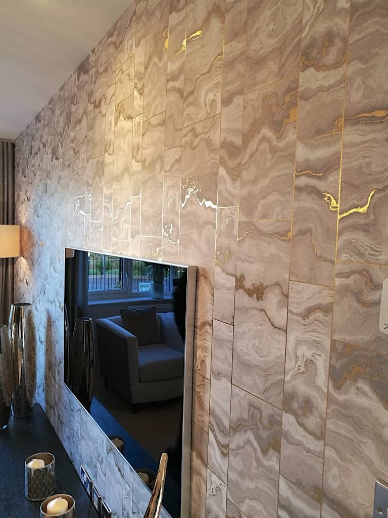
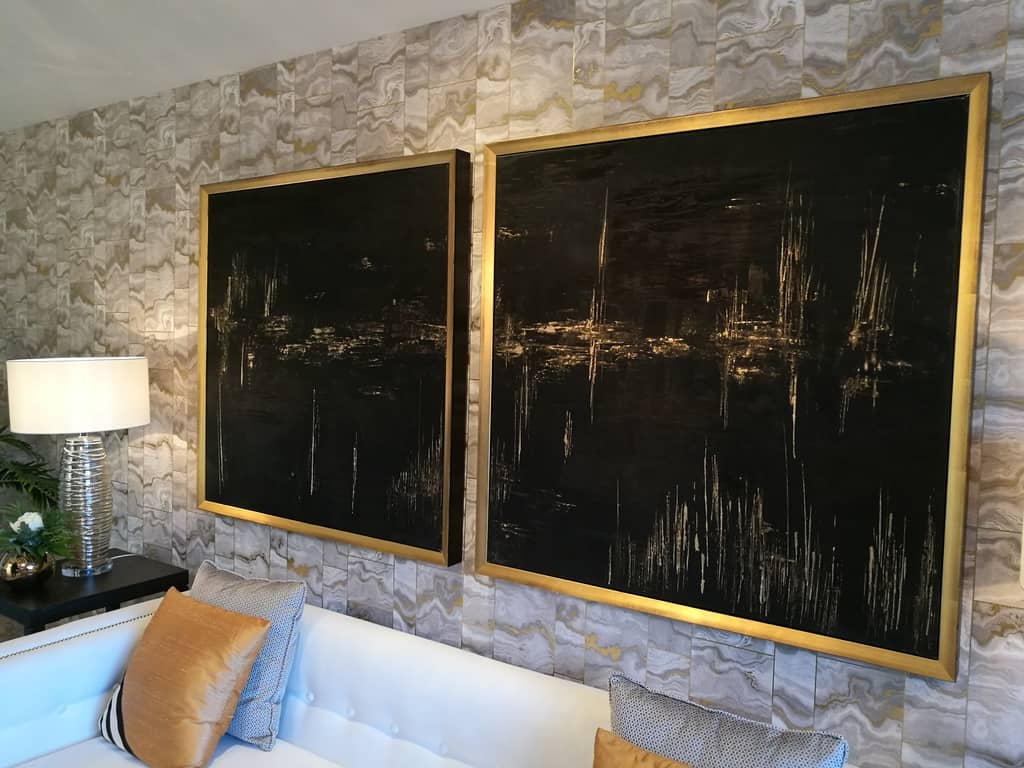
The metallic veins running through the wallpaper have been carried throughout the room design. In the photos below, you will see how the metallic tones have been carried over to the supersized picture frames, the coffee table frame and even down to the switch and socket facings.
TOP TIP – Here is a tip if your room is a blank canvas and you are struggling to get started. I would recommend starting with finding either a wallpaper or a fabric you like. They are normally one of the most prominent features within your room therefore, it can help to find a colour and style that you love first. From there, it may be easier to find what furniture and accessories work best for the style you have chosen.
Inspiration
There may also be times where your inspiration comes from unexpected places. For instance, you may find a beautiful accessory item like a vase or a painting, and you can then build your room design from there. Overall, you will want to find a style that you love and see yourself happy with for many years to come.
Scale
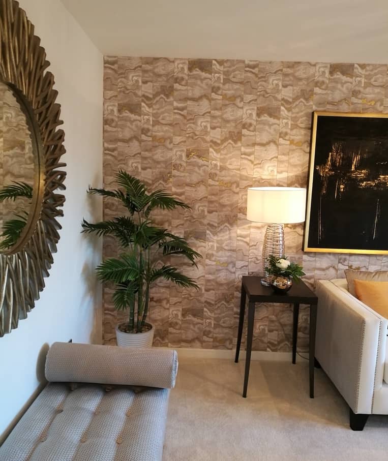
Adding non bulky furniture to your room will help keep your room looking spacious. For example, here you can see the simple but elegant side table doing just that. Being able to see space under your furniture gives the illusion of airy and bigger rooms whilst keeping the ‘extra junk’ hiding places to a minimum.
Also, adding greenery to rooms has been a really big trend for a number of years. It can be used to help soften interior spaces and add layers of interest. The corner of the room could take an even taller plant whilst still balancing the space well. When it comes to corners of rooms and living spaces, scale is a major factor.
Successful design is about drawing the eye to what the designer/creator wants you to see. In this photograph, I can see a few different heights that all work well together. The table height next to the sofa arms match perfectly. Next, my eye is drawn to the side-table lamp and the plant height, and again up to the picture height. Lots of layers create interest in a room. I would love to know if this is something you notice also when looking at this photo.
Furniture
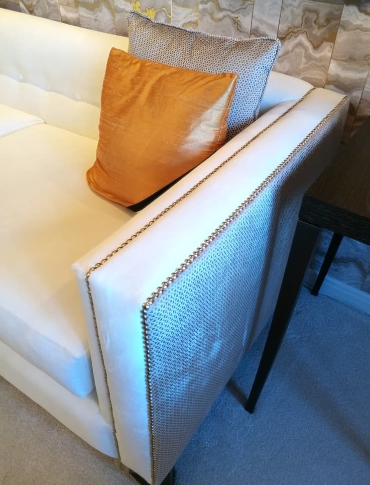
Now, I just LOVE this sofa. Yip, I just had to use capital letters there. I fell in love with this style of sofa many years ago whilst working in an Interiors shop. I WILL have it one day….it is on my wish list 😉
The shape and stud detail of the sofa is so elegant and when a patterned fabric has also been used for the side panels…well… that is just the cherry on top! This sofa style is mostly suited to formal spaces but as this style is becoming increasingly popular, there are ways to soften the look by adding bolster style cushions for comfort which softens the sharp angle of the side arms.
Artwork
The large two-piece artwork is a large focal point of the room. This is a perfect example if you are interested in adding a dark colour into your home interior but unsure of how to successfully achieve it.
By using the dark colour within the artwork, it allows the dark side tables, the legs of the seating furniture and the accent detail within the cushions to all flow perfectly without being overpowering. This room is a perfect mix of light and dark colours, with a mix of metals as an accent.
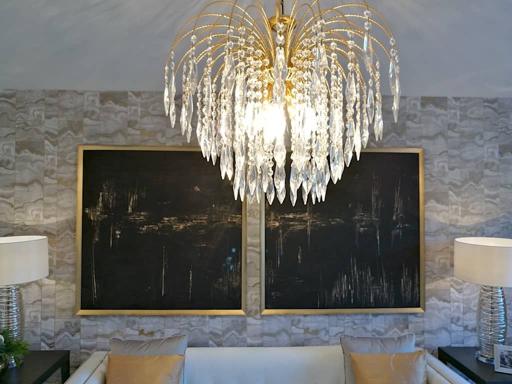
Details
One thing I love about looking at different home interiors is that I always appreciate the colour and style used even if it may not always be to my personal taste. I have never thought I was a ‘gold-person’ or even a ‘mixed-metals person’. But as I’m writing this post, the above photograph is definitely tempting me to incorporate it soon.
I love how everything in this photo is perfectly balanced. The dark painting is picking up the side tables, the gold is popping from the ceiling light, the frames and the cushions. Also, the light colour is getting pulled from the wallpaper to compliment the sofa and the matching lampshades. It’s just a shame I couldn’t take the photo from any further back to capture the full sofa and detail for you.
Let me know in the comments below if you like to stick to one metal colour or have successfully used mixed metal within your home. I’d love to hear your feedback.
Here is some extra images of this room, showing some beautiful details –
KITCHEN
Functionality
Kitchen design is ever changing due to the way we live our daily lives and what we need the space to provide for us.
Kitchens have to work hard to cater to all our requirements whilst still looking stylish. New properties have long been creating kitchens to take on many functions in our home. From incorporating dining space and snug areas as an alternative to having these as separate rooms.
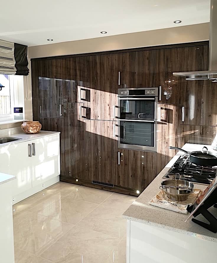
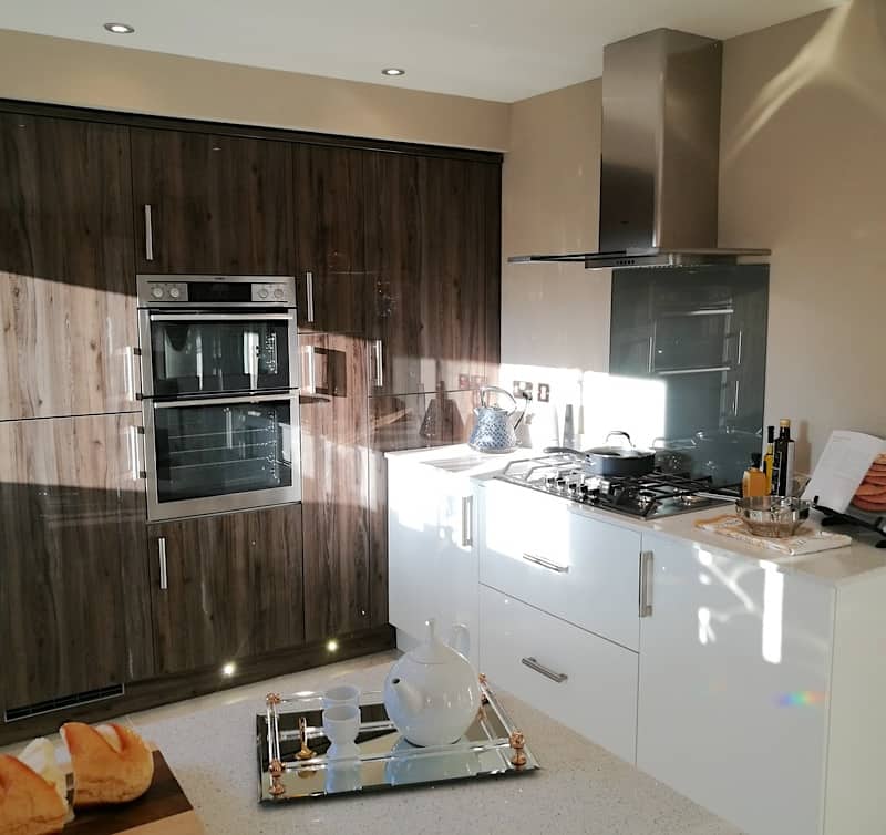
The current popular trend is to design kitchen units to be sleek by creating a streamlined wall of integrated units. It eliminates the unused spaces of previous designs and stops the temptation to add clutter. By taking integration to the next level, it gives a spacious feel whilst eliminating the ‘boxed-in’ feel that being surrounded by upper and lower units can create. The light and dark colour palette has been carried through from the living room, whilst still maintaining a light and bright feel to the space.
Details
The entrance floor tiles have been carried through from the entrance hall, which is an ideal way to connect spaces together. The worktops in this kitchen have been kept primarily functional with only a small section allocated for a breakfast bar. I feel this is perfectly adequate as there is also a dining space in the room. Also, the dark bar stool fabric has been used to pull in the darker palette that has been carried through the Show House.
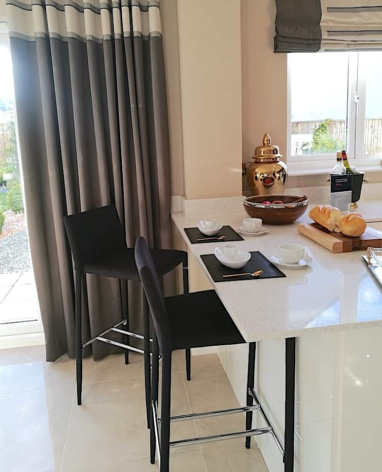
TOP TIP – If you are trying to source bar stools for your kitchen, first questions to ask yourself are – will they be used daily? What fabric best suits the households lifestyle? i.e wipeable for kids, no white fabric if anyone is a ‘spiller’. Once decided, it will help narrow down the most suitable options for your home. It is easier to have a checklist to work from than to lose hours distracted by nice but unsuitable styles.

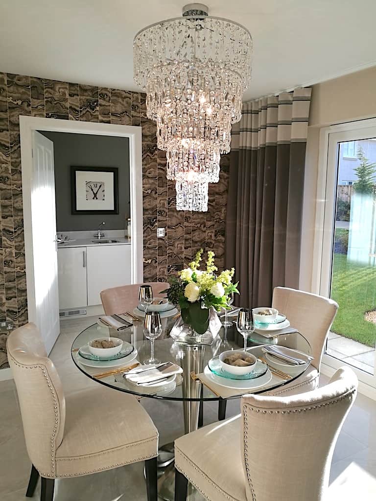
This kitchen layout is open and very sociable. Which makes the design very attractive for many people wanting to get the most out of the space. The living room style palette has been continued into the dining space of the kitchen. The same wallpaper has been carried through as well as the stud detail from the sofa to the dining chairs. I would definitely have this dining table in my home, I love the combination of the dining table and the light together!
The ceiling light is another beautiful statement piece that is perfect for above a dining table. However, it’s a pity the fitting isn’t in-line with the entrance hall, that would’ve looked amazing entering from the front door.
BEDROOM
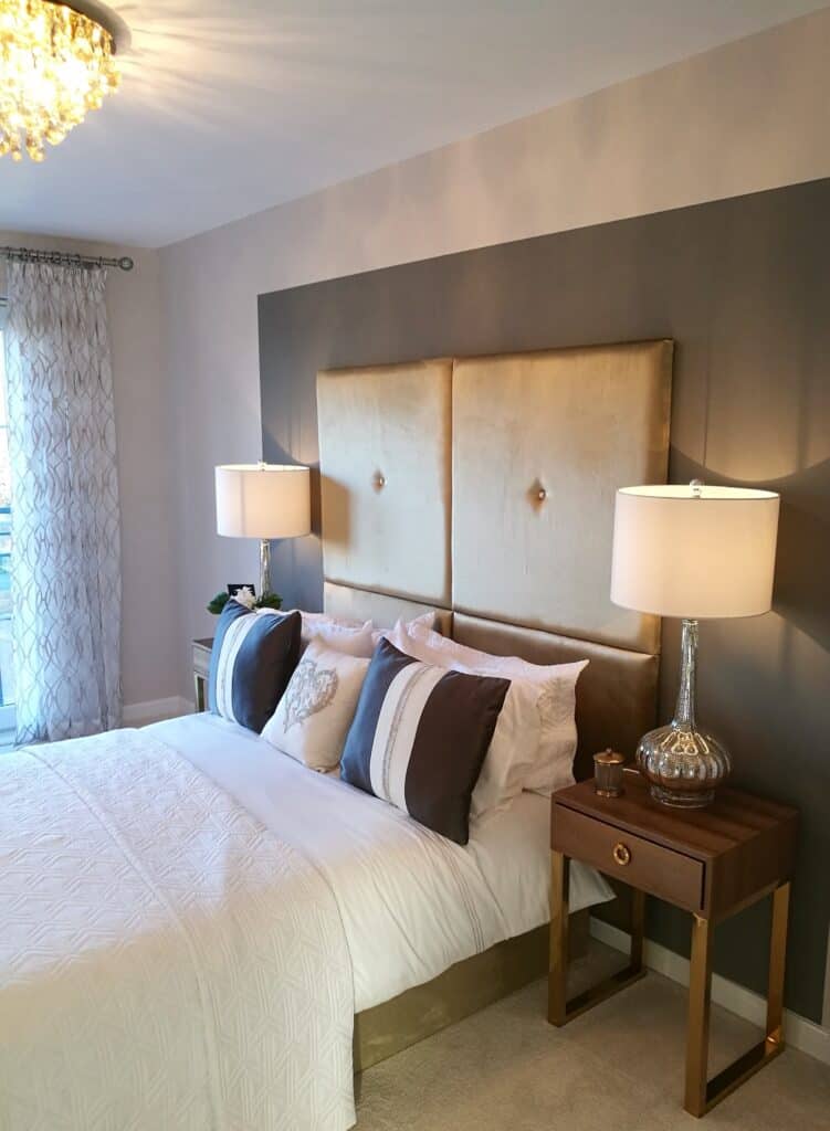
This bedroom has a neutral colour palette, keeping the style simple and sophisticated. Using a colour block behind the bed area helps frame the area and to add interest to the space. High headboards are a nice luxurious touch that allows the headboard to be a feature on its own, without the need to add anymore to your walls.
As before, in the living room, the bedside tables are on legs and provides a spacious feel to the room. I can also see height layers again which draws your eye around the room from the light shade height to the headboard and on to the colour block feature. It adds interest and depth to the space.
BATHROOM
Details
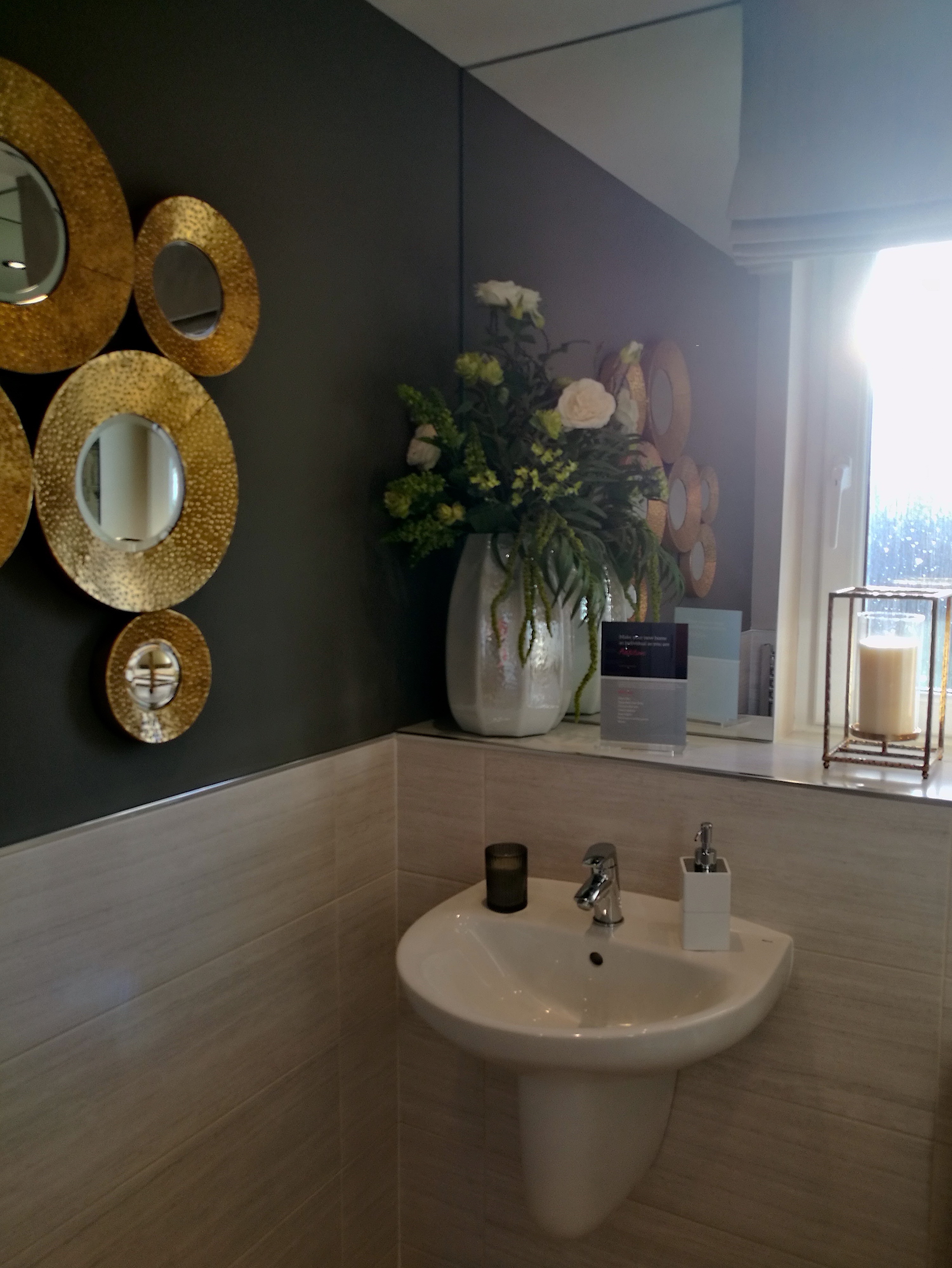
Now, I nearly didn’t include this bathroom due to my not so great photos but I wanted to include them to highlight some of the finishing touches. This wall art piece looks stunning in this space and doubles up as a mirror. Or it could be a mirror doubling up as a wall art piece. Whichever it is, the piece works really well at adding a beautiful detail to the bathroom. It continues to bring in the metals that has been featured beautifully throughout the Show Home.
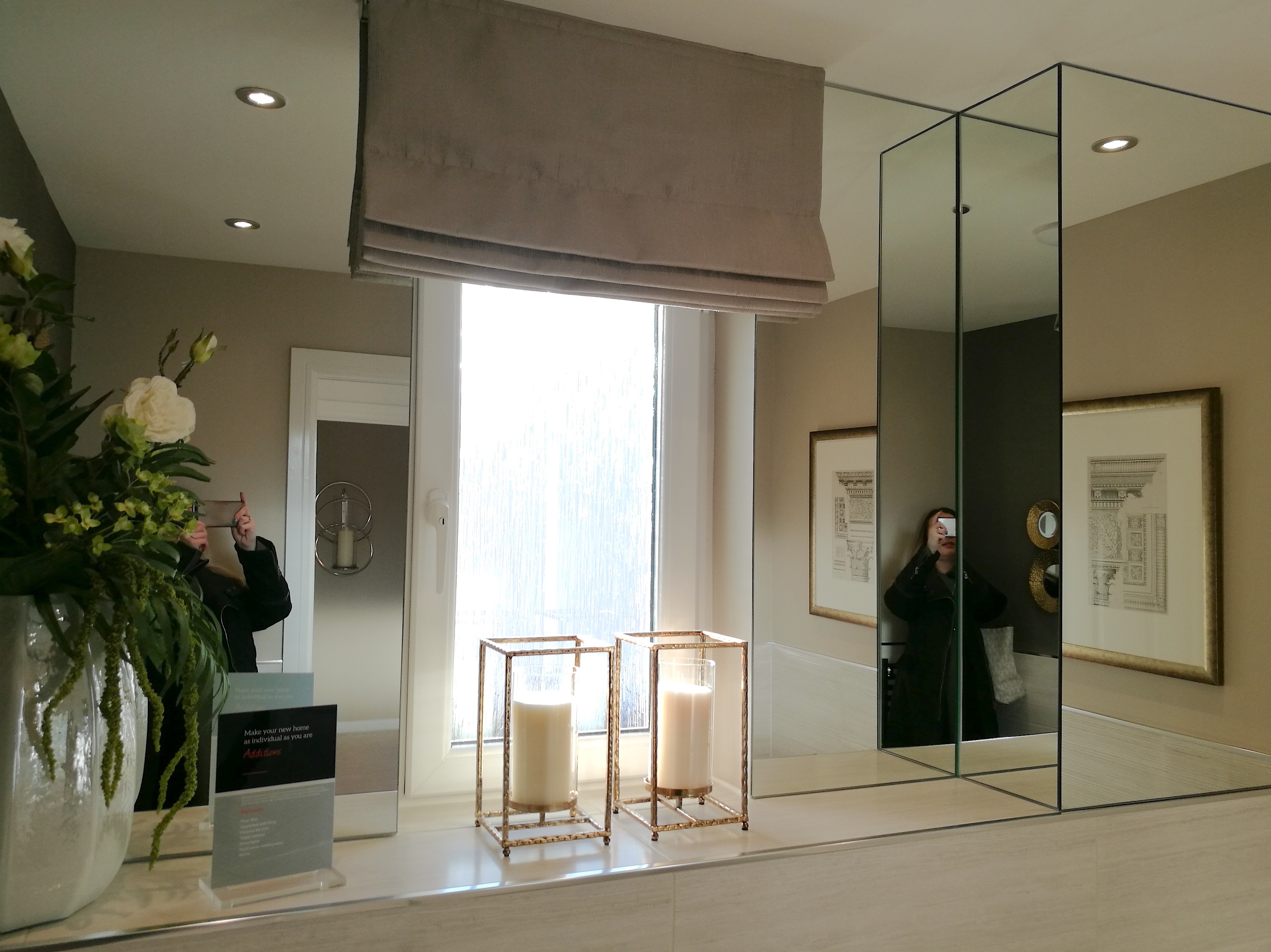
Integrated half-wall mirrors have been increasingly popular in bathrooms over the last few years. This design feature helps to eliminate the need for a separate hanging mirror and provides a streamline look. Personally, I like this design detail, so it was interesting to see it taken a step further by having a wall section fully mirrored.
Do you like this idea? As you can see, it was very hard to take a picture of, but I wanted to show you incase it suited your style and it could work in your home.
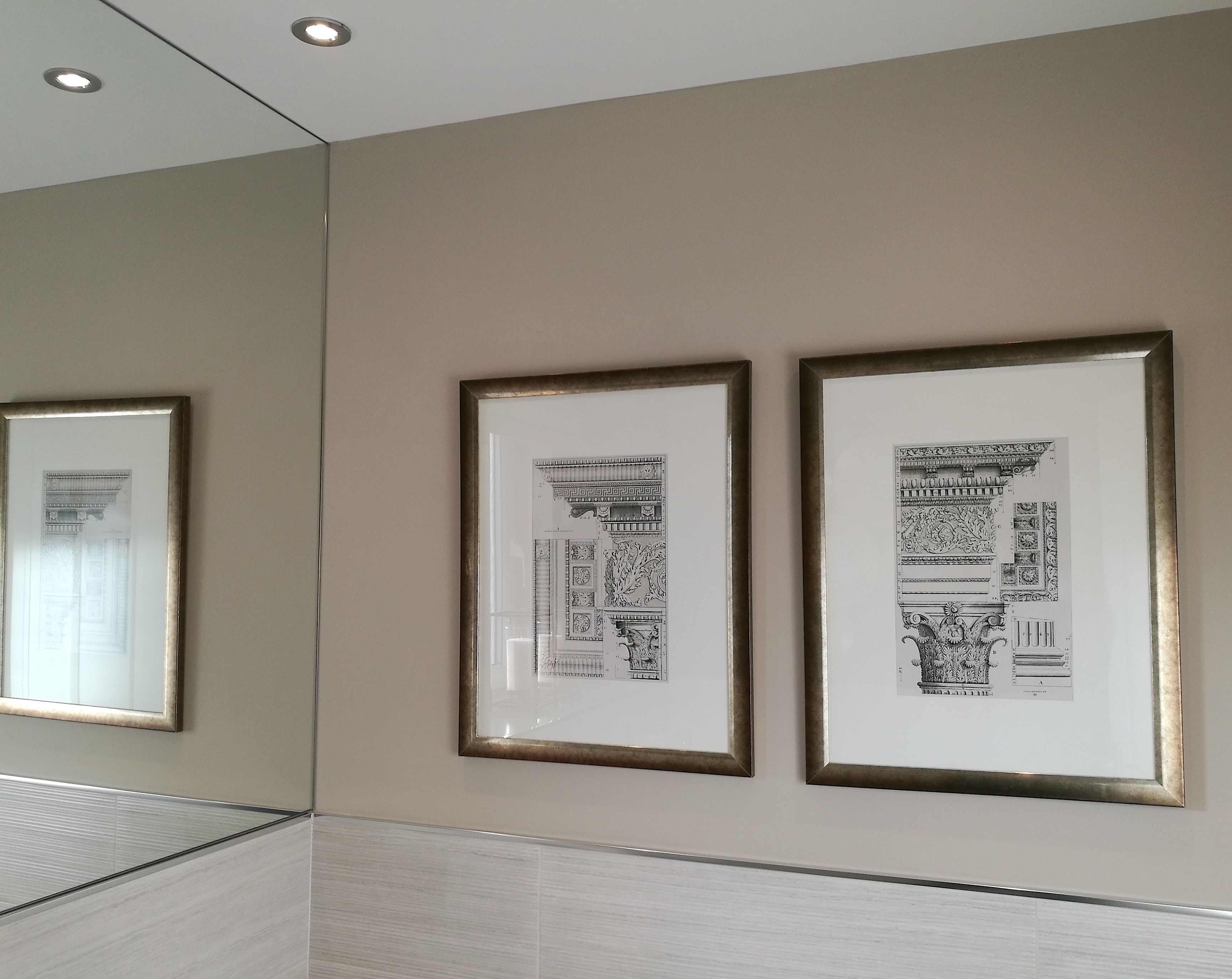
Another nice touch with the bathroom accessories is carrying the metallic tones into the picture frames. The designer has carried the light and dark tones from the other areas of the house into the prints. By finishing them off with these beautiful frames, it pulls all the styling details together.
BEDROOM
Mirror Walls
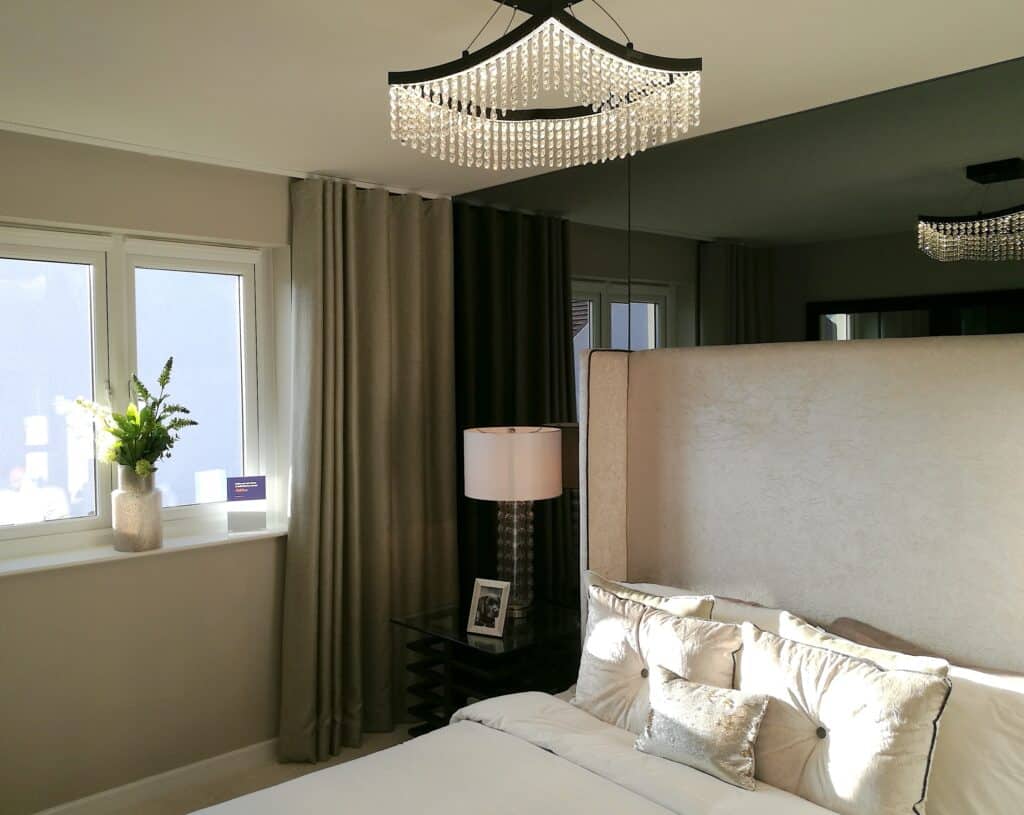
This bedroom has a lot of beautiful features and is definitely for people with a more glamorous taste. Full mirror walls can be stunning in many rooms of your home. I’ve seen them in hallways, living rooms and now bedrooms.
The smoked glass wall in this room works really well as there is a good balance of lighter colours to compliment without being overbearing. By making the headboard tall and using lamps that are also a good height, it helps to hide enough of the mirror to keep it from becoming too much for the space. Mirror walls have various styles to suit your taste. The most popular I’ve seen lately is the antique mirror look being used around lots of homes, on large and small scales.
If you like the idea of a mirrored wall and want to see different styling inspiration, pop over to the Pinterest board that I made especially for this post. I’ve pulled together lots of styles, finishes and amazing photos that will definitely inspire you.
Curtains
Using curtains to cover unused walls to the side of your windows is a trick I love, because what would we really do with that unused space anyway? Squeezing some small picture frames into the space is only going to draw more attention to how small the space is.
Also, taking your curtains up to your ceiling height is another trend that has worked really well for the last few years. Since the introduction of the wave curtain (think eyelet curtains without the holes) it has allowed designers to streamline the whole curtain look to be much more sleek and framing the window much better. And in my opinion, creating a much more luxurious look to the whole room.
Details
Although, the side tables have full frames, they are open, which still allows light through, enhancing the spacious feel of the room. The light/dark styling is continued throughout this room again, as it has been throughout the house. Most importantly, I want you to notice how each room carries the same basic colours and styling details but all are done very differently.
Sometimes trying to tie a house together with a colour scheme can seem overwhelming. I hope by seeing how this Show Home managed it, without it being obvious, inspires you.
TOP TIP – If you like this style, pick a few colours along with a neutral tone and a metallic tone. Once you have a starting point, use Pinterest to find rooms of those colourways. For example, typing ‘taupe and orange bedrooms’ will be enough to get started. Then pin any images to a new board until a style emerges that you like.
I think I have fell in love with every light in this Show Home so far! This beautiful ceiling light suits this room perfectly. For bedroom ceiling lights, you have to be cautious of the drop measurement. No matter how beautiful your chosen light is, it will soon lose its appeal if you have to walk around it to get to bed.
MAIN BEDROOM
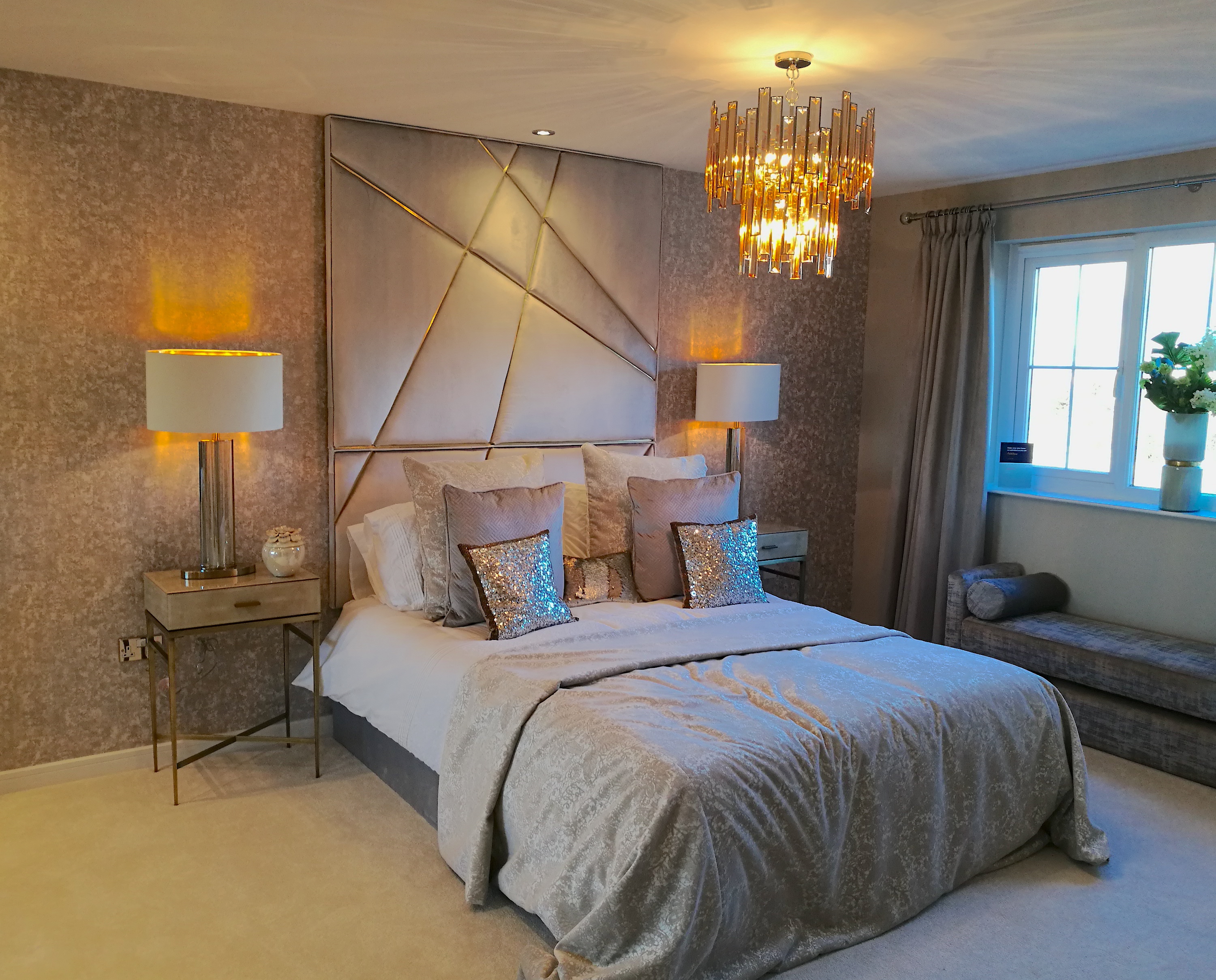
The main bedroom is oozing glamour. Whilst mixed metals have been used throughout the Show Home, the gold tone is used more heavily here. I’m getting a lovely Gatsby vibe from this room.
A full height headboard can really give your bedroom a luxurious and full look without the need to add further details on the wall such as pictures or mirrors.
TOP TIP – When choosing a ceiling light, always measure the desired drop that is perfect for your room height. Ensure that a hanging light is the best solution for the space. Also, check the style will not interrupt you functioning within the room in any way. It is easy to get carried away looking at pretty lighting and not focus on what best suits the room. Another tip, check if the wire is adjustable, you may want to tweak it slightly for the perfect height.
Another textured wallpaper has been used in this room as a feature wall, pulling all the colours in the room together nicely. Also, muted soft colour tones have been used for the bedding and cushions. Layering up your cushions and using various sizes and shapes can add another touch of luxury design to your home.
Storage
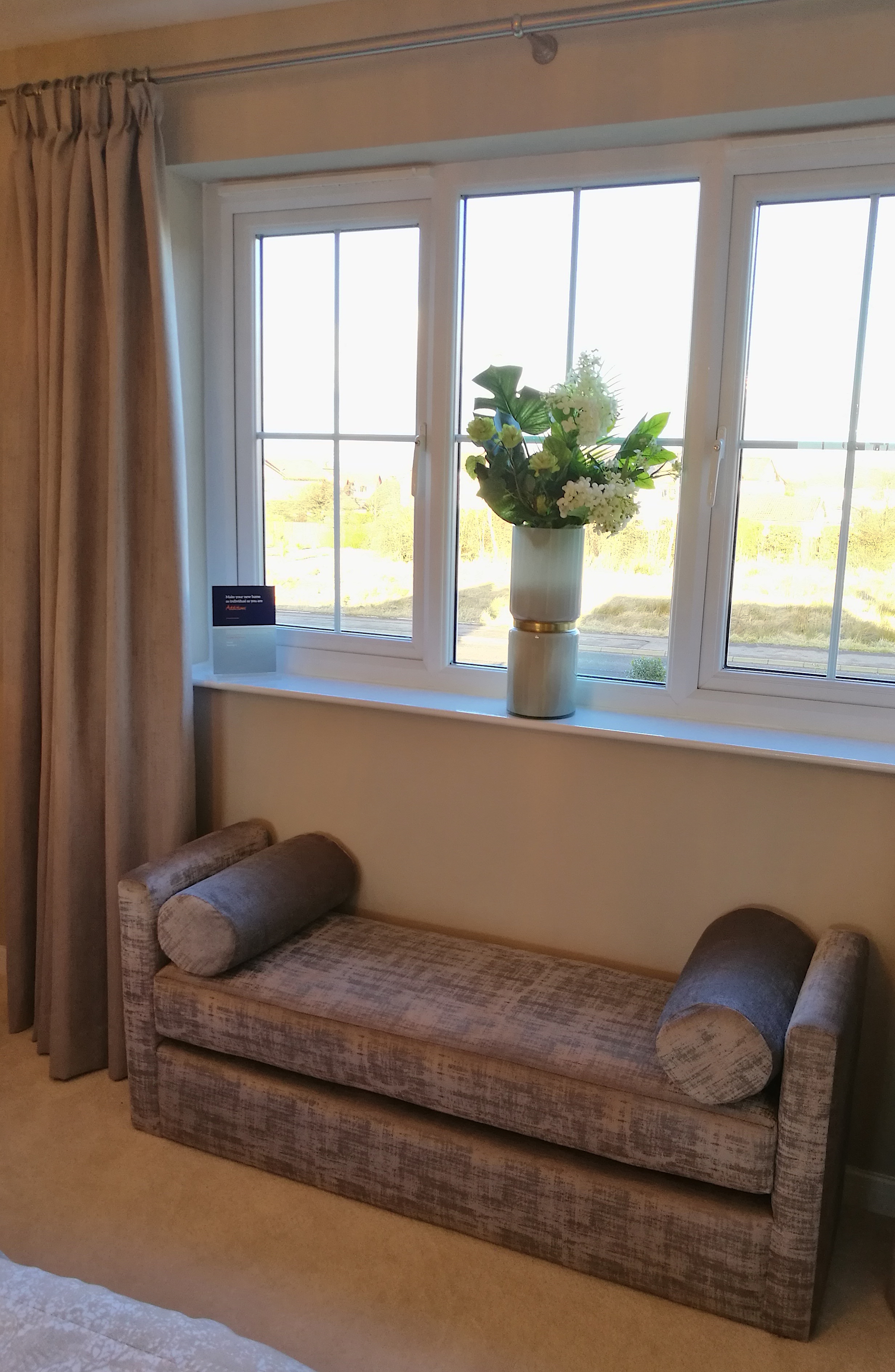
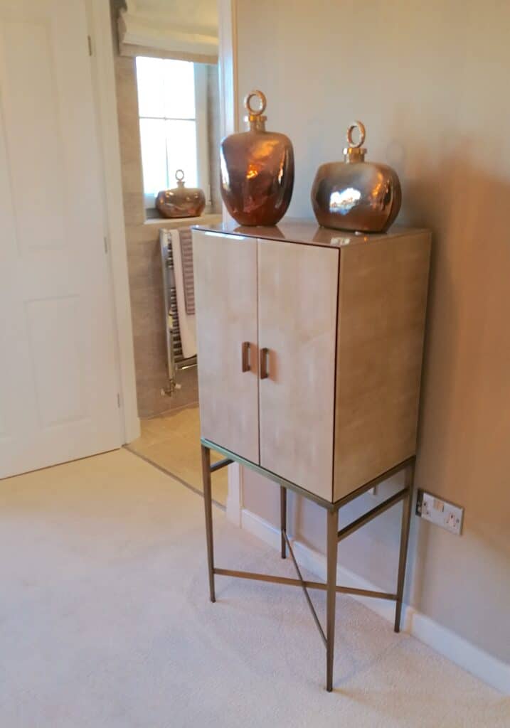
Now, I love a beautiful upholstered bench seat (they also go by many other names). There are so many different styles available that can be used for different requirements. I have always wanted one to go along the bottom of my bed. And, it would be a great place to keep extra bedding, throws or a place to store your cushions at night.
This upholstered bench seat has nice bolster cushions incorporated into the finished look, which softens the straight sides of the design. The fabric mimics the textured wallpaper design, which creates a visual flow through the room, from wall covering to furniture. Below are some other photos of this room –
That’s our Show Home visit done for today.
So, did you enjoy your Show Home visit with me today? I hope you’ve managed to pick up some helpful tips and ideas for your home interiors. I will be sharing my Show Home visits with your regularly. Therefore, please remember to pop back as you never know, the next visit could be exactly what you are looking for.
If you found this post helpful or you want to share any tips, please let me know in the comments. If there’s something you would like me to write about please let me know here.
Need more inspiration? Visit another Show Home here.
Take Care


