Visit this Show Home with me today
Are you free right now? If you are thats great as I will be sharing interior tips and ideas.
Today I will be sharing with you –
- Top Tips – Watch out for these throughout the post as an extra bonus
- Interior Design advice and suggestions to help you style your home
- A before/after photo of my client’s problem we fixed
- Show Home knowledge you may not have discovered before
- My photos from the visit with interior ideas for your home
- Links to my Pinterest boards for further ideas on particular furnishings
How will visiting a Show Home help me with my home?
Show Homes only have one purpose – to look so utterly amazing that you want to buy it …….now!
Therefore, it is logical to believe that the house builders will put a fair bit of effort into all their Show Homes so by creating each one with hot new interior trends and styling techniques it will make them more attractive to buyers, increasing sales.
The interior styling also has to withstand the test of time, for instance, it may be a large development and be building on-site for many years to come. It is time consuming and not always geographically logical to visit a Show Home. Therefore, let me do the hard part and share with you the new and fresh interior ideas I have found for you and your home.
TOP TIP :If an item or piece of furniture stands out, the Sales Advisor should be able to provide the Designer’s details for further information.
Before we get started with our Show Home visit today
One thing to keep in mind with any Show Home – the price brackets of the properties being sold will determine the budget that is spent on the Show Homes. The pricier the property the more exclusive the finishes used are.
However, there are still so many great styling tips and ideas that can be taken and implemented no matter what the Show Homes budget was or your budget.
And this is what I love about the advice I share on Secret Home Designer – you may have a studio apartment or a six bedroom mansion – every space has the potential to look amazing by finding the ideas that appeal to you and your home.
TOP TIP: Use Show Homes as a point of inspiration. If you see an item that you just have to have, but it’s ££££ (or you just know that it’s expensive) try and find something on the high street or online that is very similar. You may have to compromise on some details but you may like it better!
Time to come and join me on my tour around this Show Home.
This lovely Persimmon Show Home is inviting and it had some great features that I will share with you below.
SNUG ROOM
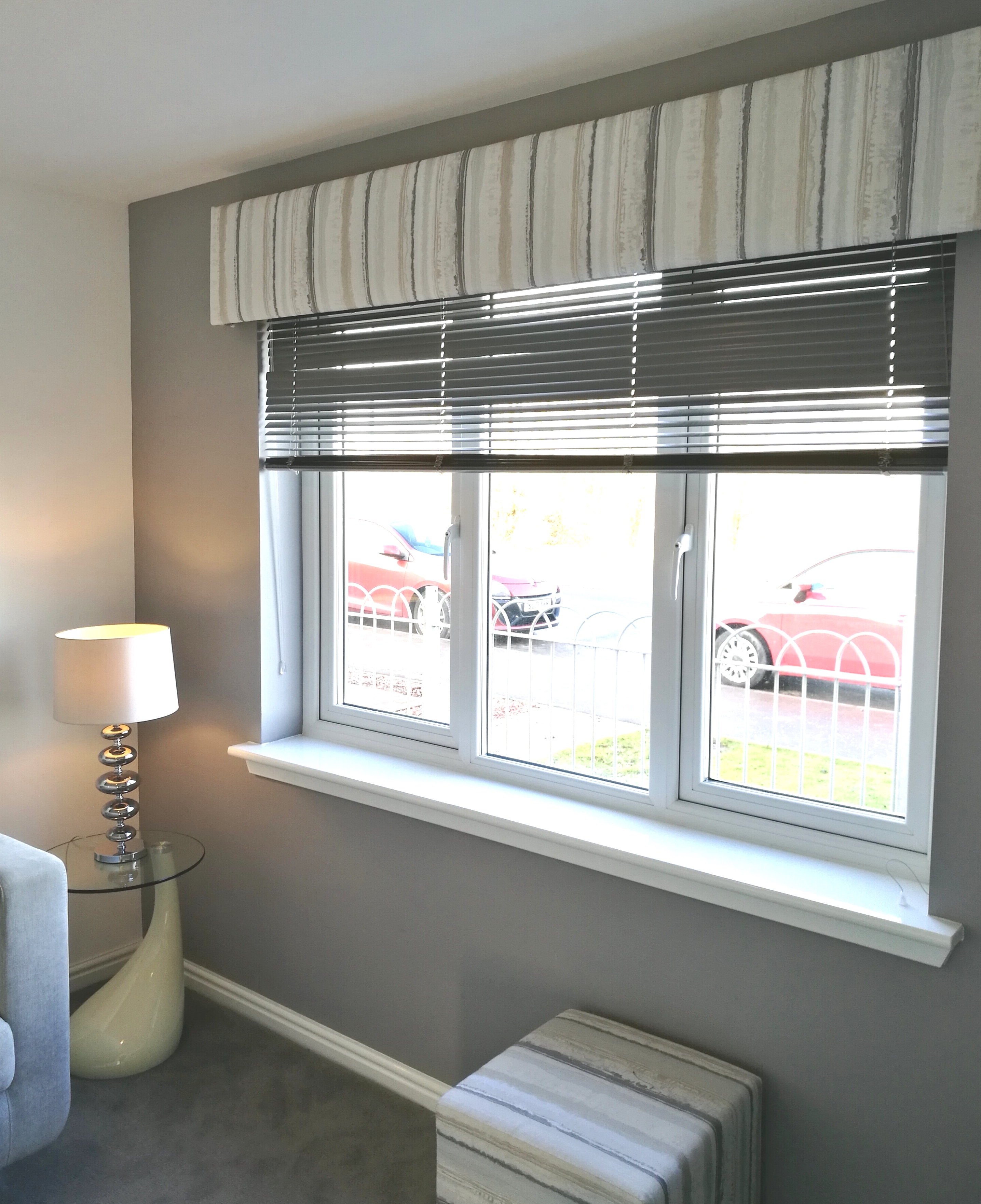
This is the small snug room at the front of the property. You can see the lovely textured pelmet fabric is carried through to the stools.
Using matching fabrics round your room will give it a ‘High-End-Designer’ feel as not a lot of High Street stores carry there fabrics throughout their soft furnishing ranges. Also, I would carry the fabric to the cushions on the sofa, but break the pattern up with some block coloured cushions, that will help you from getting pattern overload.
A great idea I would pull from this room is the cube stools which are great for flexible living. Use them as footstools or side tables (with a nice tray on top). And, depending on their size, you could tuck them under coffee tables or low fixed shelving when not in use. These cubes are really great if you don’t want bulky seating and only require occasional seating for when you have visitors over.
I have really wanted to put stools under low shelving for years but it just didn’t suit the property I was in., perhaps my next place maybe?
Head over to my Pinterest board for more stool ideas.
TOP TIP: Carry fabrics and patterns around your room for a ‘Designer’ bespoke look to your home.
LIVING ROOM
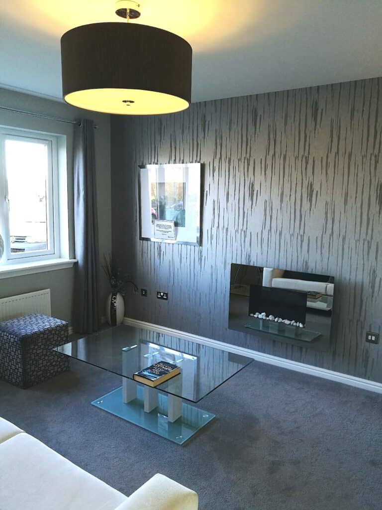
Moving on to the living room, this is where you can see the budget restraints unfortunately. However, an Interior Designer can only work with what they have been given and there is still some good ideas we can take from this room.
LIGHTING
The oversized ceiling light is very popular at the moment. Many years ago these large style shades were mainly seen only in grand rooms but if done correctly, they can look amazing in your home. Possibly not if you have a traditional cottage though 😉
Be aware of your ceiling height and if there’s someone tall in your household!
Now, I absolutely love large oversized shades. As a result, I have a workroom full of handmade shades that I have never gotten round to selling. I just like them too much. By tweaking the height and diameter you can create a bespoke piece made exactly to the requirements of your room.
Lampshades are another area that you can carry your curtain/cushion fabric into. Although, bear in mind, there are some thicker fabrics that are unsuitable for lampshades. I will write another blog post on lampshades soon. In the meantime, I have a board of lampshade inspiration over on my Pinterest board.
Bespoke lampshades can be made to a perfect size for your room. And most importantly, you can choose the fabric to match/tie in with your colour scheme. A diffuser panel can also be inserted so the bulbs are hidden, for instance, in the photo above.
TOP TIP: Floor and table lampshades can also be tied together in a matching or more appropriate fabric for your colour scheme.
WINDOW DRESSINGS
My advice for anyone that is settled and will not be moving home in the near future, is to invest in the best window treatments that you can afford. There really is no comparison between High Street curtains/blinds and Made to Measure Bespoke by a highly skilled curtain/blind maker.
I add that last part because although you can purchase Made to Measure window dressings on the High Street, as a result, you really won’t get the quality and detail that a skilled maker can provide.
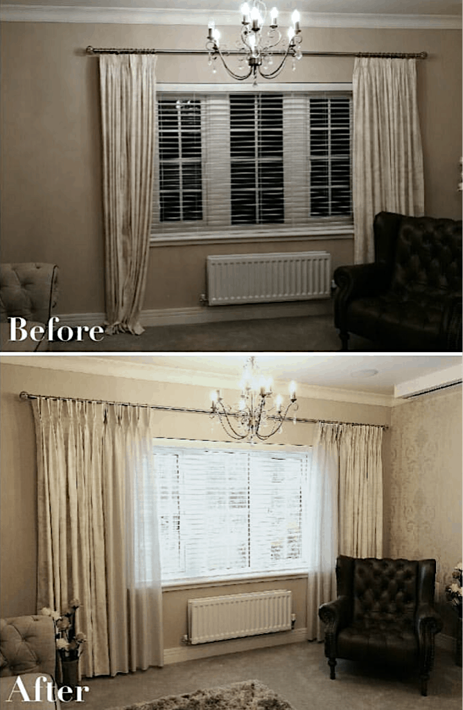
The difference getting your window dressings right can make to the styling of your home is amazing. Below, my client had curtains that needed some help to go from High Street to luxurious looking. So it pays to really think about what you want the room to look like before you purchase your curtains.
There will be more on the best ways to dress your windows in another post.
TOP TIP: For when you buy curtains from the high street and there are no matching cushions. Buy a second pair of the curtains and use this fabric to make matching cushions. Work out the size of the cushions required and buy the size of curtains suitable so there is little wastage. This is an easy hack to help you coordinate your room. Please bear in mind, the thicker your fabric the harder this will be to achieve the best results.
KITCHEN
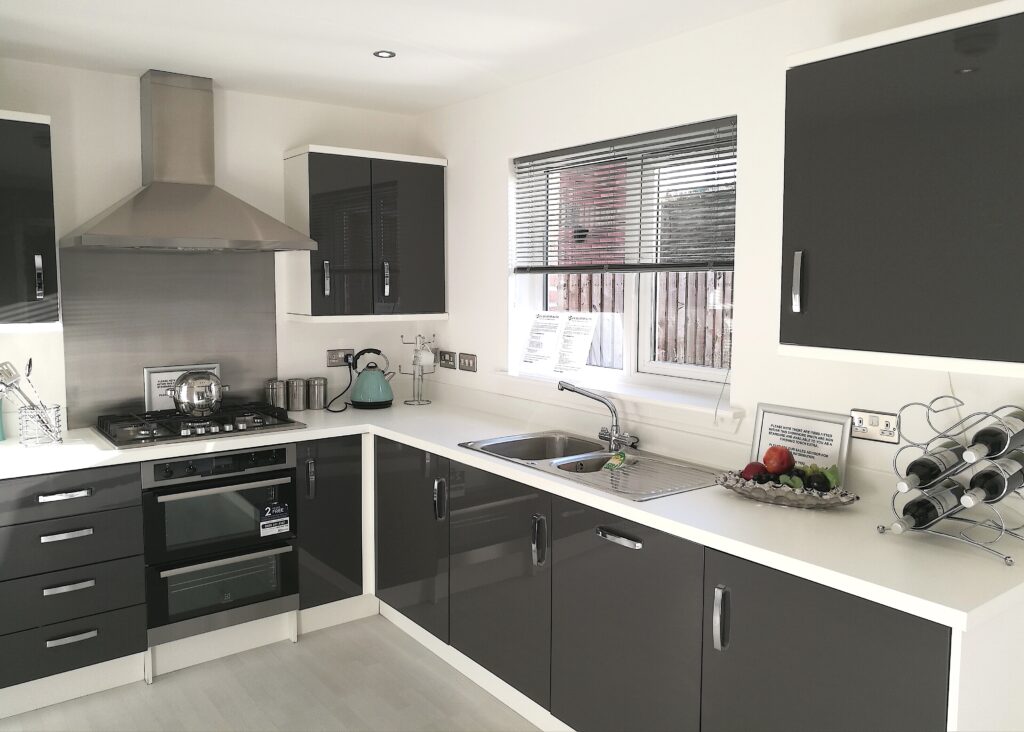
The kitchen is simple and stylish therefore, this photo will help anyone who is thinking of going for a dark gloss and visualise how it will look. High gloss kitchens have been trending for quite a number of years now.
Now, I did visit this show house a while back (quarantine of 2020 is making me rummage into the dark corners of Dropbox) however, colours and marbled gloss finishes are still proving very popular. If your wanting something bold and shiny, this image hopefully helps spark some ideas.
Some ideas to soften the room –
- A Roman Blind at the window, with some colour through it to compliment the units.
- Faux trailing plants in the dead space above the units. Allow the trail to fall down the units (without obstructing them) will contrast beautifully against the hard material.
- Try placing coloured items on the units or against the back walls. The silver frame could be replaced by one that brings in colour from the blind. A beautiful vase or platter style plate with a touch of colour could also be added.
- And if you are just wanting a bit more, you could always paint the walls with a soft shade to compliment the unit colour. This will definitely soften the overall look and feel of the space. Please follow builders guidelines when painting a new property.
DINING AREA
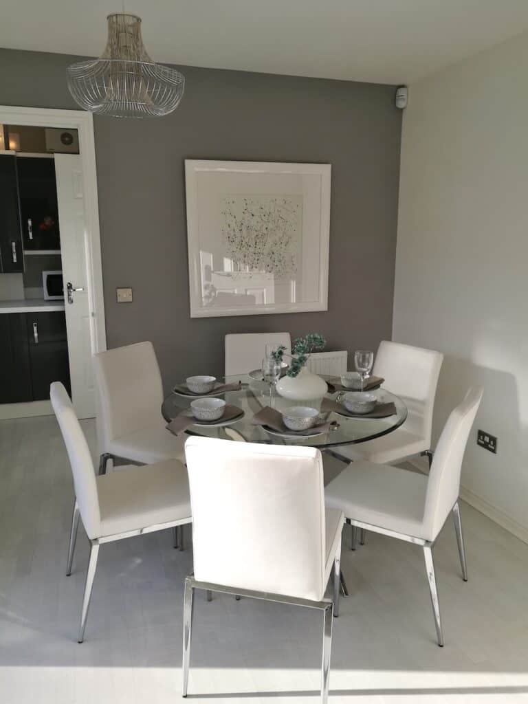
The dining space at the opposite side of the room, has a beautiful elegant feel to it. The room has been ‘zoned’ but the use of soft grey paint. As you can see in the previous photo, the kitchen is kept bold and contrasting whilst on this side of the room it is much softer.
Now, my heart absolutely melts at a pretty decorated table. If only it was acceptable to leave set up all the time just to look good. This dining set has small confetti style dots, and I am sure I saw these or similar at Next Home.
I have to say, this part of the house is my favorite. The gloss frame and artwork is from Tambo Design Ltd, a local artist/frame company and I love seeing their work.
The colour of the flowers are the perfect soft shade to compliment the grey wall and it picks up the colour in the artwork. Overall, the soft grey, soft green and white works really well to achieve a calming colour scheme with added sophistication.
HALLWAY
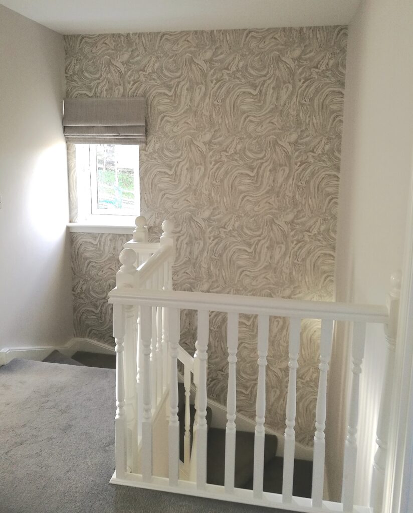
As mentioned before, Show Homes that are allocated a larger budget could add much more to this space. Here are some ideas that could help your own hallway based off of the photo above –
- Take your wallpaper around. Here, the feature wall is the highlight, however by wallpapering more walls (if the space can take it) you will be adding further interest and creating more flow to the space.
- A shallow pelmet could be added to the window instead of a blind if privacy is not required, streamlining the overall look of the window.
- A focal point in front of the spindles, i.e. tall vase with faux flowers, shallow console table with photo frames and accessories (providing it wouldn’t interrupt the flow to any rooms).
- Lastly, I would highly recommend creating an amazing lighting feature in the void space above the stairwell. I personally feel this stairway and hallway is just crying out for a gorgeous cascading light. It will instantly create a stunning focal point to the whole upstairs.
No matter your taste, chandelier, industrial etc – a statement light is going to give this stair area a complete overhaul. With the loft area above, this should be a simple enough job for an electrician. However, please remember to measure the space and the ideal/maximum hanging length of the desired light before shopping. You need to ensure the light you choose will not interrupt the stairway in any way, especially for any tall people in your home.
For more lighting ideas perfect for hallways, pop over to my Pinterest board that I have created especially for this post.
BEDROOM
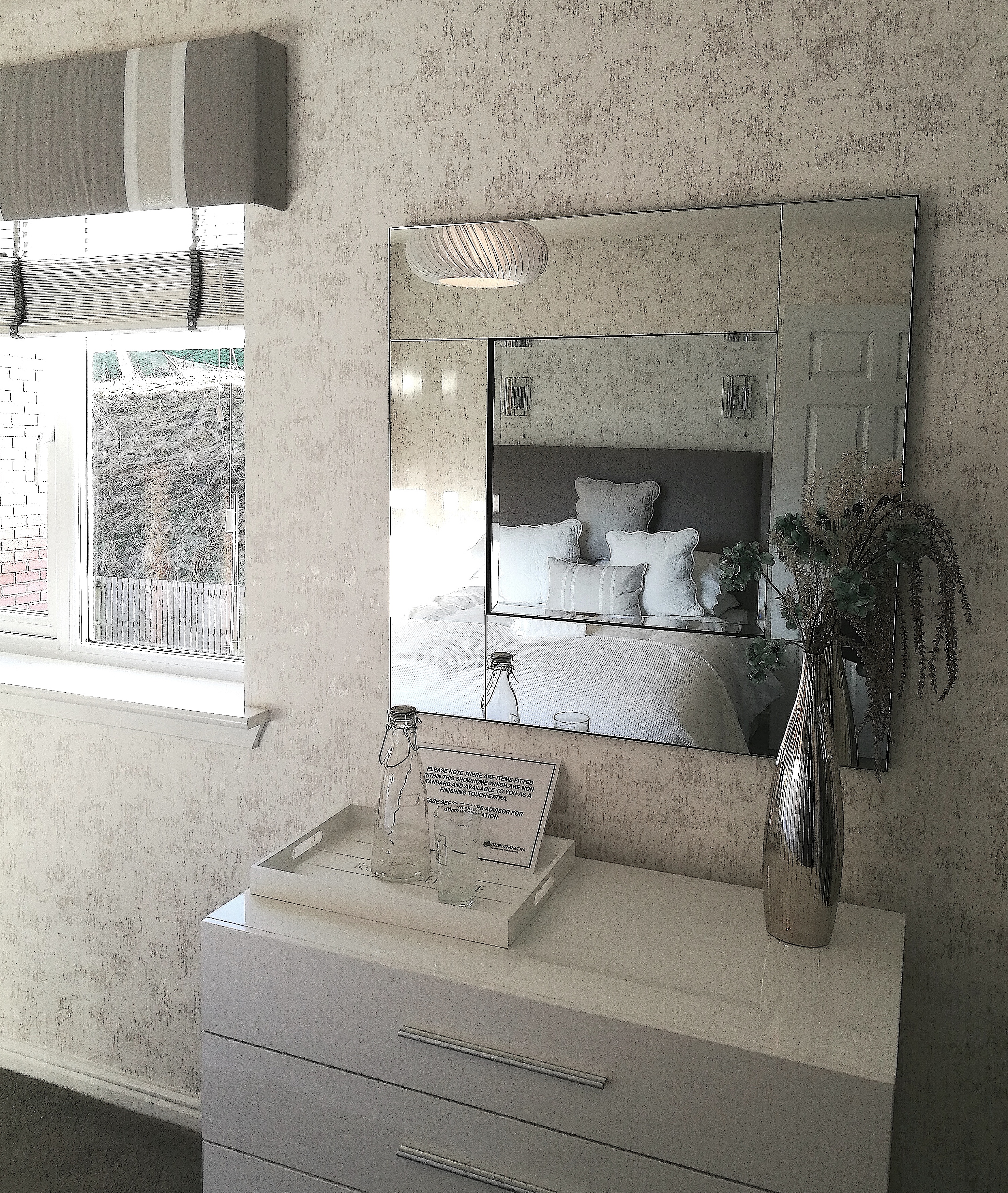
This is the best photo I have of the bedroom unfortunately, the lighting wasn’t wanting to help me out that day.
The bedroom has a similar calming vibe as the dining area, with soft tones and textures. You can only see part of the window pelmet in this photo, and it looks to have a gentle but luxurious ruffle style. The pelmet works well to combine all the soft tones of the colour palette and to tie the room together.
The size and height of this mirror fits beautifully in this space. A lot of times, creating a beautiful home is tweaking and adjusting until it is just right. Some people have a natural talent for just knowing when the perfect set up has been created. The square shapes of the drawer unit, mirror, tray and boxed pelmet all work together to create a harmonious look to this space.
If you want just a little bit more, you could source a taller mirror. For taller mirrors, you could align it with the top of the pelmet. Though, for the size of this particular bedroom, this mirror is a perfect fit.
That’s our Show Home visit done for today.
So, did you enjoy your Show Home visit with me today? I hope your managed to pick up some helpful tips and ideas for your home interiors today.
I will be sharing my Show Home visits with your regularly. So please remember to pop back as you never know, the next visit could be exactly what you are looking for.
If you found this post helpful or you want to share any tips, please let me know in the comments. If there’s something you would like me to write about please let me know here.
Need more inspiration? Visit another Show Home here.
Take Care
Michelle

